Introduction
This documentation will show the complete procedure for analyzing multi-group data. We use data from the study “Lipidomic and biophysical homeostasis of mammalian membranes counteracts dietary lipid perturbations to maintain cellular fitness” as an example (Levental KR 2020). This dataset includes three distinctgroups: a control group (N = 7) and two experimental groups: DHA-supplementation (N = 6) and AA-supplementation (N = 4).
Installation
Here is the procedures of running the LipidSigR package on your system. We assume that you have already installed the R program (see the R project at http://www.r-project.org and are familiar with it. You need to have R 4.3.0 or a later version installed for running LipidSigR.
Our package is available at the github https://github.com/BioinfOMICS/LipidSigR. Following are the instructions for installing our package.
# Step 1: Install devtools
install.packages("devtools")
# Step 2: Install BiocManager
if (!require("BiocManager", quietly = TRUE))
    install.packages("BiocManager")
# Step 3: Install LipidSigR
## Update repositories
options(repos = c(
    CRAN = "https://cloud.r-project.org/",
    BiocManager::repositories()))

## Install dependencies and package
devtools::install_github(
    "BioinfOMICS/LipidSigR",
    dependencies = TRUE)
LipidSigR relies on several dependencies. If an error indicates a missing package, you can install the required packages using the commands below.
# LipidSigR package depends on several packages, which can be installed using the below commands:
BiocManager::install(
    c('fgsea', 'gatom', 'mixOmics', 'S4Vectors', 'BiocGenerics',
      'SummarizedExperiment', 'rgoslin'))

install.packages(
    c('devtools', 'magrittr', 'plotly', 'tidyverse', 'factoextra', 'ggthemes',
      'ggforce', 'Hmisc', 'heatmaply', 'hwordcloud', 'iheatmapr', 'Rtsne', 'uwot',
      'wordcloud', 'rsample', 'ranger', 'caret', 'yardstick', 'fastshap',
      'SHAPforxgboost', 'visNetwork', 'tidygraph', 'ggraph'))

devtools::install_github("ctlab/mwcsr")
After the installation, you can load and start using our package!
Data preparation
The input data of our functions must be a SummarizedExperiment object
construct by as_summarized_experiment or output from
upstream analysis function.
Input data for general analysis
For profiling, differential expression, and enrichment, we use data from the study “Lipidomic and biophysical homeostasis of mammalian membranes counteracts dietary lipid perturbations to maintain cellular fitness” (Levental KR 2020) as an example dataset. This dataset includes three distinct groups: a control group (N = 7) and two experimental groups: DHA-supplementation (N = 6) and AA-supplementation (N = 4). Through the steps below, you can construct the input SummarizedExperiment object. NOTE: For constructing the input data for machine learning analysis and correlation analysis, please refer to the corresponding section (Input data for machine learning and Input data for correlation).
Input data frames
The abundance data and group information table must be provided as data frames and adhere to the following requirements.
Abundance data: The lipid abundance data includes the abundance values of each feature across all samples.
- The first column of abundance data must contain a list of lipid names (features).
- Each lipid name (feature) is unique.
- All abundance values are numeric.
For example:
rm(list = ls())
data("abundance_multiGroup")
head(abundance_multiGroup[, 1:6], 5)
#>     feature   ctrl1   ctrl2    ctrl3    ctrl4   ctrl5
#> 1 CE 14:0;0      NA      NA 28.15280 10.26670 11.5552
#> 2 CE 15:0;0      NA      NA  5.79962       NA      NA
#> 3 CE 16:0;0 48.9834 24.1368 96.14220 18.83000 39.3052
#> 4 CE 16:1;0 29.9144 13.1919 57.59300  6.84655 19.7895
#> 5 CE 17:0;0      NA      NA  5.44714       NA      NA
Group information table: The group information table contains the grouping details corresponding to the samples in lipid abundance data.
- The column names are arranged in order of sample_name, label_name, group, and pair.
- All sample names are unique.
- Sample names in ‘sample_name’ column are as same as the sample names in lipid abundance data.
- Columns of ‘sample_name’, ‘label_name’, and ‘group’ columns do not contain NA values.
- The column ‘group’ contain more than 2 groups.
For example:
Mapping lipid characteristics
The purpose of this step is to exclude lipid features not recognized
by rgoslin package. Please follow the instructions below
before constructing the input data as a SummarizedExperiment object.
- In this step, an error message will be returned if
rgoslin::parseLipidNamescannot recognize a certain lipid. However, if your data contains at least two recognizable lipids, it will be sufficient for analysis (note that different analyses may have varying data requirements).
library(dplyr)
# map lipid characteristics by rgoslin
parse_lipid <- rgoslin::parseLipidNames(lipidNames=abundance_multiGroup$feature)
#> Encountered an error while parsing 'Chol 27:1;0': Expecting a single string value: [type=character; extent=4].

# filter lipid recognized by rgoslin
recognized_lipid <- parse_lipid$Original.Name[
    which(parse_lipid$Grammar != 'NOT_PARSEABLE')]
abundance <- abundance_multiGroup %>%
    dplyr::filter(feature %in% recognized_lipid)
goslin_annotation <- parse_lipid %>%
    dplyr::filter(Original.Name %in% recognized_lipid)
After running the above code, two data frames,
abundance, and goslin_annotation, will be
generated and used in the next step.
head(abundance[, 1:6], 5)
#>     feature   ctrl1   ctrl2    ctrl3    ctrl4   ctrl5
#> 1 CE 14:0;0      NA      NA 28.15280 10.26670 11.5552
#> 2 CE 15:0;0      NA      NA  5.79962       NA      NA
#> 3 CE 16:0;0 48.9834 24.1368 96.14220 18.83000 39.3052
#> 4 CE 16:1;0 29.9144 13.1919 57.59300  6.84655 19.7895
#> 5 CE 17:0;0      NA      NA  5.44714       NA      NA
head(goslin_annotation[, 1:6], 5)
#>   Normalized.Name Original.Name Grammar Message Adduct Adduct.Charge
#> 1    SE 27:1/14:0     CE 14:0;0  Goslin      NA     NA             0
#> 2    SE 27:1/15:0     CE 15:0;0  Goslin      NA     NA             0
#> 3    SE 27:1/16:0     CE 16:0;0  Goslin      NA     NA             0
#> 4    SE 27:1/16:1     CE 16:1;0  Goslin      NA     NA             0
#> 5    SE 27:1/17:0     CE 17:0;0  Goslin      NA     NA             0
Construct SE object
se <- as_summarized_experiment(
    abundance, goslin_annotation, group_info=group_info_multiGroup,
    se_type='de_multiple', paired_sample=NULL)
#> Input data info
#> se_type: de_multiple
#> Number of lipids (features) available for analysis: 1183
#> Number of samples: 17
#> Number of group: 3
#> Not paired samples.
After running the above code, you are ready to begin the analysis
with the output se. After the code execution, a summary of
the input data will be displayed.
(Note: If errors occur during execution, please revise the input data to resolve them.)
Three main analysis workflows—“Profiling,” “Differential Expression,” and “Enrichment”—can be conducted for multi-group data.
“Profiling” provides an overview of comprehensive analyses to efficiently examine data quality, the clustering of samples, the correlation between lipid species, and the composition of lipid characteristics.
“Differential expression” integrates many useful lipid-focused analyses for identifying significant lipid species or lipid characteristics.
“Enrichment” provides two main approaches: ‘Over Representation Analysis (ORA)’ and ‘Lipid Set Enrichment Analysis (LSEA)’ to illustrates significant lipid species enriched in the categories of lipid class and determine whether an a priori-defined set of lipids shows statistically significant, concordant differences between two biological states (e.g., phenotypes).
Please refer to the corresponding section for detailed descriptions and instructions.
Input data for correlation
In the correlation workflow, we use data from the study “Plasma sphingolipids associated with chronic obstructive pulmonary disease phenotypes”, which identified strong associations between sphingomyelins and emphysema and between glycosphingolipids and COPD exacerbations (Bowler et al. 2015). This dataset consists of 129 samples.
The input data of our functions must be a SummarizedExperiment object
construct by LipidSigR::as_summarized_experiment and after
being processed by LipidSigR::data_process.
Input data frames
The abundance data and group information table must be provided as data frames and adhere to the following requirements.
Abundance data: The lipid abundance data includes the abundance values of each feature across all samples.
- The first column of abundance data must contain a list of lipid names (features).
- Each lipid name (feature) is unique.
- All abundance values are numeric.
For example:
data("corr_abundance")
head(corr_abundance[, 1:6], 5)
#> # A tibble: 5 × 6
#>   feature       sample1 sample2 sample3 sample4 sample5
#>   <chr>           <dbl>   <dbl>   <dbl>   <dbl>   <dbl>
#> 1 SM d18:1/14:1   1.44    1.36    1.03    0.398    1.14
#> 2 SM d18:1/14:0   1.09    0.934   1.02    0.519    1.27
#> 3 SM d18:1/16:1   1.14    0.898   1.03    0.695    1.23
#> 4 SM d18:1/16:0   0.883   0.875   0.952   0.778    1.16
#> 5 SM d18:1/18:1   1.18    1.06    0.838   0.923    1.08
Group information table: The group information table includes various clinical attributes, including age, sex, BMI, clinical sub-phenotypes of COPD, symptoms, etc.
- The first column name must be ‘sample_name’.
- Sample names ‘sample_name’ column must be as same as the sample names in lipid abundance data.
- The column ‘sample_name’ must contain character values.
- Must include at least two columns containing numeric values (except ‘sample_name’ column).
For example:
data("corr_group_info")
head(corr_group_info[, 1:6], 5)
#> # A tibble: 5 × 6
#>   sample_name FEV1_FVC Emphysema Exacerbations   Age   Sex
#>   <chr>          <dbl>     <dbl>         <dbl> <dbl> <dbl>
#> 1 sample1         0.29    11.0               6  48.7     0
#> 2 sample2         0.57     2.36              0  70.1     0
#> 3 sample3         0.79     0.983             0  49.6     0
#> 4 sample4         0.39    35.0               0  54.1     1
#> 5 sample5         0.37    26.8               0  70.5     0
Mapping lipid characteristics
The purpose of this step is to exclude lipid features not recognized
by rgoslin package. Please follow the instructions below
before constructing the input data as a SummarizedExperiment object.
- In this step, an error message will be returned if
rgoslin::parseLipidNamescannot recognize a certain lipid. However, if your data contains at least two recognizable lipids, it will be sufficient for analysis (note that different analyses may have varying data requirements).
library(dplyr)
# map lipid characteristics by rgoslin
parse_lipid <- rgoslin::parseLipidNames(lipidNames=corr_abundance$feature)
#> Encountered an error while parsing 'Sphingosine': Expecting a single string value: [type=character; extent=4].
#> Encountered an error while parsing 'Sphinganine': Expecting a single string value: [type=character; extent=4].
#> Encountered an error while parsing 'Sphingosine-1-phosphate': Expecting a single string value: [type=character; extent=4].
#> Encountered an error while parsing 'Sphinganine-1-phosphate': Expecting a single string value: [type=character; extent=4].
#> Encountered an error while parsing 'Hexosylsphingosine': Expecting a single string value: [type=character; extent=4].
#> Encountered an error while parsing 'HexCer d18:1/16:0;O': Expecting a single string value: [type=character; extent=4].
#> Encountered an error while parsing 'HexCer d18:1/18:0;O': Expecting a single string value: [type=character; extent=4].
#> Encountered an error while parsing 'HexCer d18:1/20:0;O': Expecting a single string value: [type=character; extent=4].
#> Encountered an error while parsing 'HexCer d18:1/22:0;O': Expecting a single string value: [type=character; extent=4].
#> Encountered an error while parsing 'HexCer d18:1/24:0;O': Expecting a single string value: [type=character; extent=4].
#> Encountered an error while parsing 'Hex2Cer d18:1/16:0;O': Expecting a single string value: [type=character; extent=4].
#> Encountered an error while parsing 'Hex2Cer d18:1/18:0;O': Expecting a single string value: [type=character; extent=4].
#> Encountered an error while parsing 'GM2 d18:1/16:0': Expecting a single string value: [type=character; extent=4].
#> Encountered an error while parsing 'GM2 d18:1/18:0': Expecting a single string value: [type=character; extent=4].
#> Encountered an error while parsing 'GD1 d18:1/16:0': Expecting a single string value: [type=character; extent=4].
#> Encountered an error while parsing 'GD1 d18:1/18:0': Expecting a single string value: [type=character; extent=4].
#> Encountered an error while parsing 'GD1 d18:1/20:0': Expecting a single string value: [type=character; extent=4].
#> Encountered an error while parsing 'GQ1 d18:1/18:0': Expecting a single string value: [type=character; extent=4].
#> Encountered an error while parsing 'GQ1 d18:1/20:0': Expecting a single string value: [type=character; extent=4].

# filter lipid recognized by rgoslin
recognized_lipid <- parse_lipid$Original.Name[
    which(parse_lipid$Grammar != 'NOT_PARSEABLE')]
abundance <- corr_abundance %>%
    dplyr::filter(feature %in% recognized_lipid)
goslin_annotation <- parse_lipid %>%
    dplyr::filter(Original.Name %in% recognized_lipid)
After running the above code, two data frames,
abundance, and goslin_annotation, will be
generated and used in the next step.
head(abundance[, 1:6], 5)
#> # A tibble: 5 × 6
#>   feature       sample1 sample2 sample3 sample4 sample5
#>   <chr>           <dbl>   <dbl>   <dbl>   <dbl>   <dbl>
#> 1 SM d18:1/14:1   1.44    1.36    1.03    0.398    1.14
#> 2 SM d18:1/14:0   1.09    0.934   1.02    0.519    1.27
#> 3 SM d18:1/16:1   1.14    0.898   1.03    0.695    1.23
#> 4 SM d18:1/16:0   0.883   0.875   0.952   0.778    1.16
#> 5 SM d18:1/18:1   1.18    1.06    0.838   0.923    1.08
head(goslin_annotation[, 1:6], 5)
#>   Normalized.Name Original.Name Grammar Message Adduct Adduct.Charge
#> 1 SM 18:1;O2/14:1 SM d18:1/14:1  Goslin      NA     NA             0
#> 2 SM 18:1;O2/14:0 SM d18:1/14:0  Goslin      NA     NA             0
#> 3 SM 18:1;O2/16:1 SM d18:1/16:1  Goslin      NA     NA             0
#> 4 SM 18:1;O2/16:0 SM d18:1/16:0  Goslin      NA     NA             0
#> 5 SM 18:1;O2/18:1 SM d18:1/18:1  Goslin      NA     NA             0
Construct SE object
corr_input <- as_summarized_experiment(
    abundance, goslin_annotation, group_info=corr_group_info,
    se_type='corr', paired_sample=NULL)
#> Input data info
#> se_type: corr
#> Number of lipids (features) available for analysis: 50
#> Number of samples: 129
After running the above code, you are ready to begin the analysis
with the output se. After the code execution, a summary of
the input data will be displayed.
(Note: If errors occur during execution, please revise the input data to resolve them.)
Profiling
The first step in analyzing lipid data is to take an overview of the data. In this section, you can get comprehensive analyses to explore the quality and clustering of samples, the correlation between lipids and samples, and the abundance and composition of lipids.
Cross-sample variability
Now, let’s start with a simple view of sample variability to compare the amount/abundance difference of lipid between samples (i.e., patients vs. control).
# conduct profiling
result <- cross_sample_variability(se)
# result summary
summary(result)
#>                                  Length Class      Mode
#> interactive_lipid_number_barPlot 8      plotly     list
#> interactive_lipid_amount_barPlot 8      plotly     list
#> interactive_lipid_distribution   8      plotly     list
#> static_lipid_number_barPlot      9      gg         list
#> static_lipid_amount_barPlot      9      gg         list
#> static_lipid_distribution        9      gg         list
#> table_total_lipid                3      data.frame list
#> table_lipid_distribution         3      data.frame list
After running the above code, you will obtain a list called
result, containing interactive plots, static plots, and
tables for three types of distribution plots. (Note: Only static
plots are displayed here.)
# view result: histogram of lipid numbers
result$static_lipid_number_barPlot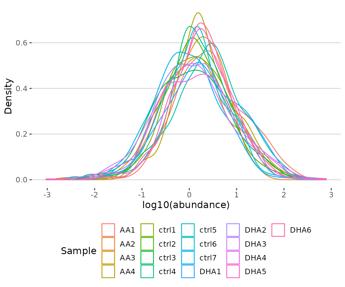
Histogram of lipid numbers The histogram overviews the total number of lipid species over samples. From the plot, we can discover the number of lipid species present in each sample.
# view result: histogram of the total amount of lipid in each sample.
result$static_lipid_amount_barPlot 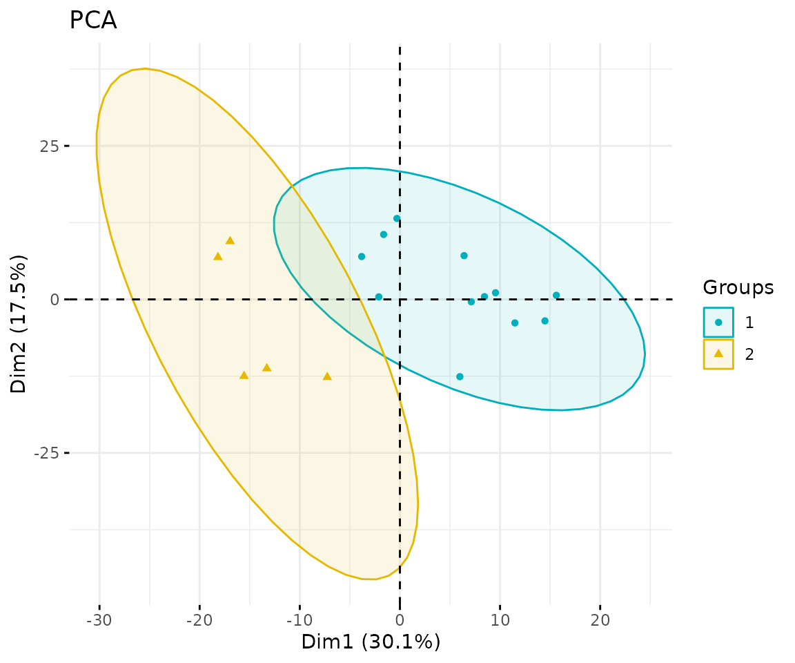
Histogram of lipid amount The histogram describes the variability of the total lipid amount between samples.
# view result: density plot of the underlying probability distribution
result$static_lipid_distribution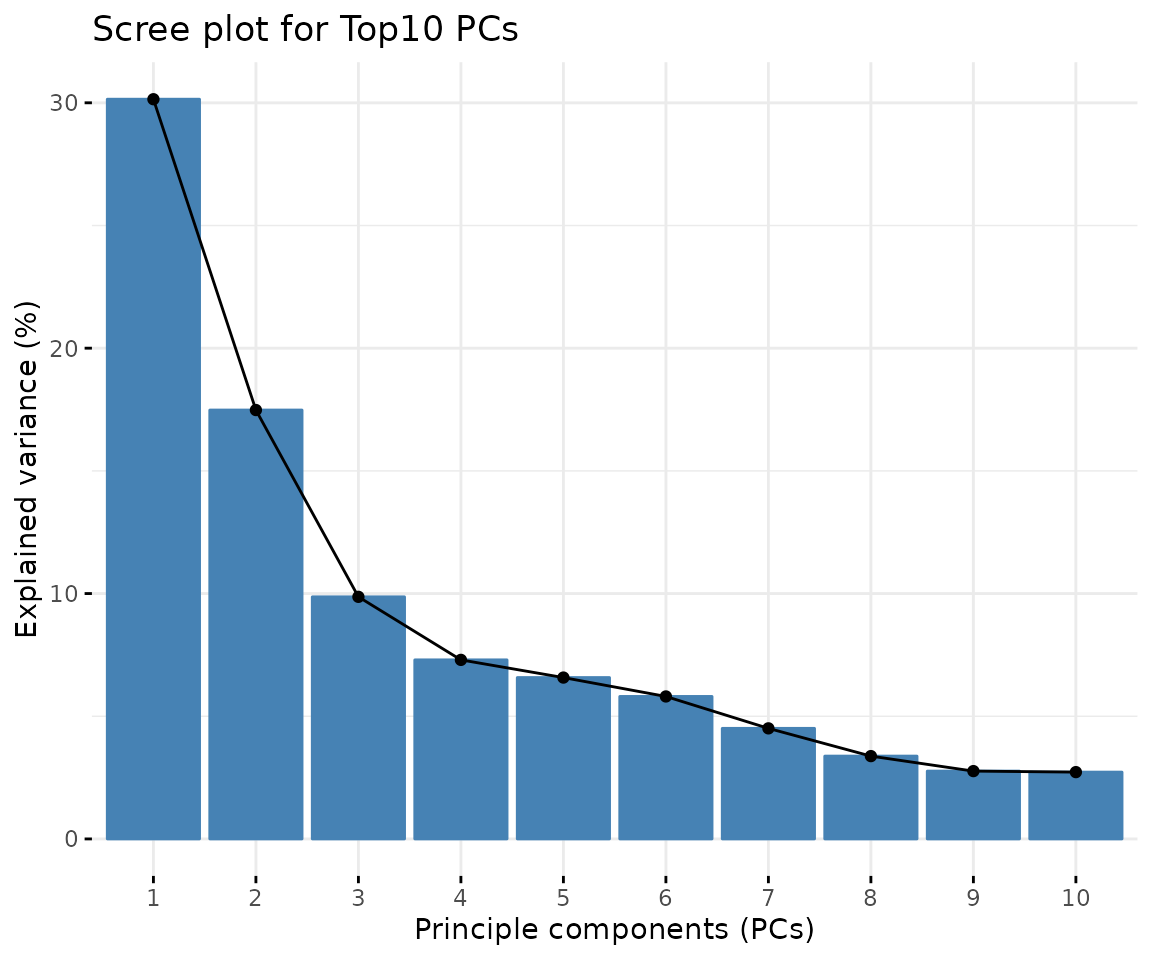
Density plot of abundance distribution The density plot uncovers the distribution of lipid abundance in each sample (line). From this plot, we can have a deeper view of the distribution between samples.
Dimension reduction
Dimension reduction is commonly used when dealing with large numbers of observations and/or large numbers of variables in lipids analysis. It transforms data from a high-dimensional space into a low-dimensional space so that it retains vital properties of the original data and is close to its intrinsic dimension.
Here we provide 3 dimensionality reduction methods, PCA, t-SNE, UMAP. As for the number of groups shown on the PCA, t-SNE, and UMAP plot, it can be defined by users (default: 2 groups).
PCA
PCA (Principal component analysis) is an unsupervised linear dimensionality reduction and data visualization technique for high dimensional data, which tries to preserve the global structure of the data. Scaling (by default) indicates that the variables should be scaled to have unit variance before the analysis takes place, which removes the bias towards high variances. In general, scaling (standardization) is advisable for data transformation when the variables in the original dataset have been measured on a significantly different scale. As for the centering options (by default), we offer the option of mean-centering, subtracting the mean of each variable from the values, making the mean of each variable equal to zero. It can help users to avoid the interference of misleading information given by the overall mean.
# data processing
processed_se <- data_process(
    se, exclude_missing=TRUE, exclude_missing_pct=70,
    replace_na_method='min', replace_na_method_ref=0.5,
    normalization='Percentage')
# conduct PCA
result_pca <- dr_pca(
    processed_se, scaling=TRUE, centering=TRUE, clustering='kmeans',
    cluster_num=2, kmedoids_metric=NULL, distfun=NULL, hclustfun=NULL,
    eps=NULL, minPts=NULL, feature_contrib_pc=c(1,2), plot_topN=10)

# result summary
summary(result_pca)
#>                                  Length Class      Mode
#> pca_rotated_data                 19     data.frame list
#> table_pca_contribution           18     data.frame list
#> interactive_pca                   8     plotly     list
#> interactive_screePlot             8     plotly     list
#> interactive_feature_contribution  8     plotly     list
#> interactive_variablePlot          8     plotly     list
#> static_pca                        9     gg         list
#> static_screePlot                  9     gg         list
#> static_feature_contribution       9     gg         list
#> static_variablePlot               9     gg         list
After running the above code, you will obtain a list containing interactive plots, static plots, and tables for three types of distribution plots. (Note: Only static plots are displayed here.)
# view result: PCA plot
result_pca$static_pca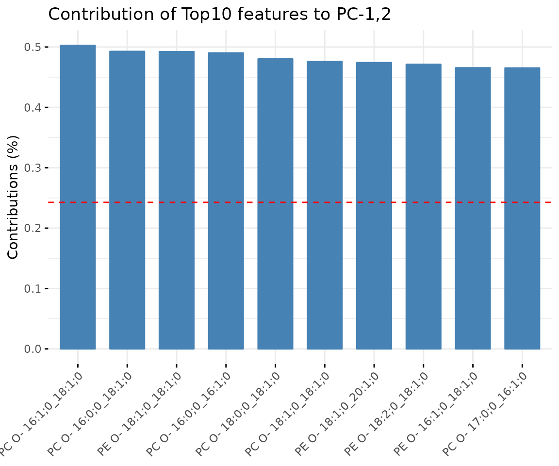
PCA plot
# view result: scree plot of top 10 principle components
result_pca$static_screePlot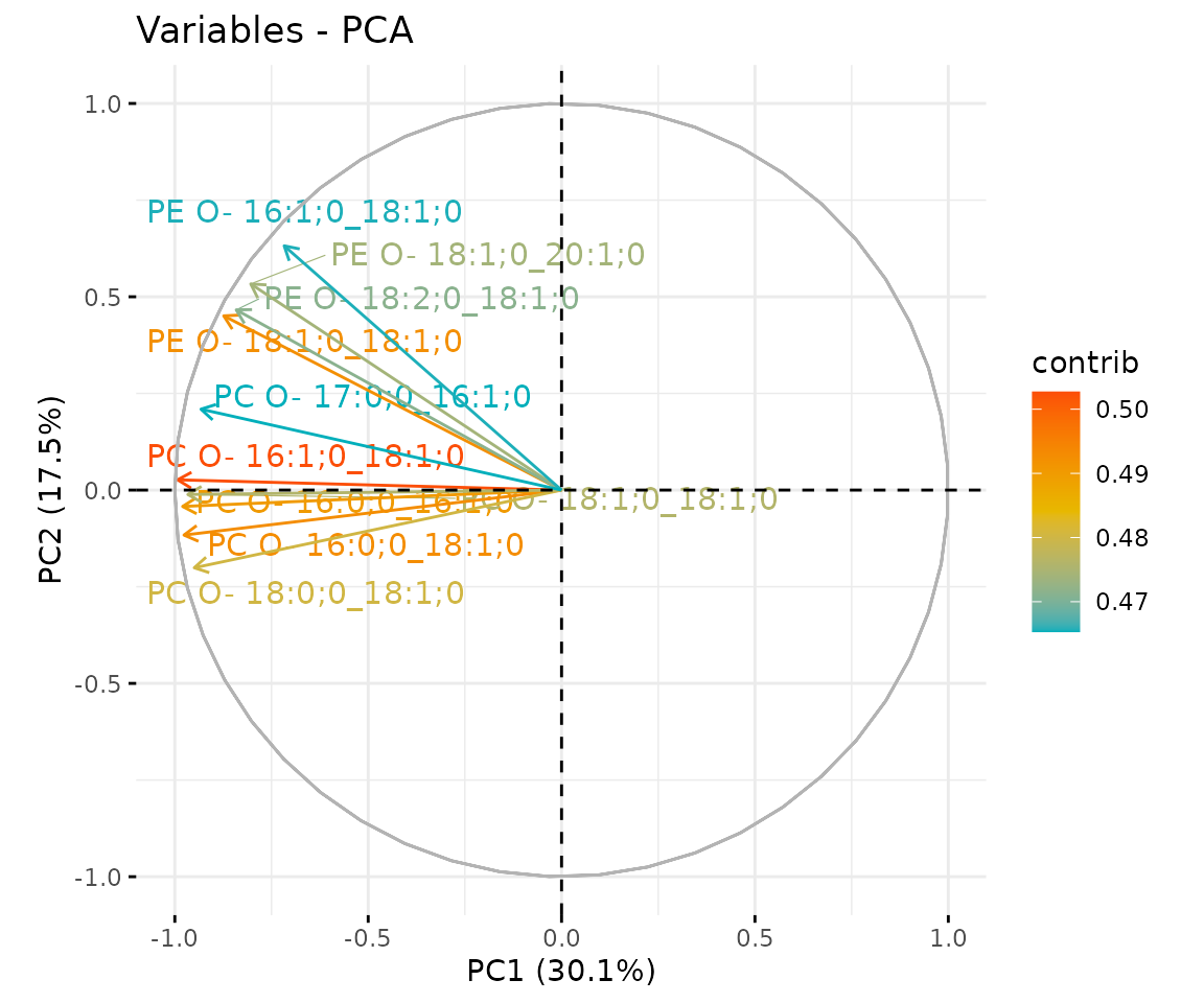
Scree plot A common method for determining the number of PCs to be retained. The ‘elbow’ of the graph indicates all components to the left of this point can explain most variability of the samples.
# view result: correlation circle plot of PCA variables
result_pca$static_feature_contribution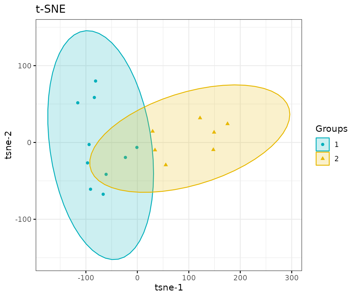
Correlation circle plot The correlation circle plot showing the correlation between a feature (lipid species) and a principal component (PC) used as the coordinates of the variable on the PC (Abdi and Williams 2010). The positively correlated variables are in the same quadrants while negatively correlated variables are on the opposite sides of the plot origin. The closer a variable to the edge of the circle, the better it represents on the factor map.
# view result: bar plot of contribution of top 10 features
result_pca$static_variablePlot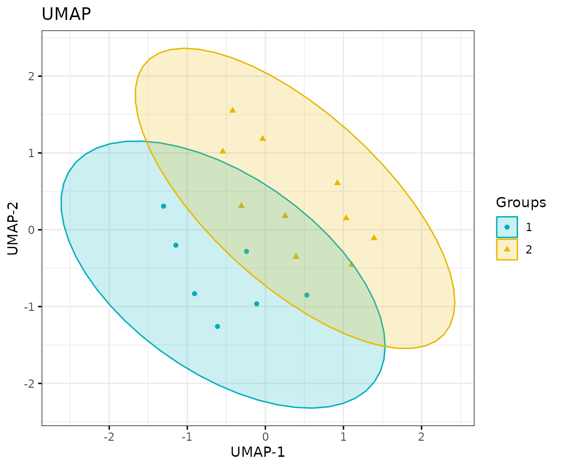
Bar plot of contribution of top 10 features The plot displays the features (lipid species) that contribute more to the user-defined principal component.
t-SNE
t-SNE (t-Distributed Stochastic Neighbour Embedding) is an
unsupervised non-linear dimensionality reduction technique that tries to
retain the local structure(cluster) of data when visualising the
high-dimensional datasets. Package Rtsne is used for
calculation, and PCA is applied as a pre-processing step. In t-SNE,
perplexity and max_iter are adjustable for
users. The perplexity may be considered as a knob that sets
the number of effective nearest neighbours, while max_iter
is the maximum number of iterations to perform. The typical perplexity
range between 5 and 50, but if the t-SNE plot shows a ‘ball’ with
uniformly distributed points, you may need to lower your perplexity
(Van der Maaten and Hinton 2008).
# data processing
processed_se <- data_process(
    se, exclude_missing=TRUE, exclude_missing_pct=70,
    replace_na_method='min', replace_na_method_ref=0.5,
    normalization='Percentage')
# conduct t-SNE
result_tsne <- dr_tsne(
    processed_se, pca=TRUE, perplexity=5, max_iter=500, clustering='kmeans',
    cluster_num=2, kmedoids_metric=NULL, distfun=NULL, hclustfun=NULL,
    eps=NULL, minPts=NULL)
#> Performing PCA
#> Read the 17 x 17 data matrix successfully!
#> OpenMP is working. 1 threads.
#> Using no_dims = 2, perplexity = 5.000000, and theta = 0.000000
#> Computing input similarities...
#> Symmetrizing...
#> Done in 0.00 seconds!
#> Learning embedding...
#> Iteration 50: error is 65.184178 (50 iterations in 0.00 seconds)
#> Iteration 100: error is 51.154138 (50 iterations in 0.00 seconds)
#> Iteration 150: error is 47.533771 (50 iterations in 0.00 seconds)
#> Iteration 200: error is 55.875387 (50 iterations in 0.00 seconds)
#> Iteration 250: error is 55.402810 (50 iterations in 0.00 seconds)
#> Iteration 300: error is 1.031271 (50 iterations in 0.00 seconds)
#> Iteration 350: error is 0.709192 (50 iterations in 0.00 seconds)
#> Iteration 400: error is 0.146836 (50 iterations in 0.00 seconds)
#> Iteration 450: error is 0.081061 (50 iterations in 0.00 seconds)
#> Iteration 500: error is 0.074737 (50 iterations in 0.00 seconds)
#> Fitting performed in 0.00 seconds.

# result summary
summary(result_tsne)
#>                  Length Class      Mode
#> tsne_result      4      data.frame list
#> interactive_tsne 8      plotly     list
#> static_tsne      9      gg         list
# view result: t-SNE plot
result_tsne$static_tsne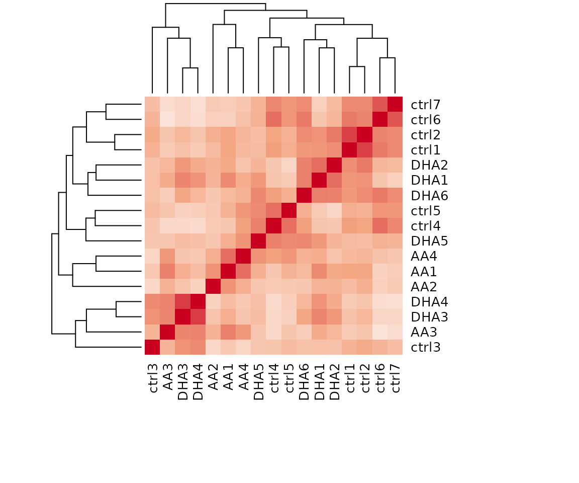
t-SNE plot
UMAP
UMAP (Uniform Manifold Approximation and Projection) using a nonlinear dimensionality reduction method, Manifold learning, which effectively visualizing clusters or groups of data points and their relative proximities. Both tSNE and UMAP are intended to predominantly preserve the local structure that is to group neighbouring data points which certainly delivers a very informative visualization of heterogeneity in the data. The significant difference with t-SNE is scalability, which allows UMAP eliminating the need for applying pre-processing step (such as PCA). Besides, UMAP applies Graph Laplacian for its initialization as tSNE by default implements random initialization. Thus, some people suggest that the key problem of tSNE is the Kullback-Leibler (KL) divergence, which makes UMAP superior over t-SNE. Nevertheless, UMAP’s cluster may not good enough for multi-class pattern classification (McInnes, Healy, and Melville 2018).
The type of distance metric to find nearest neighbors the size of the
local neighborhood (as for the number of neighboring sample points) are
set by parameter metric and n_neighbors.
Larger values lead to more global views of the manifold, while smaller
values result in more local data being preserved. Generally, values are
set in the range of 2 to 100. (default: 15).
# data processing
processed_se <- data_process(
    se, exclude_missing=TRUE, exclude_missing_pct=70,
    replace_na_method='min', replace_na_method_ref=0.5,
    normalization='Percentage')
# conduct UMAP
result_umap <- dr_umap(
    processed_se, n_neighbors=15, scaling=TRUE, umap_metric='euclidean',
    clustering='kmeans', cluster_num=2, kmedoids_metric=NULL,
    distfun=NULL, hclustfun=NULL, eps=NULL, minPts=NULL)

# result summary
summary(result_umap)
#>                  Length Class      Mode
#> umap_result      4      data.frame list
#> interactive_umap 8      plotly     list
#> static_umap      9      gg         list
# view result: UMAP plot
result_umap$static_umap
UMAP plot
Correlation heatmap
The correlation heatmap illustrates the correlation between samples
or lipid species and also depicts the patterns in each group. The
correlation is calculated by the method defined by parameter
corr_method, and the correlation coefficient is then
clustered depending on method defined by parameter distfun
and the distance defined by parameter hclustfun. Users can
choose to output the sample correlation or lipid correlation results by
the parameter type.
Please note that if the number of lipids or samples is over 50, the names of lipids/samples will not be shown on the heatmap.
Here, we use type='sample' as example.
# data processing
processed_se <- data_process(
    se, exclude_missing=TRUE, exclude_missing_pct=70,
    replace_na_method='min', replace_na_method_ref=0.5,
    normalization='Percentage')
# correlation calculation
result_heatmap <- heatmap_correlation(
    processed_se, char=NULL, transform='log10', correlation='pearson',
    distfun='maximum', hclustfun='average', type='sample')
# result summary
summary(result_heatmap)
#>                     Length Class              Mode
#> interactive_heatmap   1    IheatmapHorizontal S4
#> static_heatmap        3    recordedplot       list
#> corr_coef_matrix    289    -none-             numeric
# view result: sample-sample heatmap
result_heatmap$static_heatmap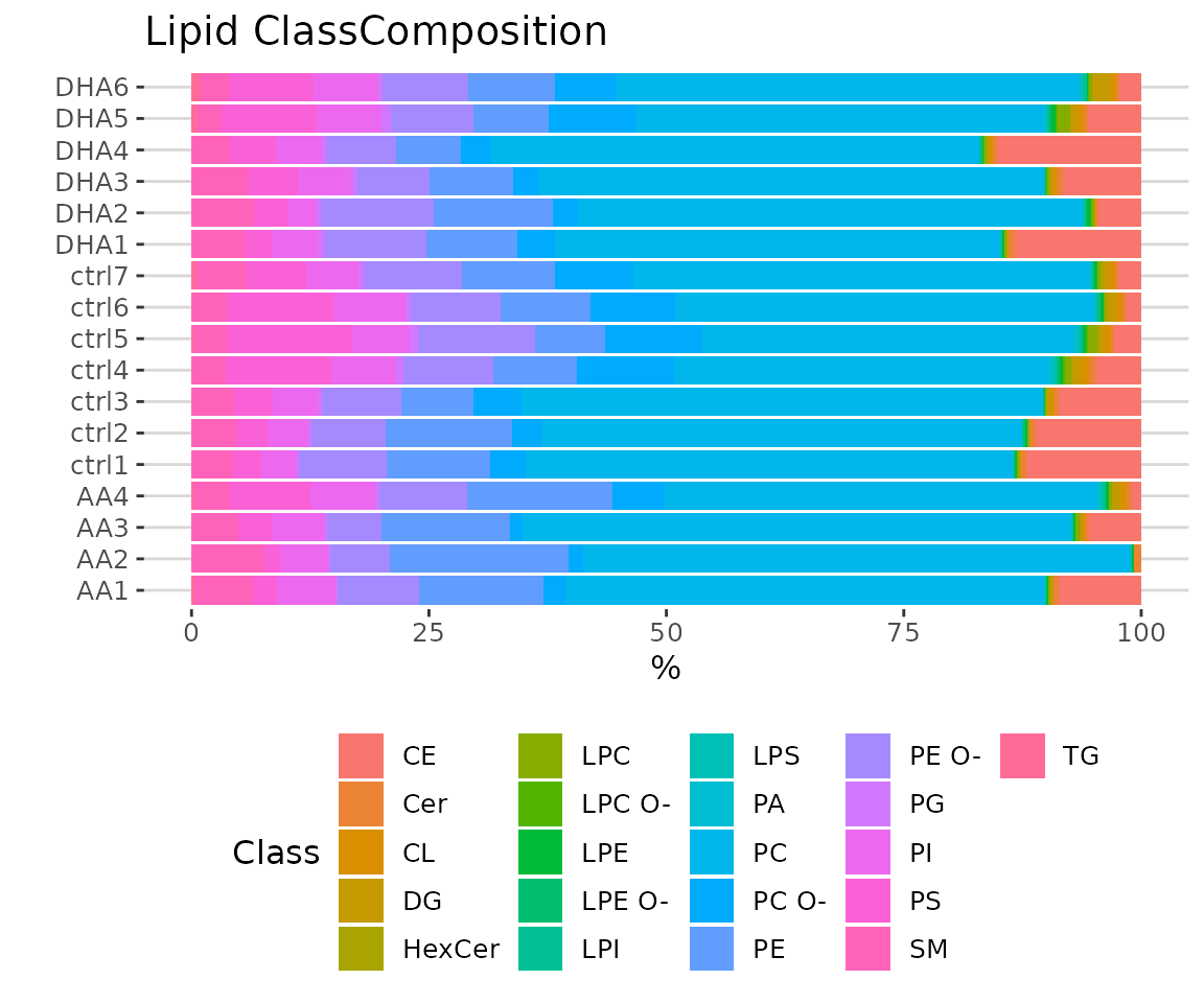
Heatmap of sample to sample correlations Correlations between lipid species are colored from strong positive correlations (red) to no correlation (white).
Lipid characteristics
Now, we are going to take a view of lipid expression over specific lipid characteristics. First, lipids are classified by characteristics selected from the ‘Lipid characteristics’ table. Here, we select “class” as the selected lipid characteristic. The results will be showed by two plots.
# data processing
processed_se <- data_process(
    se, exclude_missing=TRUE, exclude_missing_pct=70,
    replace_na_method='min', replace_na_method_ref=0.5,
    normalization='Percentage')
# lipid characteristic
list_lipid_char(processed_se)$common_list
#> There are 4 ratio characteristics that can be converted in your dataset.
#>            Lipid classification            Lipid classification
#>                      "Category"                    "Main.Class"
#>            Lipid classification            Lipid classification
#>                     "Sub.Class"                         "class"
#>           Fatty acid properties           Fatty acid properties
#>                            "FA"                          "FA.C"
#>           Fatty acid properties           Fatty acid properties
#>     "FA.Chain.Length.Category1"     "FA.Chain.Length.Category2"
#>           Fatty acid properties           Fatty acid properties
#>     "FA.Chain.Length.Category3"                         "FA.DB"
#>           Fatty acid properties           Fatty acid properties
#>                         "FA.OH"     "FA.Unsaturation.Category1"
#>           Fatty acid properties           Fatty acid properties
#>     "FA.Unsaturation.Category2"                       "Total.C"
#>           Fatty acid properties           Fatty acid properties
#>                      "Total.DB"                      "Total.FA"
#>           Fatty acid properties Physical or chemical properties
#>                      "Total.OH"             "Bilayer.Thickness"
#> Physical or chemical properties Physical or chemical properties
#>                     "Bond.type"              "Headgroup.Charge"
#> Physical or chemical properties Physical or chemical properties
#>           "Intrinsic.Curvature"             "Lateral.Diffusion"
#> Physical or chemical properties              Cellular component
#>        "Transition.Temperature"            "Cellular.Component"
#>                        Function
#>                      "Function"
# calculate lipid expression of selected characteristic
result_lipid <- lipid_profiling(processed_se, char="class")
#> There are 4 ratio characteristics that can be converted in your dataset.

# result summary
summary(result_lipid)
#>                               Length Class  Mode
#> interactive_char_barPlot      8      plotly list
#> interactive_lipid_composition 8      plotly list
#> static_char_barPlot           9      gg     list
#> static_lipid_composition      9      gg     list
#> table_char_barPlot            5      tbl_df list
#> table_lipid_composition       5      tbl_df list
# view result: bar plot
result_lipid$static_char_barPlot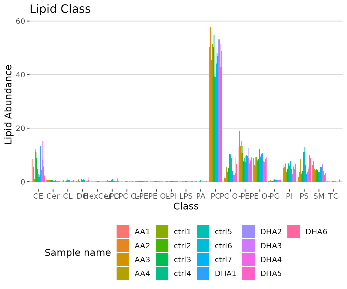
Bar plot classified by selected characteristic The bar plot depicts the abundance level of each sample within each group (e.g., PE, PC) of selected characteristics (e.g., class).
# view result: stacked horizontal bar chart
result_lipid$static_lipid_composition 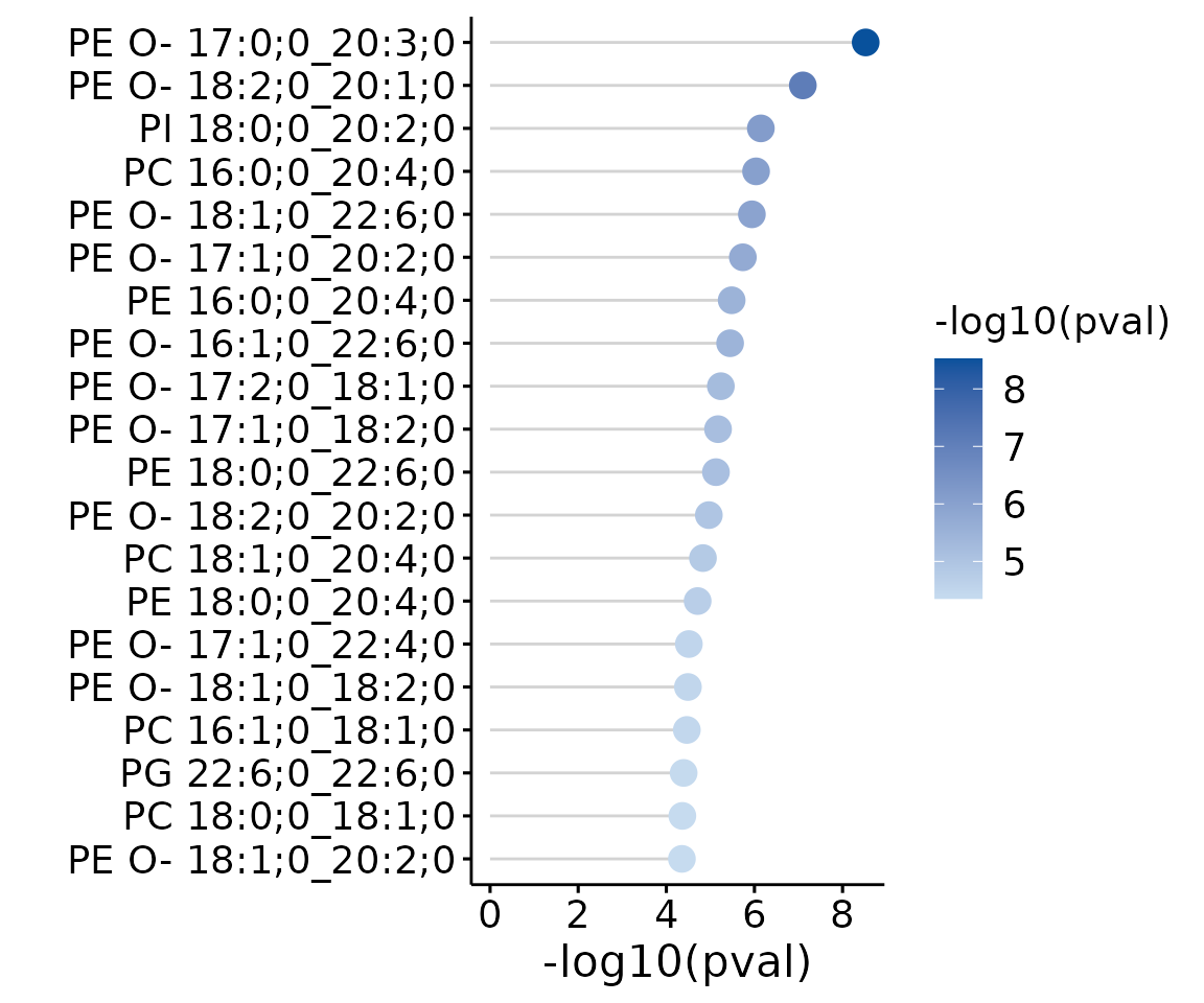
Lipid class composition The stacked horizontal bar chart illustrates the percentage of characteristics in each sample. The variability of percentage between samples can also be obtained from this plot.
Differential expression
After overviewing the lipid data, then we move on to differential expression to identify the significant lipid species and lipid characteristics. Differential Expression is divided into two main analyses, ‘Lipid species analysis’ and ‘Lipid characteristics analysis’. Further analysis and visualization methods can also be conducted based on the results of differential expressed analysis.
-
Lipid species analysis: The lipid species analysis explores the significant lipid species based on differentially expressed analysis. Data are analyzed based on each lipid species. Further analysis and visualization methods, include
- dimensionality reduction,
- hierarchical clustering,
- characteristics association.
-
Lipid characteristics analysis: The lipid characteristics analysis explores the significant lipid characteristics. Lipid species are categorized and summarized into a new lipid abundance table according to a selected lipid characteristic. The abundance of all lipid species of the same categories are summed up, then conduct differential expressed analysis. Further analysis and visualization methods include
- dimensionality reduction,
- hierarchical clustering,
- double bond-chain length analysis.
Lipid species analysis
Now, let’s start with the analysis of lipid species.
Differential expression analysis
For lipid species analysis section, differential expression analysis is performed to figure out significant lipid species. In short, samples will be divided into two groups (independent) according to the input “Group Information” table.
# data processing
processed_se <- data_process(
    se, exclude_missing=TRUE, exclude_missing_pct=70,
    replace_na_method='min', replace_na_method_ref=0.5,
    normalization='Percentage')
# conduct differential expression analysis of lipid species
deSp_se <- deSp_multiGroup(
    processed_se, ref_group='ctrl', test='One-way ANOVA',
    significant='pval', p_cutoff=0.05, transform='log10')
After running the above code, a SummarizedExperiment object
deSp_se will be returned containing the analysis results.
This object can be used as input for plotting and further analyses such
as dimensionality reduction, hierarchical clustering, characteristics association, and enrichment analysis.
deSp_se includes the input abundance data, lipid
characteristic table, group information table, analysis results, and
some some setting of input parameters. You can view the data in
deSp_se by
LipidSigR::extract_summarized_experiment.
# view differential expression analysis of lipid species
deSp_result <- extract_summarized_experiment(deSp_se)
# result summary
summary(deSp_result)
#>                     Length Class      Mode
#> abundance           18     data.frame list
#> lipid_char_table    72     data.frame list
#> group_info           4     data.frame list
#> all_deSp_result     15     data.frame list
#> sig_deSp_result     15     data.frame list
#> processed_abundance 18     data.frame list
#> significant          1     -none-     character
#> p_cutoff             1     -none-     numeric
#> transform            1     -none-     character
The differential expression analysis result can be input for plotting lollipop plots and dot plots. (Note: Only static plots are displayed here.)
# plot differential expression analysis result
deSp_plot <- plot_deSp_multiGroup(deSp_se)

# result summary
summary(deSp_plot)
#>                      Length Class      Mode
#> static_de_lipid       9     gg         list
#> static_dotPlot       10     gg         list
#> interactive_de_lipid  8     plotly     list
#> interactive_dotPlot   8     plotly     list
#> table_de_lipid       16     data.frame list
#> table_dotPlot        89     data.frame list
# view result: lollipop chart
deSp_plot$static_de_lipid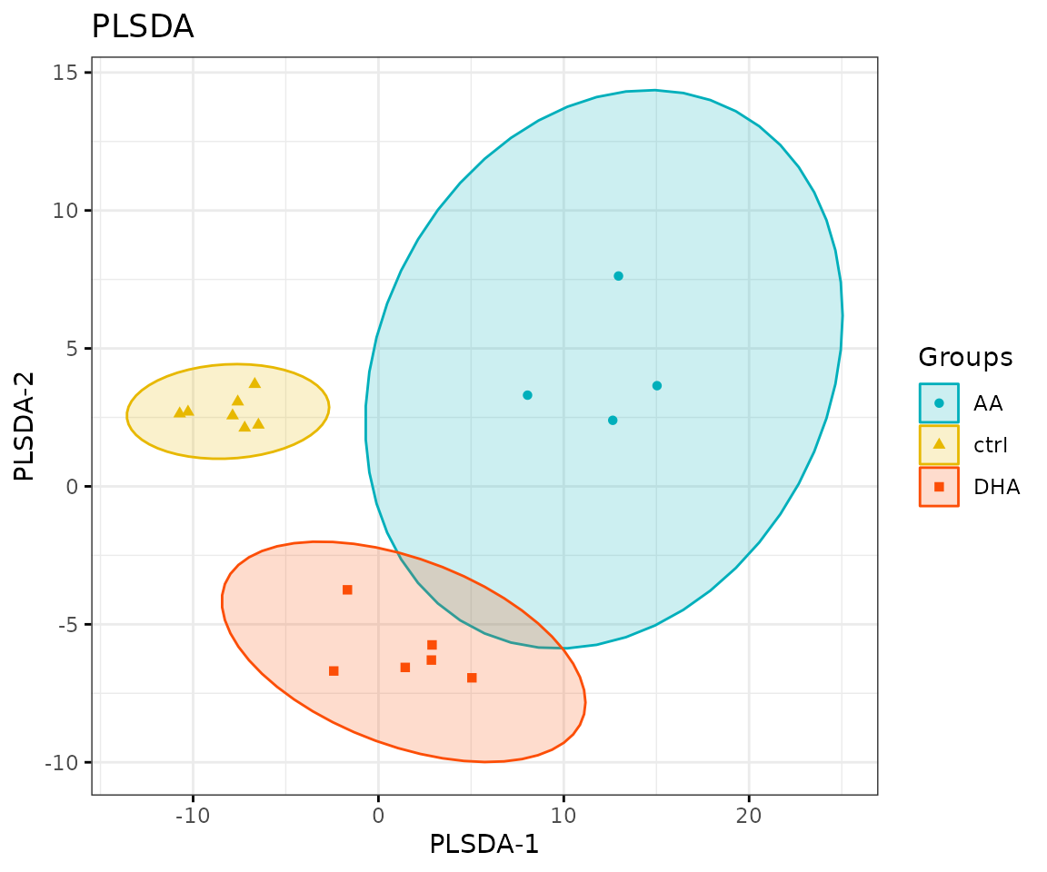
Lollipop chart of lipid species analysis The
lollipop chart reveals the lipid species that pass chosen cut-offs. The
x-axis shows log2 fold change while the y-axis is a list of lipids
species. The color of the point is determined by
-log10(adj_value/p-value).
# view result: MA plot
deSp_plot$static_dotPlot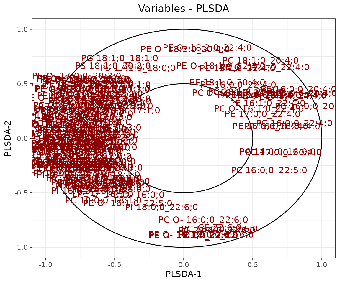
Dot plot
You can further plot an abundance box plot for any lipid species of
interest by LipidSigR::boxPlot_feature_multiGroup.
For example, let’s use PE O- 17:0;0_20:3;0, a
significant lipid species from the lollipop above.
# plot abundance box plot of 'PE O- 17:0;0_20:3;0'
boxPlot_result <- boxPlot_feature_multiGroup(
    processed_se, feature='PE O- 17:0;0_20:3;0', ref_group='ctrl',
    test='One-way ANOVA', post_hoc_sig='padj', transform='log10')
# result summary
summary(boxPlot_result)
#>                Length Class      Mode
#> static_boxPlot 9      gg         list
#> table_boxplot  6      data.frame list
#> table_stat     7      data.frame list

# view result: static box plot
boxPlot_result$static_boxPlot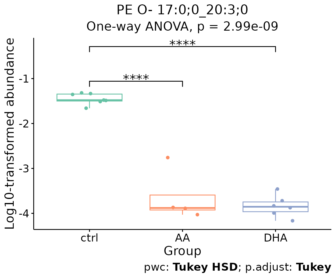
Box plot of lipid abundance An asterisk sign indicates significant differences between groups. The absence of an asterisk or line denotes a non-significant difference between groups.
Dimension reduction
Dimension reduction is common when dealing with large numbers of observations and/or large numbers of variables in lipids analysis. It transforms data from a high-dimensional space into a low-dimensional space to retain vital properties of the original data and close to its intrinsic dimension.
Here, we provide four dimension reduction methods: in addition to the previously introduced PCA, t-SNE, and UMAP (details in Section PCA, t-SNE, UMAP), we include PLS-DA.
- Note: The input data of this section is the output data of
deSp_multiGroup.
PCA, t-SNE, UMAP
Previous sections introduced details of PCA (Principal Component Analysis), t-SNE (t-distributed stochastic neighbor embedding), and UMAP (Uniform Manifold Approximation and Projection) (please refer to Section PCA, t-SNE, UMAP).
The only difference in running the functions is that the input data
changes from processed_se to deSp_se (output
from lipid species analysis).
Here, we use PCA as an example.
# conduct PCA
result_pca <- dr_pca(
    deSp_se, scaling=TRUE, centering=TRUE, clustering='kmeans',
    cluster_num=2, kmedoids_metric=NULL, distfun=NULL, hclustfun=NULL,
    eps=NULL, minPts=NULL, feature_contrib_pc=c(1,2), plot_topN=10)

# result summary
summary(result_pca)
#>                                  Length Class      Mode
#> pca_rotated_data                 19     data.frame list
#> table_pca_contribution           18     data.frame list
#> interactive_pca                   8     plotly     list
#> interactive_screePlot             8     plotly     list
#> interactive_feature_contribution  8     plotly     list
#> interactive_variablePlot          8     plotly     list
#> static_pca                        9     gg         list
#> static_screePlot                  9     gg         list
#> static_feature_contribution       9     gg         list
#> static_variablePlot               9     gg         list
PLS-DA
The input data is the output data of deSp_multiGroup
from lipid species analysis.
# conduct PLSDA
result_plsda <- dr_plsda(
  deSp_se, ncomp=2, scaling=TRUE, clustering='group_info', cluster_num=2,
  kmedoids_metric=NULL, distfun=NULL, hclustfun=NULL, eps=NULL, minPts=NULL)

# result summary
summary(result_plsda)
#>                         Length Class      Mode
#> plsda_result            4      data.frame list
#> table_plsda_loading     2      data.frame list
#> interacitve_plsda       8      plotly     list
#> interactive_loadingPlot 8      plotly     list
#> static_plsda            9      gg         list
#> static_loadingPlot      9      gg         list
# view result: PLS-DA plot
result_plsda$static_plsda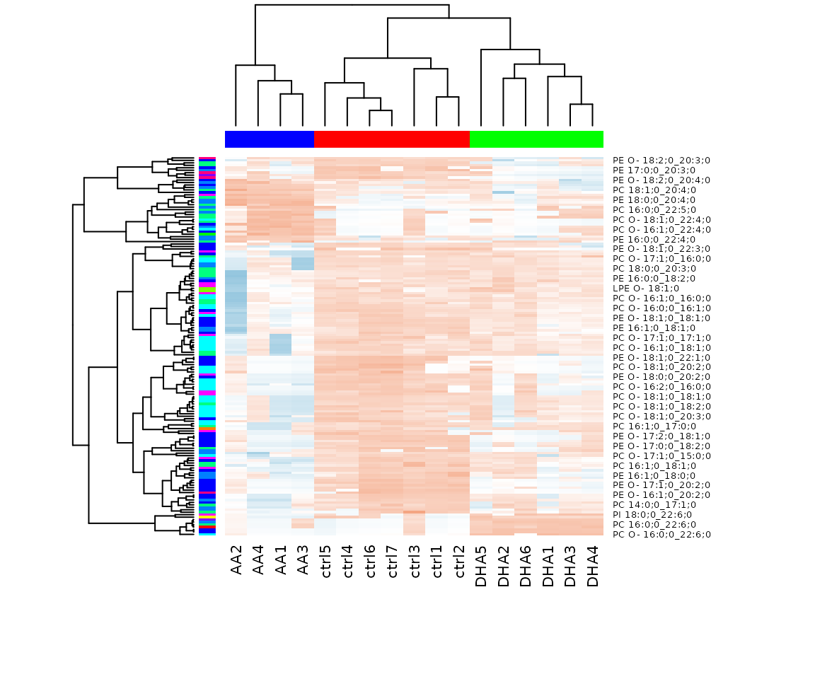
PLS-DA plot
# view result: PLS-DA loading plot
result_plsda$static_loadingPlot 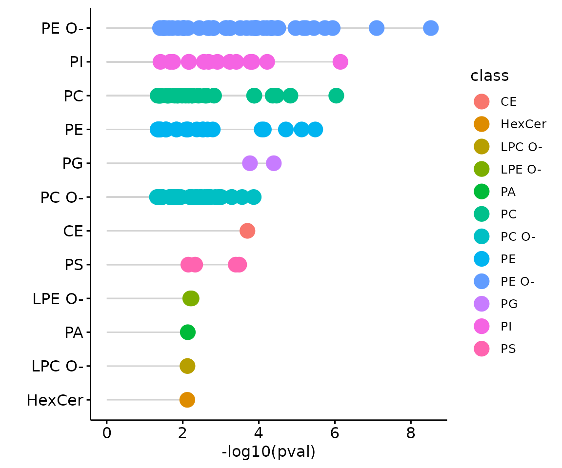
Loading plot In the PLS-DA loading plot, the distance to the center of the variables indicates the contribution of the variable. The value of the x-axis reveals the contribution of the variable to PLS-DA-1, whereas the value of the y-axis discloses the contribution of the variable to PLS-DA-2.
Hierarchical clustering
Based on the results of differential expression analysis, we further
take a look at differences of lipid species between the control group
and the experimental group. Lipid species derived from two groups are
clustered and visualized on heatmap by hierarchical clustering. Users
can choose to output the results of all lipid species or only
significant lipid species by the parameter type.
The top of the heatmap is grouped by sample group (top annotation)
while the side of the heatmap (row annotation) can be chosen from
lipid_char_table, such as class, structural category,
functional category, total length, total double bond (Total.DB),
hydroxyl group number (Total.OH), the double bond of fatty acid(FA.DB),
hydroxyl group number of fatty acid(FA.OH).
# get lipid characteristics
list_lipid_char(processed_se)$common_list
#> There are 4 ratio characteristics that can be converted in your dataset.
#>            Lipid classification            Lipid classification
#>                      "Category"                    "Main.Class"
#>            Lipid classification            Lipid classification
#>                     "Sub.Class"                         "class"
#>           Fatty acid properties           Fatty acid properties
#>                            "FA"                          "FA.C"
#>           Fatty acid properties           Fatty acid properties
#>     "FA.Chain.Length.Category1"     "FA.Chain.Length.Category2"
#>           Fatty acid properties           Fatty acid properties
#>     "FA.Chain.Length.Category3"                         "FA.DB"
#>           Fatty acid properties           Fatty acid properties
#>                         "FA.OH"     "FA.Unsaturation.Category1"
#>           Fatty acid properties           Fatty acid properties
#>     "FA.Unsaturation.Category2"                       "Total.C"
#>           Fatty acid properties           Fatty acid properties
#>                      "Total.DB"                      "Total.FA"
#>           Fatty acid properties Physical or chemical properties
#>                      "Total.OH"             "Bilayer.Thickness"
#> Physical or chemical properties Physical or chemical properties
#>                     "Bond.type"              "Headgroup.Charge"
#> Physical or chemical properties Physical or chemical properties
#>           "Intrinsic.Curvature"             "Lateral.Diffusion"
#> Physical or chemical properties              Cellular component
#>        "Transition.Temperature"            "Cellular.Component"
#>                        Function
#>                      "Function"
# conduct hierarchical clustering
result_hcluster <- heatmap_clustering(
    de_se=deSp_se, char='class', distfun='pearson',
    hclustfun='complete', type='sig')

# result summary
summary(result_hcluster)
#>                     Length Class              Mode
#> interactive_heatmap    1   IheatmapHorizontal S4
#> static_heatmap         3   recordedplot       list
#> corr_coef_matrix    2618   -none-             numeric
# view result: heatmap of significant lipid species
result_hcluster$static_heatmap
Heatmap of significant lipid species The difference between the two groups by observing the distribution of lipid species.
Characteristics analysis
The characteristics analysis visualizes the difference between
control and experimental groups of significant lipid species categorized
based on different lipid characteristics from
lipid_char_table, such as class, structural category,
functional category, total length, total double bond (Total.DB),
hydroxyl group number (Total.OH), the double bond of fatty acid(FA.DB),
hydroxyl group number of fatty acid(FA.OH).
# get lipid characteristics
list_lipid_char(processed_se)$common_list
#> There are 4 ratio characteristics that can be converted in your dataset.
#>            Lipid classification            Lipid classification
#>                      "Category"                    "Main.Class"
#>            Lipid classification            Lipid classification
#>                     "Sub.Class"                         "class"
#>           Fatty acid properties           Fatty acid properties
#>                            "FA"                          "FA.C"
#>           Fatty acid properties           Fatty acid properties
#>     "FA.Chain.Length.Category1"     "FA.Chain.Length.Category2"
#>           Fatty acid properties           Fatty acid properties
#>     "FA.Chain.Length.Category3"                         "FA.DB"
#>           Fatty acid properties           Fatty acid properties
#>                         "FA.OH"     "FA.Unsaturation.Category1"
#>           Fatty acid properties           Fatty acid properties
#>     "FA.Unsaturation.Category2"                       "Total.C"
#>           Fatty acid properties           Fatty acid properties
#>                      "Total.DB"                      "Total.FA"
#>           Fatty acid properties Physical or chemical properties
#>                      "Total.OH"             "Bilayer.Thickness"
#> Physical or chemical properties Physical or chemical properties
#>                     "Bond.type"              "Headgroup.Charge"
#> Physical or chemical properties Physical or chemical properties
#>           "Intrinsic.Curvature"             "Lateral.Diffusion"
#> Physical or chemical properties              Cellular component
#>        "Transition.Temperature"            "Cellular.Component"
#>                        Function
#>                      "Function"
# conduct characteristic analysis
result_char <- char_association(deSp_se, char='class')

# result summary
summary(result_char)
#>                       Length Class        Mode
#> interactive_barPlot   1      -none-       character
#> interacitve_lollipop  8      plotly       list
#> interactive_wordCloud 8      hwordcloud   list
#> static_barPlot        1      -none-       character
#> static_lollipop       9      gg           list
#> static_wordCloud      3      recordedplot list
#> table_barPlot         1      -none-       character
#> table_lollipop        9      tbl_df       list
#> table_wordCloud       2      tbl_df       list
# view result: lollipop plot
result_char$static_lollipop
The lollipop chart of all significant groups The lollipop chart compares multiple values simultaneously and it aligns the log2(fold change) of all significant groups (values) within the selected characteristics.
# view result: word cloud
result_char$static_wordCloud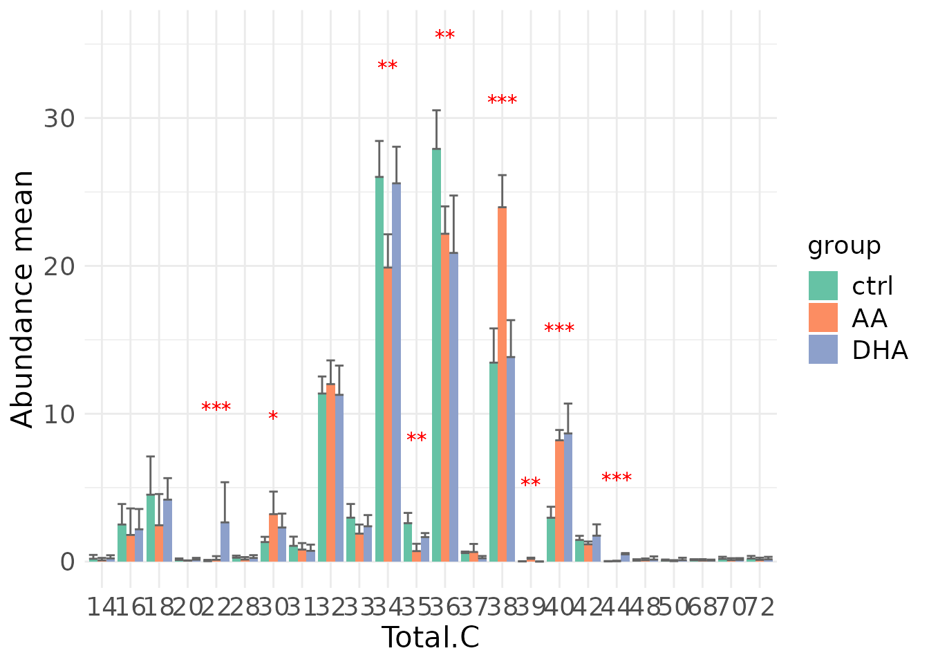
Word cloud with the count of each group The word cloud shows the count of each group(value) of the selected characteristics.
Lipid characteristics analysis
After lipid species analysis, now let’s move on to another main analysis of the Differential expression section – ‘Lipid Characteristics Analysis’. The massive degree of structural diversity of lipids contributes to the functional variety of lipids. The characteristics can range from subtle variance (i.e. the number of a double bond in the fatty acid) to major change (i.e. diverse backbones). In this section, lipid species are categorized and summarized into a new lipid abundance table according to two selected lipid characteristics, then conducted differential expressed analysis. Samples are divided into two groups based on the input ‘Group Information’ table.
Differentially expressed analysis
In differentially expressed analysis, we are going to conduct two procedures of analysis - first is ‘Characteristics’ and then ‘Subgroup of characteristics’.
‘Characteristics’ is based on the first selected
‘characteristics’ while ‘Subgroup of characteristics’
is the subgroup analysis of the previous section. Analyses will be
performed based on parameter char and subChar
selected by users.
Before we begin, let’s calculate the two-way ANOVA and review the results for all lipid characteristics.
# data processing
processed_se <- data_process(
    se, exclude_missing=TRUE, exclude_missing_pct=70,
    replace_na_method='min', replace_na_method_ref=0.5,
    normalization='Percentage')
# two way anova
twoWayAnova_table <- char_2wayAnova(
  processed_se, ratio_transform='log2', char_transform='log10')
#> There are 4 ratio characteristics that can be converted in your dataset.
# view result table
head(twoWayAnova_table[, 1:4], 5)
#>                  aspect characteristic fval_2factors pval_2factors
#> 1  Lipid classification          class     1.1223282  2.909275e-01
#> 2  Lipid classification       Category     0.8479604  5.386405e-01
#> 3  Lipid classification     Main.Class     0.6906394  8.678680e-01
#> 4  Lipid classification      Sub.Class     0.6763720  9.147063e-01
#> 5 Fatty acid properties       Total.FA     2.6413587  3.389689e-22
From the table returned by LipidSigR::char_2wayAnova, we
have to selected the lipid characteristics of interest as
char and subChar for
LipidSigR::deChar_twoGroup and
LipidSigR::subChar_twoGroup.
Here, we use Total.C as an example.
# data processing
processed_se <- data_process(
    se, exclude_missing=TRUE, exclude_missing_pct=70,
    replace_na_method='min', replace_na_method_ref=0.5,
    normalization='Percentage')
# conduct differential expression of lipid characteristics
deChar_se <- deChar_multiGroup(
    processed_se, char='Total.C', ref_group='ctrl', post_hoc='One-way ANOVA',
    post_hoc_sig='pval', post_hoc_p_cutoff=0.05, transform='log10')
#> There are 4 ratio characteristics that can be converted in your dataset.
After running the above code, a SummarizedExperiment object
deChar_se will be returned containing the analysis results.
This object can be used as input for plotting and further analyses such
as dimension reduction, and hierarchical clustering.
deChar_se includes the input abundance data, lipid
characteristic table, group information table, analysis results, and
some some setting of input parameters. You can view the data in
deChar_se by
LipidSigR::extract_summarized_experiment.
# view differential expression of lipid characteristics
deChar_result <- extract_summarized_experiment(deChar_se)
# result summary
summary(deChar_result)
#>                     Length Class      Mode
#> abundance           18     data.frame list
#> lipid_char_table     2     data.frame list
#> group_info           4     data.frame list
#> all_deChar_result   23     grouped_df list
#> sig_deChar_result   23     grouped_df list
#> processed_abundance 18     data.frame list
#> char                 1     -none-     character
#> post_hoc_sig         1     -none-     character
#> post_hoc_p_cutoff    1     -none-     numeric
The differential expression analysis result can be input for plotting result plots. (Note: Only static plots are displayed here.)
# plot differential expression analysis results
deChar_plot <- plot_deChar_multiGroup(deChar_se)
# result summary
summary(deChar_plot)
#>                           Length Class      Mode
#> static_barPlot             9     gg         list
#> static_barPlot_sqrt        9     gg         list
#> static_linePlot            9     gg         list
#> static_linePlot_sqrt       9     gg         list
#> static_boxPlot             9     gg         list
#> interactive_barPlot        8     plotly     list
#> interactive_barPlot_sqrt   8     plotly     list
#> interactive_linePlot       8     plotly     list
#> interactive_linePlot_sqrt  8     plotly     list
#> table_barPlot             11     tbl_df     list
#> table_linePlot            11     tbl_df     list
#> table_boxPlot              6     data.frame list
#> table_char_index          18     data.frame list
#> table_index_stat          13     grouped_df list
The results of ‘Characteristics’ analysis in the first section
# view result: bar plot of selected `char`
deChar_plot$static_barPlot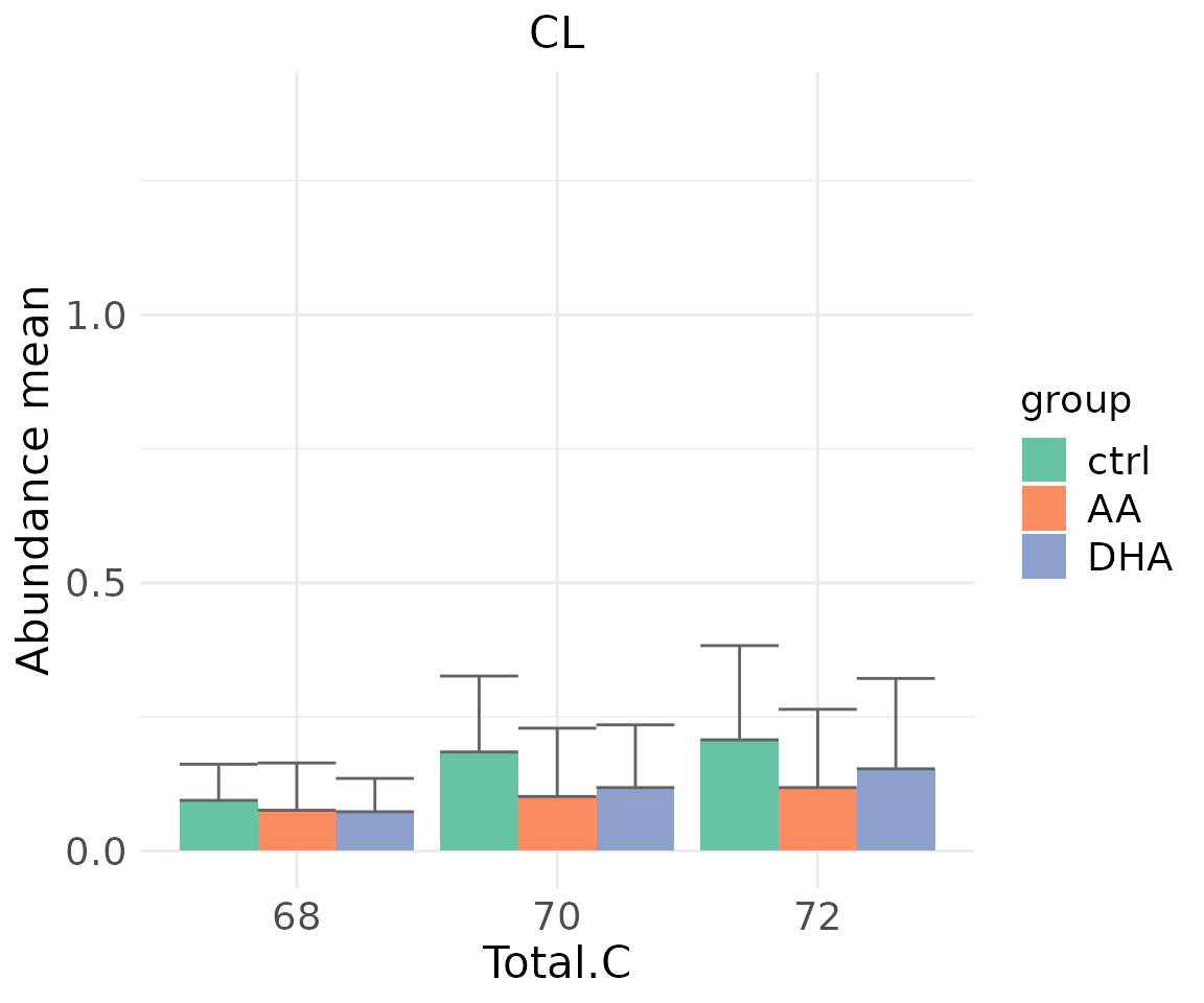
# view result: sqrt-scaled bar plot of selected `char`
deChar_plot$static_barPlot_sqrt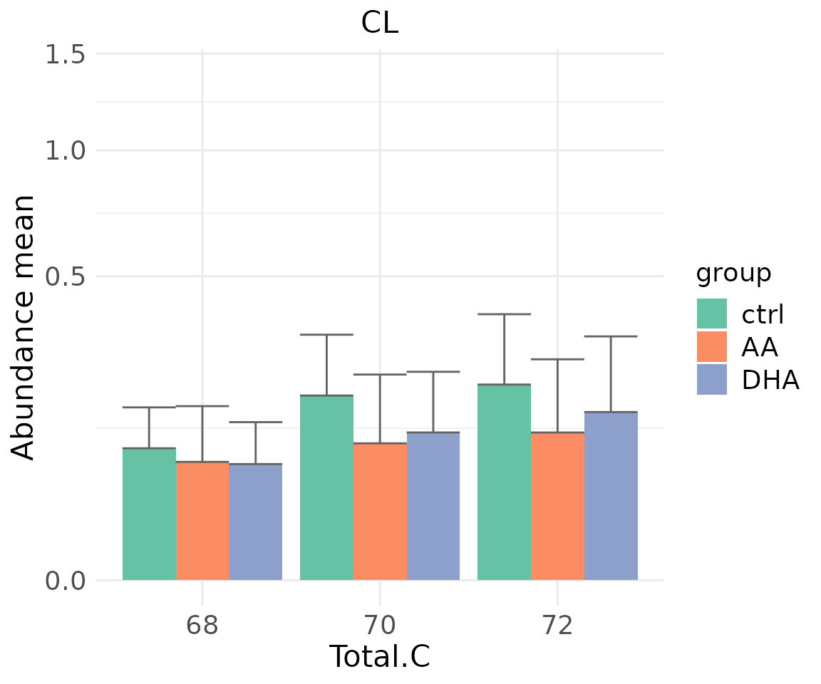
# view result: line plot of `selected char`
deChar_plot$static_linePlot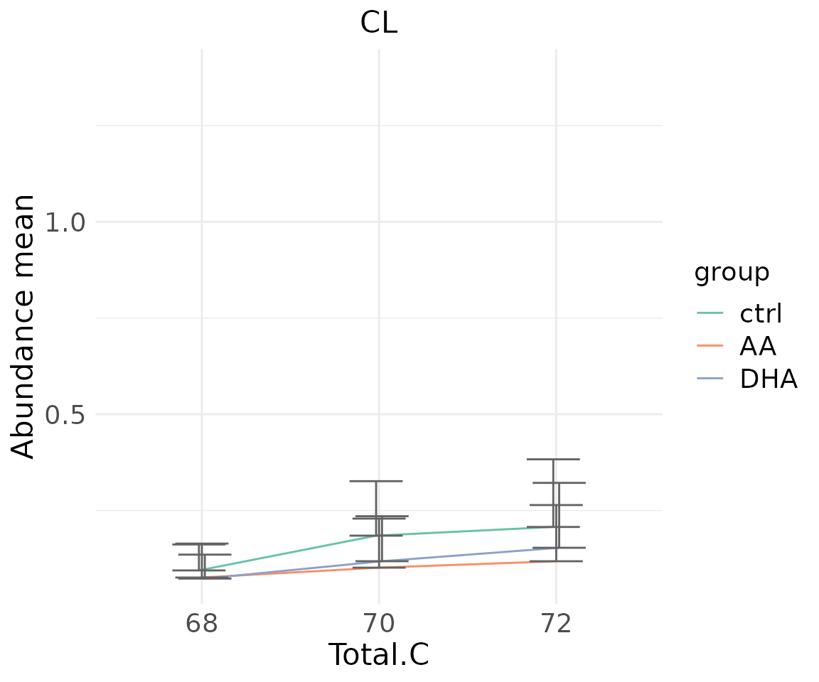
# view result: sqrt-scaled line plot of selected `char`
deChar_plot$static_linePlot_sqrt 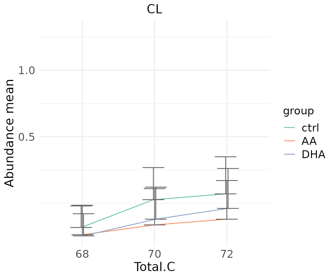
# view result: box plot of selected `char`
deChar_plot$static_boxPlot 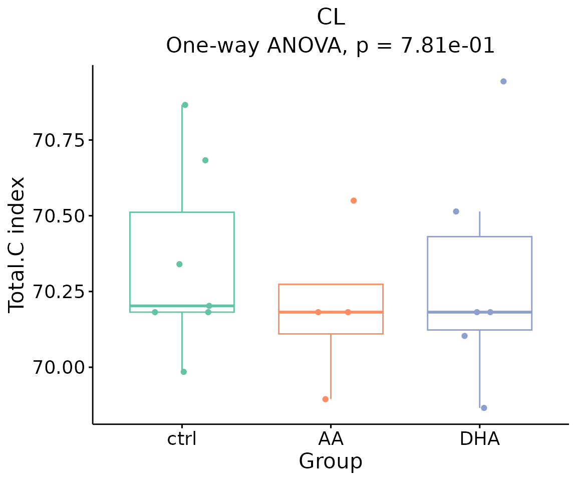
In the ‘Subgroup of characteristics’, besides the
selected characteristic in first section defined by parameter
char, we can further choose another characteristic by
parameter subChar. The two chosen characteristics,
char and subCharshould be either both
continuous data or one continuous and one categorical data.
- NOTE: You can use
LipidSigR::list_lipid_charto get all the selectable lipid characteristics. Please readvignette("1_tool_function").
# data processing
processed_se <- data_process(
    se, exclude_missing=TRUE, exclude_missing_pct=70,
    replace_na_method='min', replace_na_method_ref=0.5,
    normalization='Percentage')
# subgroup differential expression of lipid characteristics
subChar_se <- subChar_multiGroup(
    processed_se, char='Total.C', subChar='class', ref_group='ctrl',
    post_hoc='One-way ANOVA', post_hoc_sig='pval', post_hoc_p_cutoff=0.05,
    transform='log10')
#> There are 4 ratio characteristics that can be converted in your dataset.
After running the code, the returned subChar_se
contained the input abundance data, lipid characteristic table, group
information table, analysis results, and some some setting of input
parameters. You can view the data in subChar_se by
LipidSigR::extract_summarized_experiment.
# view differential expression of lipid characteristics
subChar_result <- extract_summarized_experiment(subChar_se)
# result summary
summary(subChar_result)
#>                     Length Class      Mode
#> abundance           18     data.frame list
#> lipid_char_table     5     data.frame list
#> group_info           4     data.frame list
#> all_deChar_result   25     tbl_df     list
#> sig_deChar_result   25     tbl_df     list
#> processed_abundance 18     tbl_df     list
#> char                 1     -none-     character
#> subChar              1     -none-     character
#> post_hoc_sig         1     -none-     character
#> post_hoc_p_cutoff    1     -none-     numeric
You can also plot the results of a specific feature within the
subChar. For example, if you select “class” as
subChar, you can choose “Cer” within the ‘class’ feature by
parameter subChar_feature for plotting result plots.
(Note: Only static plots are displayed here.)
# get subChar_feature list
subChar_feature_list <- unique(
    extract_summarized_experiment(subChar_se)$all_deChar_result$sub_feature)
# visualize subgroup differential expression of lipid characteristics
subChar_plot <- plot_subChar_multiGroup(subChar_se, subChar_feature='CL')

# result summary
summary(subChar_plot)
#>                           Length Class      Mode
#> static_barPlot             9     gg         list
#> static_barPlot_sqrt        9     gg         list
#> static_linePlot            9     gg         list
#> static_linePlot_sqrt       9     gg         list
#> static_boxPlot             9     gg         list
#> interactive_barPlot        8     plotly     list
#> interactive_barPlot_sqrt   8     plotly     list
#> interactive_linePlot       8     plotly     list
#> interactive_linePlot_sqrt  8     plotly     list
#> table_barPlot             11     tbl_df     list
#> table_linePlot            11     tbl_df     list
#> table_boxPlot              6     data.frame list
#> table_char_index          18     data.frame list
#> table_index_stat          13     grouped_df list
The results of ‘Subgroup of characteristics’ analysis in the second section
- Note: The star above the bar shows the significant difference of the specific subgroup of the selected characteristic between control and experimental groups.
# view result: bar plot of `subChar_feature`
subChar_plot$static_barPlot 
# view result: sqrt-scaled bar plot of `subChar_feature`
subChar_plot$static_barPlot_sqrt 
# view result: line plot of `subChar_feature`
subChar_plot$static_linePlot 
# view result: sqrt-scaled line plot of `subChar_feature`
subChar_plot$static_linePlot_sqrt 
# view result: box plot of `subChar_feature`
subChar_plot$static_boxPlot 
Dimension reduction
Dimension reduction is common when dealing with large numbers of observations and/or large numbers of variables in lipids analysis. It transforms data from a high-dimensional space into a low-dimensional space to retain vital properties of the original data and close to its intrinsic dimension.
Here, we provide 4 dimension reduction methods: PCA, t-SNE, UMAP, and PLS-DA.
The execution of all the functions respectively introduced in Section Section PCA, t-SNE, UMAP, and PLSDA. Links to there for more details manipulation.
The only difference is that the input data should be
deChar_se (output from lipid
characterisitcs analysis).
For example:
# conduct PLSDA
result_plsda <- dr_plsda(
  deChar_se, ncomp=2, scaling=TRUE, clustering='group_info', cluster_num=2,
  kmedoids_metric=NULL, distfun=NULL, hclustfun=NULL, eps=NULL, minPts=NULL)

# result summary
summary(result_plsda)
#>                         Length Class      Mode
#> plsda_result            4      data.frame list
#> table_plsda_loading     2      data.frame list
#> interacitve_plsda       8      plotly     list
#> interactive_loadingPlot 8      plotly     list
#> static_plsda            9      gg         list
#> static_loadingPlot      9      gg         list
Hierarchical clustering
Hierarchical clustering can also be conducted based on the differential expression analysis results of lipid characteristics. It visualizes the differences of lipid characteristics between the control group and the experimental group.
- NOTE: The
charparameter should match the input used in thedeChar_multiGroupfrom lipid characteristics analysis
# conduct hierarchical clustering
result_hcluster <- heatmap_clustering(
    de_se=deChar_se, char='Total.C', distfun='pearson',
    hclustfun='complete', type='all')
#> char Total.C has been selected in upstream function.

# result summary
summary(result_hcluster)
#>                     Length Class              Mode
#> interactive_heatmap   1    IheatmapHorizontal S4
#> static_heatmap        3    recordedplot       list
#> corr_coef_matrix    408    -none-             numeric
# view result: heatmap of significant lipid species
result_hcluster$static_heatmap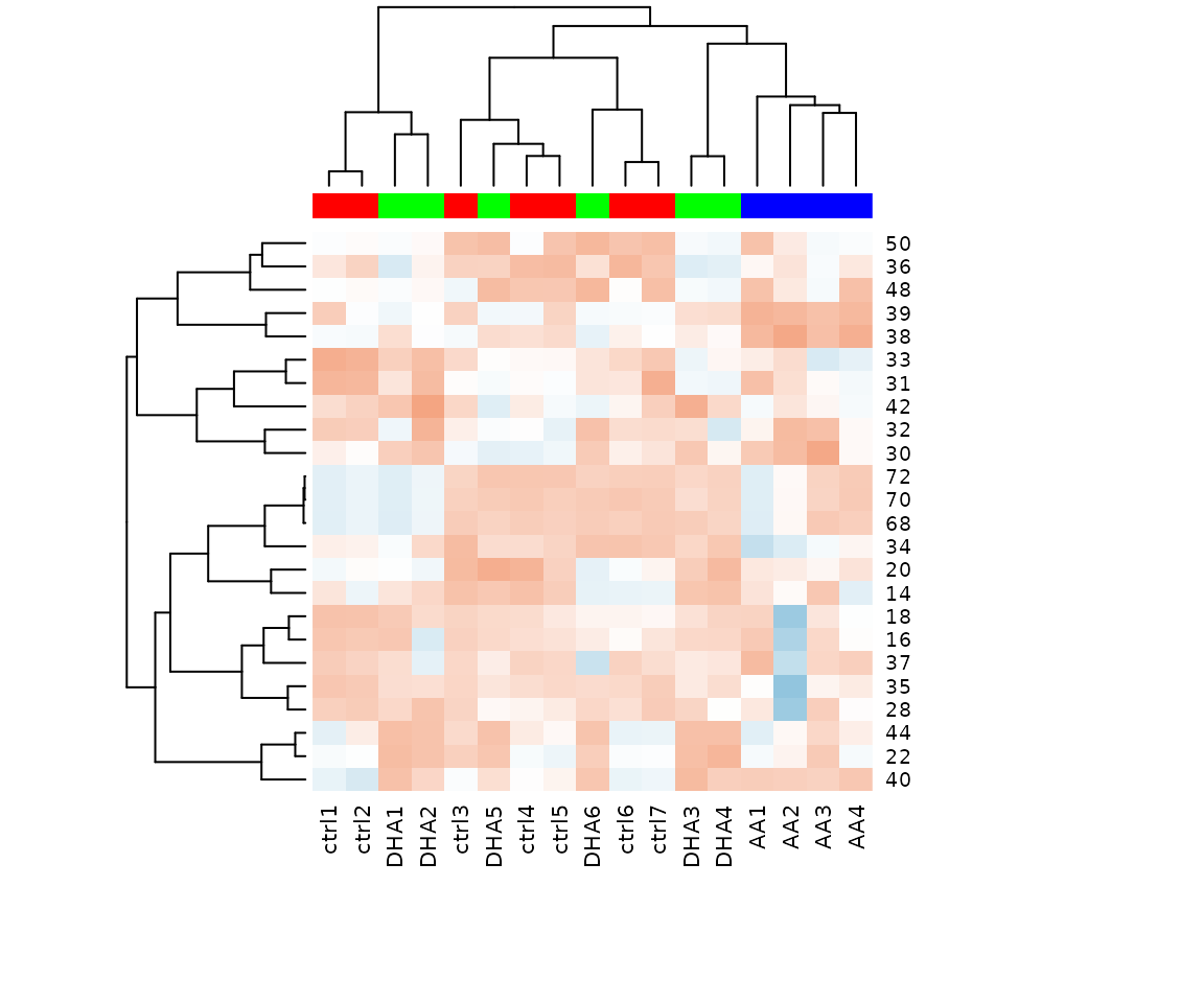
Heatmap of significant lipid species The difference between the two groups by observing the distribution of lipid species.
Double bond-chain length analysis
This section provides heatmaps that illustrates the correlation between the double bond and chain length of lipid species. The color in the heatmaps is gradient according to log2FC.
The correlation is visually represented by cell colors—red indicates a positive correlation, while blue indicates a negative. Significant correlations are highlighted with an asterisk sign on the plot.
# data processing
processed_se <- data_process(
    se, exclude_missing=TRUE, exclude_missing_pct=70,
    replace_na_method='min', replace_na_method_ref=0.5,
    normalization='Percentage')
# get lipid characteristics
list_lipid_char(processed_se)$chain_db_list
#> There are 4 ratio characteristics that can be converted in your dataset.
#>            Lipid classification            Lipid classification
#>                      "Category"                    "Main.Class"
#>            Lipid classification            Lipid classification
#>                     "Sub.Class"                         "class"
#> Physical or chemical properties Physical or chemical properties
#>             "Bilayer.Thickness"                     "Bond.type"
#> Physical or chemical properties Physical or chemical properties
#>              "Headgroup.Charge"           "Intrinsic.Curvature"
#> Physical or chemical properties Physical or chemical properties
#>             "Lateral.Diffusion"        "Transition.Temperature"
#>              Cellular component                        Function
#>            "Cellular.Component"                      "Function"
# conduct double bond-chain length analysis (without setting `char_feature`)
heatmap_all <- heatmap_chain_db(
    processed_se, char='class', char_feature=NULL,
    ref_group='ctrl', test='One-way ANOVA', significant='pval',
    p_cutoff=0.05, FC_cutoff=NULL, transform='log10')

# result summary
summary(heatmap_all)
#>             Length Class  Mode
#> total_chain 5      -none- list
#> each_chain  5      -none- list
# summary of total chain result
summary(heatmap_all$total_chain)
#>                       Length Class                Mode
#> static_heatmap         9     gg                   list
#> table_heatmap         21     data.frame           list
#> processed_abundance   18     data.frame           list
#> transformed_abundance 18     data.frame           list
#> chain_db_se           77     SummarizedExperiment S4
# view result: heatmap of total chain
heatmap_all$total_chain$static_heatmap
# summary of each chain result
summary(heatmap_all$each_chain)
#>                       Length Class                Mode
#> static_heatmap         9     gg                   list
#> table_heatmap         21     data.frame           list
#> processed_abundance   18     data.frame           list
#> transformed_abundance 18     data.frame           list
#> chain_db_se           31     SummarizedExperiment S4
# view result: heatmap of each chain
heatmap_all$each_chain$static_heatmap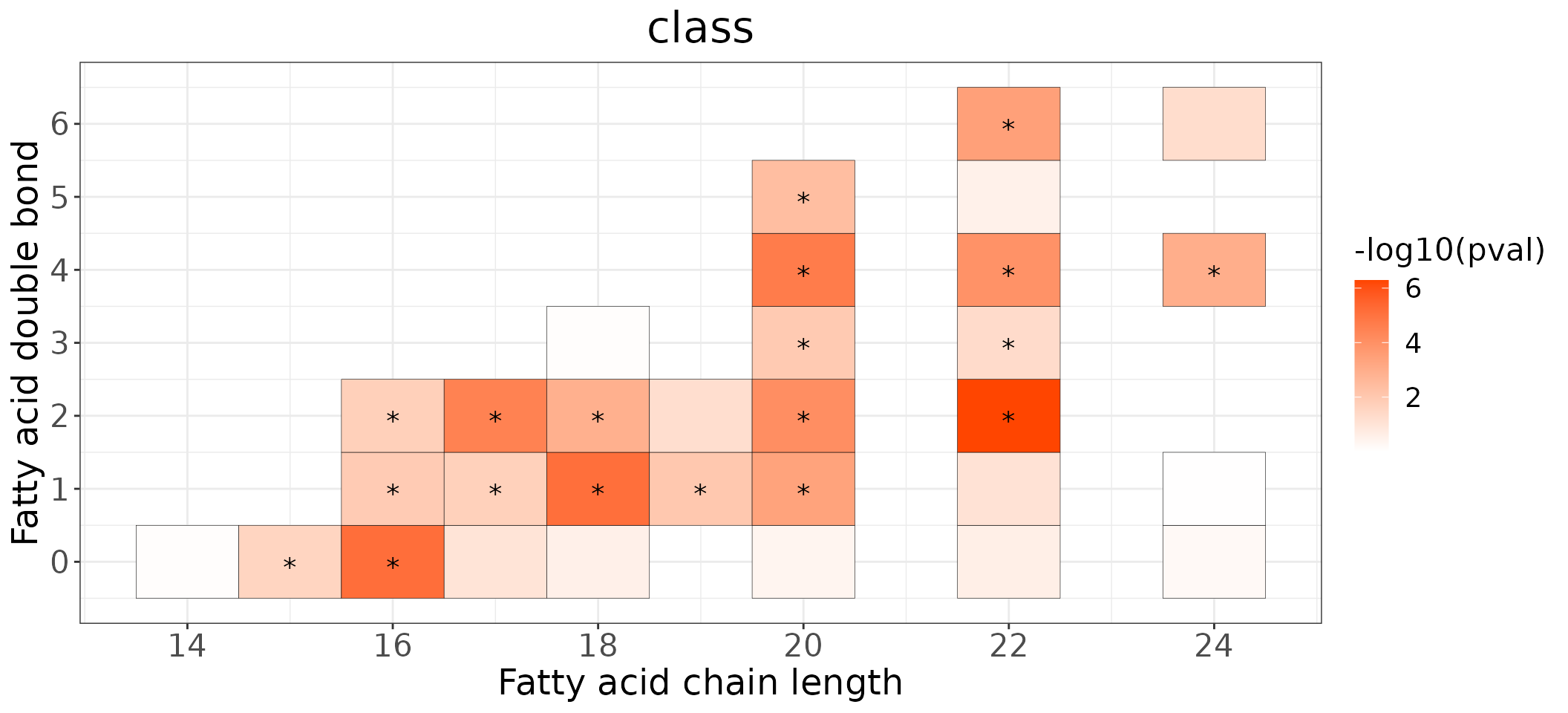
# conduct double bond-chain length analysis (a specific `char_feature`)
heatmap_one <- heatmap_chain_db(
    processed_se, char='class', char_feature='PC', ref_group='ctrl',
    test='One-way ANOVA', significant='pval', p_cutoff=0.05,
    FC_cutoff=NULL, transform='log10')

# result summary
summary(heatmap_one)
#>             Length Class  Mode
#> total_chain 5      -none- list
#> each_chain  5      -none- list
# summary of total chain result
summary(heatmap_one$total_chain)
#>                       Length Class                Mode
#> static_heatmap         9     gg                   list
#> table_heatmap         22     data.frame           list
#> processed_abundance   18     data.frame           list
#> transformed_abundance 18     data.frame           list
#> chain_db_se           32     SummarizedExperiment S4
# view result: heatmap of total chain
heatmap_one$total_chain$static_heatmap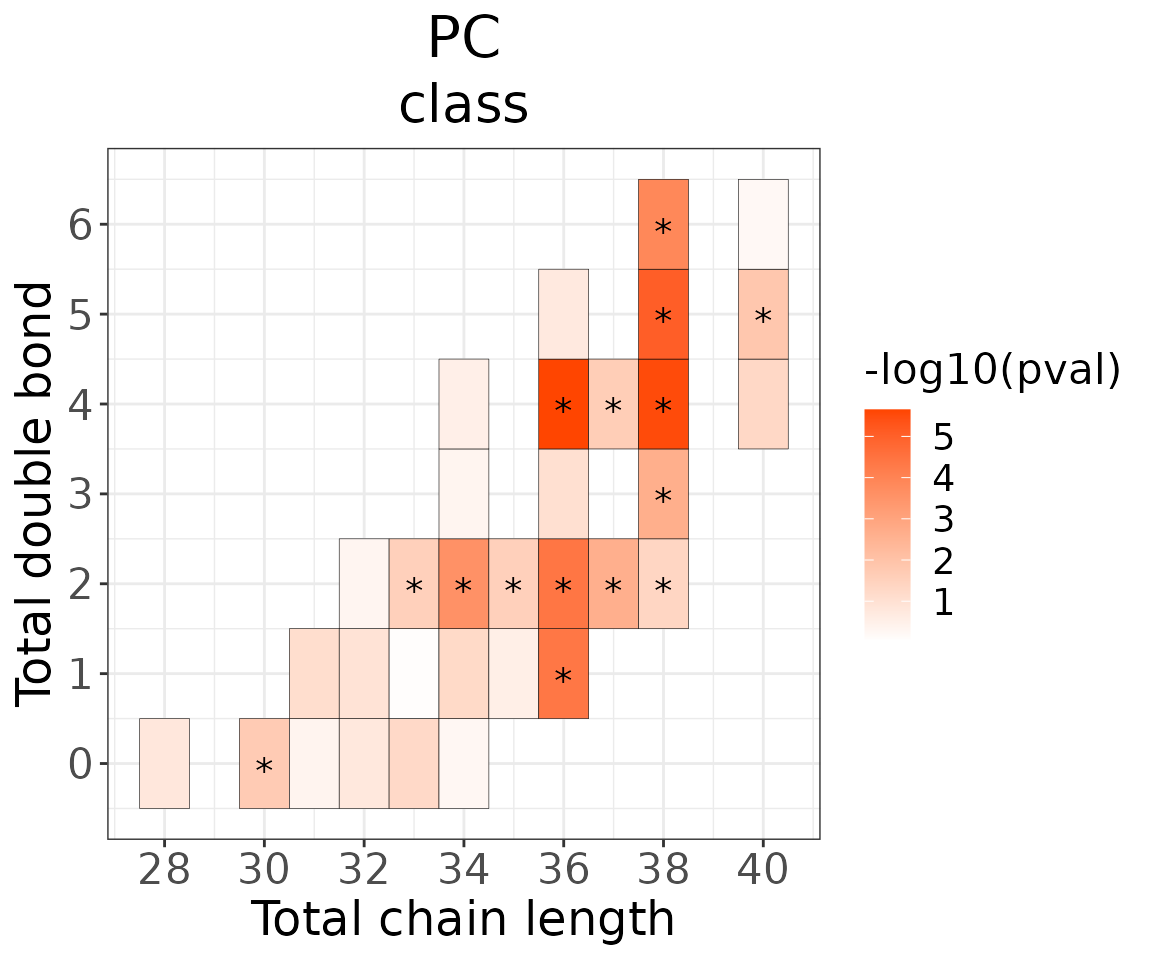
# summary of each chain result
summary(heatmap_one$each_chain)
#>                       Length Class                Mode
#> static_heatmap         9     gg                   list
#> table_heatmap         22     data.frame           list
#> processed_abundance   18     data.frame           list
#> transformed_abundance 18     data.frame           list
#> chain_db_se           20     SummarizedExperiment S4
# view result: heatmap of each chain
heatmap_one$each_chain$static_heatmap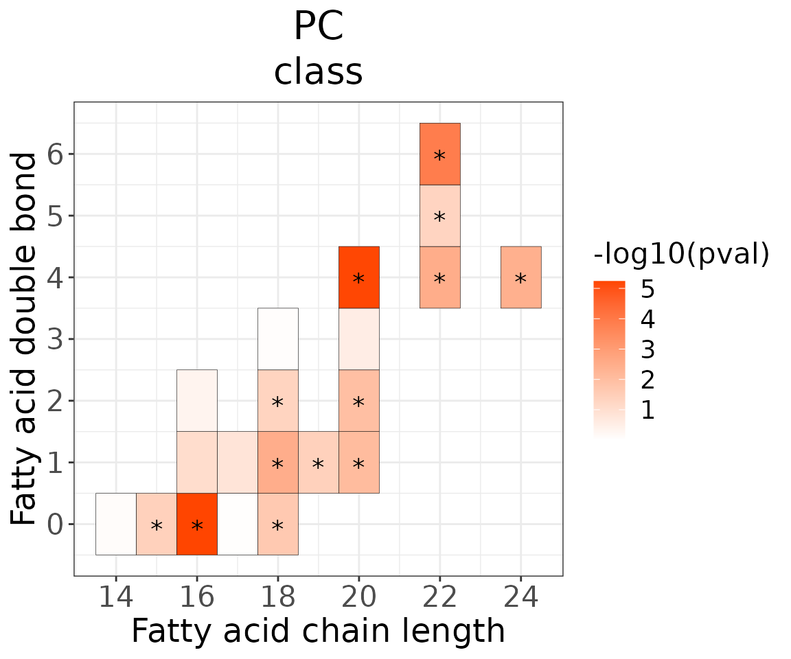
- NOTE: You can view the data in
chain_db_sebyLipidSigR::extract_summarized_experiment.
For example:
# view data in `chain_db_se`
heatmap_one_total_chain_list <-
    extract_summarized_experiment(heatmap_one$each_chain$chain_db_se)
# result summary
summary(heatmap_one_total_chain_list)
#>                  Length Class      Mode
#> abundance        18     data.frame list
#> lipid_char_table  4     data.frame list
#> group_info        3     data.frame list
You can further plot an abundance box plot for any lipid species of
interest by LipidSigR::boxPlot_feature_multiGroup.
For example, let’s use 16:0, a significant lipid species
from the heatmap above.
# plot abundance box plot of "16:0"
boxPlot_result <- boxPlot_feature_multiGroup(
    heatmap_one$each_chain$chain_db_se, feature='16:0', ref_group='ctrl',
    test='One-way ANOVA', post_hoc_sig='padj', transform='log10')

# result summary
summary(boxPlot_result)
#>                Length Class      Mode
#> static_boxPlot 9      gg         list
#> table_boxplot  6      data.frame list
#> table_stat     7      data.frame list
# view result: static box plot
boxPlot_result$static_boxPlot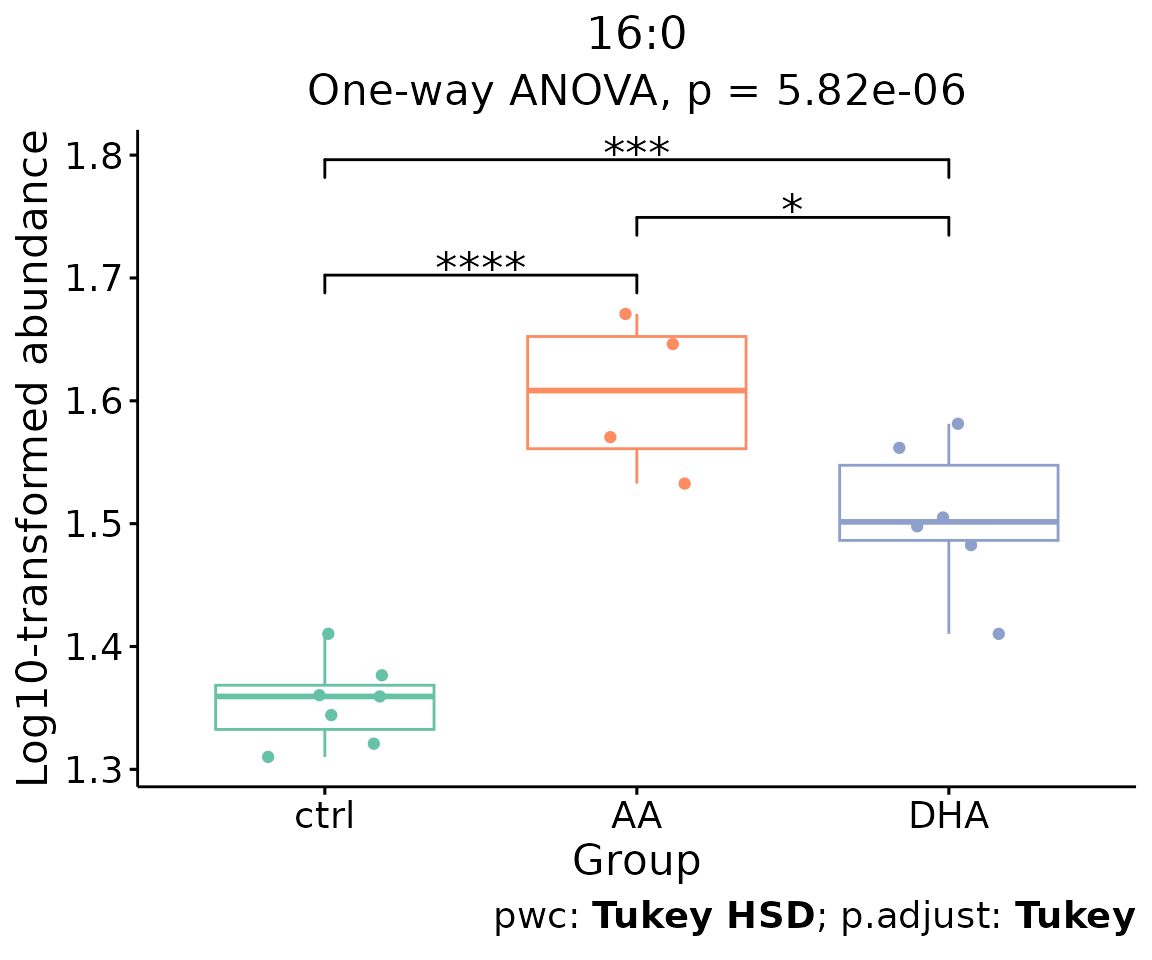
Box plot of lipid abundance An asterisk sign indicates significant differences between groups. The absence of an asterisk or line denotes a non-significant difference between groups.
Enrichment
Enrichment analysis provides two main approaches: ‘Over Representation Analysis (ORA)’ and ‘Lipid Set Enrichment Analysis (LSEA)’. ORA analysis illustrates significant lipid species enriched in the categories of lipid class. LSEA analysis is a computational method determining whether an a priori-defined set of lipids shows statistically significant, concordant differences between two biological states (e.g., phenotypes).
Over Representation Analysis (ORA)
The Over-Representation analysis provides whether significant lipid species are enriched in the categories of lipid class. Results are presented in tables and bar plots categorizing lipid species into ‘up-regulated’ or ‘down-regulated’ groups based on log2 fold change.
- NOTE: The input data of this section
deSp_seis generated bydeSp_multiGroupin lipid species analysis.
# conduct ORA
ora_all <- enrichment_ora(
    deSp_se, char=NULL, significant='pval', p_cutoff=0.05)
# result summary
summary(ora_all)
#>                     Length Class      Mode
#> enrich_result       13     tbl_df     list
#> static_barPlot       9     gg         list
#> interactive_barPlot  8     plotly     list
#> table_barPlot       10     grouped_df list
# view result: ORA bar plot
ora_all$static_barPlot 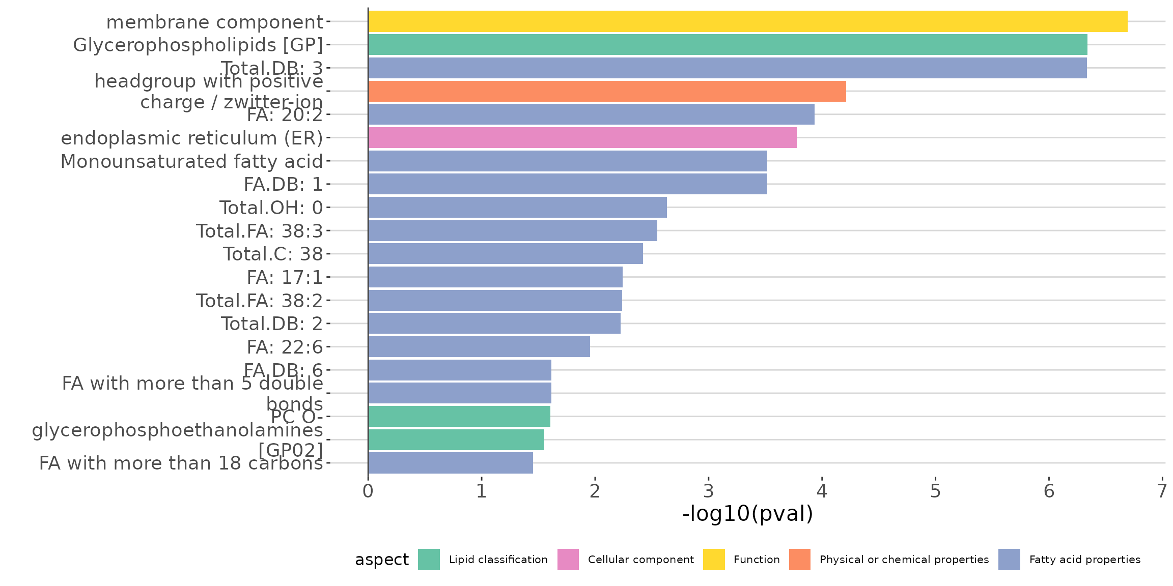
ORA bar plot of all characteristics The bar plot shows the top 20 terms.
# get lipid characteristics
list_lipid_char(processed_se)$common_list
#> There are 4 ratio characteristics that can be converted in your dataset.
#>            Lipid classification            Lipid classification
#>                      "Category"                    "Main.Class"
#>            Lipid classification            Lipid classification
#>                     "Sub.Class"                         "class"
#>           Fatty acid properties           Fatty acid properties
#>                            "FA"                          "FA.C"
#>           Fatty acid properties           Fatty acid properties
#>     "FA.Chain.Length.Category1"     "FA.Chain.Length.Category2"
#>           Fatty acid properties           Fatty acid properties
#>     "FA.Chain.Length.Category3"                         "FA.DB"
#>           Fatty acid properties           Fatty acid properties
#>                         "FA.OH"     "FA.Unsaturation.Category1"
#>           Fatty acid properties           Fatty acid properties
#>     "FA.Unsaturation.Category2"                       "Total.C"
#>           Fatty acid properties           Fatty acid properties
#>                      "Total.DB"                      "Total.FA"
#>           Fatty acid properties Physical or chemical properties
#>                      "Total.OH"             "Bilayer.Thickness"
#> Physical or chemical properties Physical or chemical properties
#>                     "Bond.type"              "Headgroup.Charge"
#> Physical or chemical properties Physical or chemical properties
#>           "Intrinsic.Curvature"             "Lateral.Diffusion"
#> Physical or chemical properties              Cellular component
#>        "Transition.Temperature"            "Cellular.Component"
#>                        Function
#>                      "Function"
# conduct ORA of a specific `char`
ora_one <- enrichment_ora(
    deSp_se, char='class', significant='pval', p_cutoff=0.05)
# result summary
summary(ora_one)
#>                     Length Class      Mode
#> enrich_result       13     tbl_df     list
#> static_barPlot       9     gg         list
#> interactive_barPlot  8     plotly     list
#> table_barPlot       11     grouped_df list
# view result: ORA bar plot
ora_one$static_barPlot 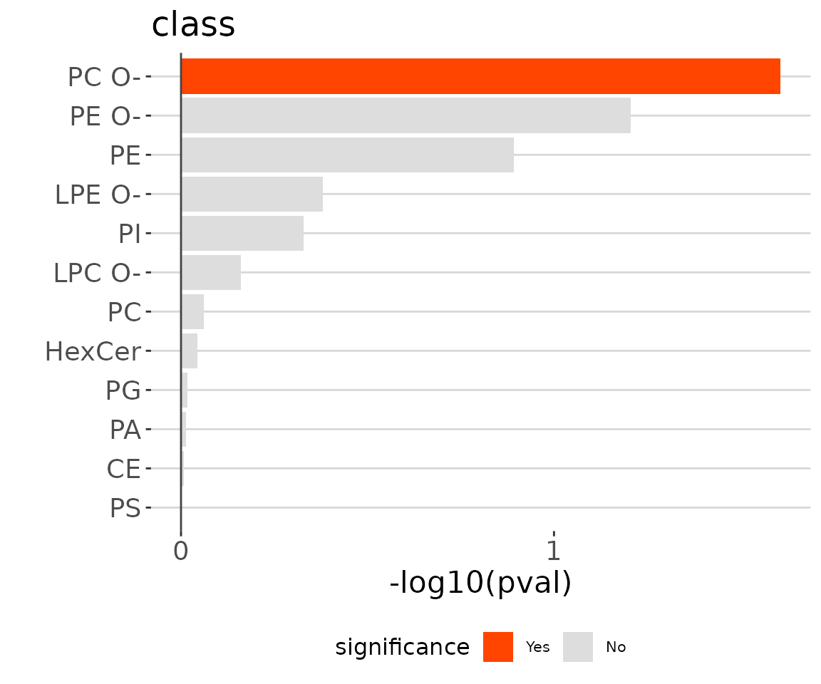
ORA bar plot of specific characteristics The bar plot classifies significant lipid species into ‘up-regulated’ or ‘down-regulated’ categories based on their log2 fold change, according to a selected characteristic. Red bars indicate up-regulated, blue bars represent down-regulated, and grey bars signify non-significant.
Lipid Set Enrichment Analysis (LSEA)
Lipid Set Enrichment Analysis (LSEA) is a computational method determining whether an a priori-defined set of lipids shows statistically significant, concordant differences between two biological states (e.g., phenotypes). Results are presented in tables and bar plots categorizing lipid species into ‘up-regulated’ or ‘down-regulated’ groups based on NES (Normalized Enrichment Score).
# conduct LSEA
lsea_all <- enrichment_lsea(
    deSp_se, char=NULL, rank_by='statistic', significant='pval',
    p_cutoff=0.05)
# result summary
summary(lsea_all)
#>                     Length Class  Mode
#> enrich_result        11    tbl_df list
#> static_barPlot        9    gg     list
#> interactive_barPlot   8    plotly list
#> table_barPlot         8    tbl_df list
#> lipid_set           228    -none- list
#> ranked_list         412    -none- numeric
# view result: LSEA bar plot
lsea_all$static_barPlot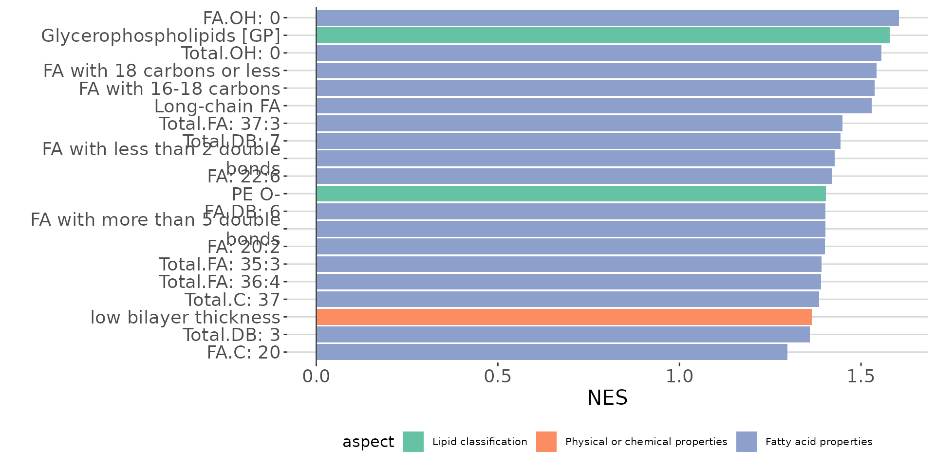
LSEA bar plot of all characteristics The bar plot shows the top 20 terms.
# get lipid characteristics
list_lipid_char(processed_se)$common_list
#> There are 4 ratio characteristics that can be converted in your dataset.
#>            Lipid classification            Lipid classification
#>                      "Category"                    "Main.Class"
#>            Lipid classification            Lipid classification
#>                     "Sub.Class"                         "class"
#>           Fatty acid properties           Fatty acid properties
#>                            "FA"                          "FA.C"
#>           Fatty acid properties           Fatty acid properties
#>     "FA.Chain.Length.Category1"     "FA.Chain.Length.Category2"
#>           Fatty acid properties           Fatty acid properties
#>     "FA.Chain.Length.Category3"                         "FA.DB"
#>           Fatty acid properties           Fatty acid properties
#>                         "FA.OH"     "FA.Unsaturation.Category1"
#>           Fatty acid properties           Fatty acid properties
#>     "FA.Unsaturation.Category2"                       "Total.C"
#>           Fatty acid properties           Fatty acid properties
#>                      "Total.DB"                      "Total.FA"
#>           Fatty acid properties Physical or chemical properties
#>                      "Total.OH"             "Bilayer.Thickness"
#> Physical or chemical properties Physical or chemical properties
#>                     "Bond.type"              "Headgroup.Charge"
#> Physical or chemical properties Physical or chemical properties
#>           "Intrinsic.Curvature"             "Lateral.Diffusion"
#> Physical or chemical properties              Cellular component
#>        "Transition.Temperature"            "Cellular.Component"
#>                        Function
#>                      "Function"
# conduct LSEA of a specific `char`
lsea_one <- enrichment_lsea(
    deSp_se, char='class', rank_by='statistic',
    significant='pval', p_cutoff=0.05)
# result summary
summary(lsea_one)
#>                     Length Class  Mode
#> enrich_result        11    tbl_df list
#> static_barPlot        9    gg     list
#> interactive_barPlot   8    plotly list
#> table_barPlot         9    tbl_df list
#> lipid_set            21    -none- list
#> ranked_list         412    -none- numeric
# view result: LSEA bar plot
lsea_one$static_barPlot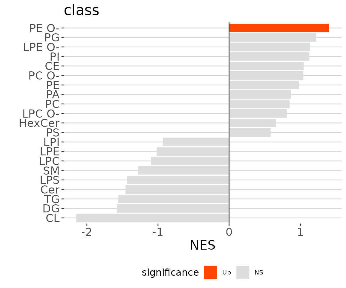
LSEA bar plot of a specific char The
bar plot classifies significant lipid species into ‘up-regulated’ or
‘down-regulated’ categories based on their log2 fold change, according
to a selected characteristic. Red bars indicate up-regulated, blue bars
represent down-regulated, and grey bars signify non-significant.
After running enrichment_lsea, you can continue
executing plot_enrichment_lsea to plot the enrichment plot
further. Please use the whole output of enrichment_lsea as
the input for plotting.
# plot LSEA results
lsea_plot <- plot_enrichment_lsea(
    lsea_res=lsea_one, char='class', char_feature='Cer')

# view result: enrichment plot
lsea_plot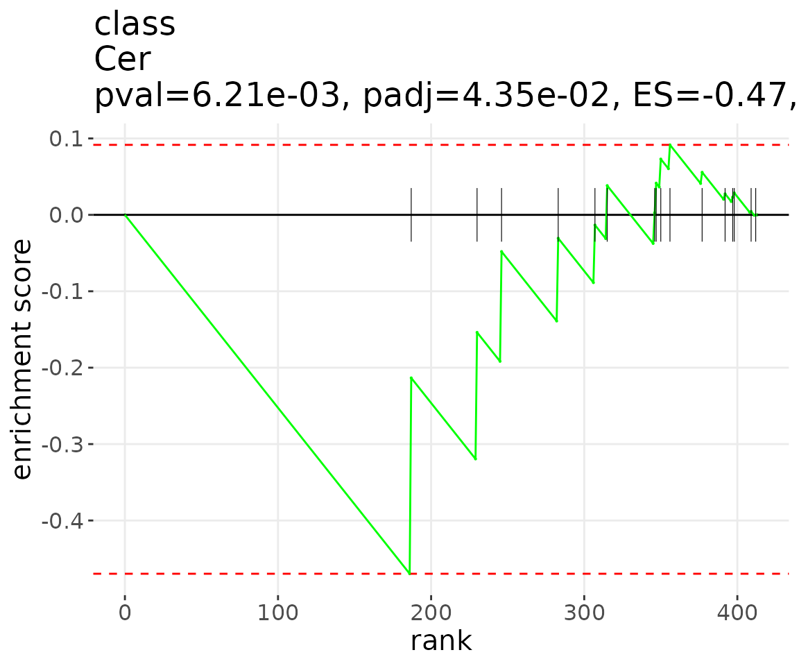
Correlation
Correlation analysis can be performed on either “lipid species” or “lipid characteristics”.
- Lipid Species Analysis: Data is analyzed at the individual lipid species level.
- Lipid Characteristics Analysis: Data is aggregated by specific lipid characteristics. The abundance of all lipid species in the same categories of a selected characteristic is summed up for analysis.
This section is designed for continuous clinical data. The
condition_col parameter specifies the column name from the
group information table that defines the clinical conditions for
analysis. Please ensure the selected columns contain only numerical data
(e.g., integers, floats). NOTE: The condition_col must include at
least two clinical conditions.
Two correlation analyses are accessible: ‘Correlation Coefficient’ and ‘Linear Regression’. Heatmaps will be shown once the correlation analysis is completed, it depicts the pattern between lipid species/lipid characteristics and clinical features.
The available clustering methods are as follows.
- Distance measurement: Pearson, Spearman, Kendall, Euclidean, Maximum, Manhattan, Canberra, Binary, and Minkowski.
- Clustering method: median, average, single, complete, Ward.D, Ward.D2, WPGMA, and UPGMC
All the analysis have to be conducted after data processing.
# data processing
processed_corr <- data_process(
    corr_input, exclude_missing=TRUE, exclude_missing_pct=70,
    replace_na_method='min',  replace_na_method_ref=0.5,
    normalization='Percentage')
Correlation coefficient
The Correlation Coefficient gives a summary view of whether a
relationship exists between clinical features and lipid species, how
strong that relationship is, and whether the relationship is positive or
negative. The parameters’ cor_coef_cutoff and
p_cutoff can decide the correlation coefficient and p-value
cut-offs. The rule of thumb in medical research recommended by Mukaka
for interpreting the size of a correlation coefficient is provided below
(Mukaka 2012).
| Size of Correlation | Interpretation |
|---|---|
| 0.90 to 1.00 (-.90 to -1.00) | Very high positive (negative) correlation |
| 0.70 to .90 (-.70 to -.90) | High positive (negative) correlation |
| 0.50 to .70 (-.50 to -.70) | Moderate positive (negative) correlation |
| 0.30 to .50 (-.30 to -.50) | Low positive (negative) correlation |
| 0.00 to .30 (.00 to -.30) | negligible correlation |
First, we will conduct a correlation analysis for lipid species. Set
the type parameter to Sp. You can optionally
visualize the heatmap with side colors. To do this, specify the desired
characteristic in the side_color_char parameter. Here, we
use class as an example. If you prefer not to display side
colors, set side_color_char to NULL. NOTE: The
char parameter must be set to NULL for lipid species
correlation.
Before the analysis, we must determine the condition_col
parameter, selected from the column names from the group information
table. Follow the steps below to view all available options for
condition_col.
# extract group information table
group_info <- extract_summarized_experiment(processed_corr)$group_info

# condition_col options (choose only columns with numeric values)
condition_col_option <- str(group_info[-1])
#> 'data.frame':    129 obs. of  8 variables:
#>  $ FEV1_FVC     : num  0.29 0.57 0.79 0.39 0.37 0.41 0.79 0.58 0.39 0.48 ...
#>  $ Emphysema    : num  11.017 2.361 0.983 34.993 26.85 ...
#>  $ Exacerbations: num  6 0 0 0 0 0 5 0 0 0 ...
#>  $ Age          : num  48.7 70.1 49.6 54.1 70.5 58.8 71.5 69.5 72.2 69.3 ...
#>  $ Sex          : num  0 0 0 1 0 1 0 0 1 1 ...
#>  $ Smoking      : num  0 0 0 0 0 0 0 0 1 0 ...
#>  $ BMI          : num  36.5 27.9 23.9 28.4 23.2 ...
#>  $ FEV1         : num  14.9 66.7 99.9 31.2 31.6 57.7 98.1 54.3 44.4 46.3 ...
# list the available lipid characteristics for `side_color_char`
list_lipid_char(processed_corr)$common_list
#>            Lipid classification            Lipid classification
#>                      "Category"                    "Main.Class"
#>            Lipid classification            Lipid classification
#>                     "Sub.Class"                         "class"
#>           Fatty acid properties           Fatty acid properties
#>                            "FA"                          "FA.C"
#>           Fatty acid properties           Fatty acid properties
#>     "FA.Chain.Length.Category1"     "FA.Chain.Length.Category2"
#>           Fatty acid properties           Fatty acid properties
#>     "FA.Chain.Length.Category3"                         "FA.DB"
#>           Fatty acid properties           Fatty acid properties
#>                         "FA.OH"     "FA.Unsaturation.Category1"
#>           Fatty acid properties           Fatty acid properties
#>     "FA.Unsaturation.Category2"                       "Total.C"
#>           Fatty acid properties           Fatty acid properties
#>                      "Total.DB"                      "Total.FA"
#>           Fatty acid properties Physical or chemical properties
#>                      "Total.OH"              "Headgroup.Charge"
#> Physical or chemical properties Physical or chemical properties
#>           "Intrinsic.Curvature"        "Transition.Temperature"
#>              Cellular component                        Function
#>            "Cellular.Component"                      "Function"

# compute correlation coefficient and visualize by heatmap
res_sp <- corr_cor_heatmap(
    processed_corr, char=NULL,
    condition_col=c("FEV1_FVC", "Emphysema", "Exacerbations"),
    side_color_char='class', correlation='pearson', significant='pval',
    p_cutoff=1, adjust_p_method='BH', cor_coef_cutoff=0,
    distfun='spearman', hclustfun='average', heatmap_col='statistic',
    transform='log10', type='Sp')

# result summary
summary(res_sp)
#>                        Length Class        Mode
#> all_correlation_result   9    data.frame   list
#> sig_correlation_result   9    data.frame   list
#> interactive_heatmap      8    plotly       list
#> static_heatmap           3    recordedplot list
#> heatmap_matrix         150    -none-       numeric
# view result: heatmap of clinical features and lipid species
res_sp$static_heatmap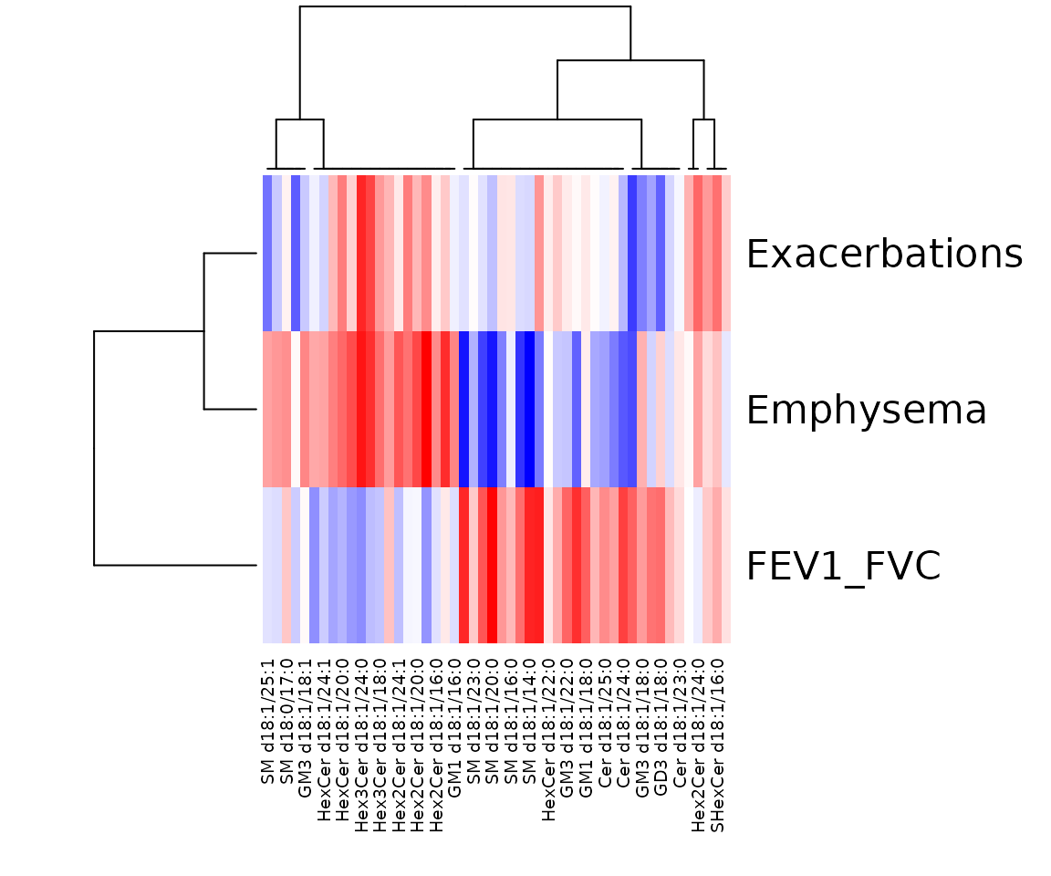
Correlation coefficient for lipid species analysis The heatmap shows only the variables that pass the defined cut-offs for the p-value and the correlation coefficient. The rows are clinical features, and the columns are the lipid species.
Next, we move on to conduct a correlation analysis of lipid
characteristics. Set the type parameter to
Char and specify a lipid characteristic for the
char parameter. You can use
LipidSigR::list_lipid_char to view a list of available
lipid characteristics. For more detailed information, please refer to
vignette("1_tool_function").
NOTE: The side_color_char parameter must be set to
NULL for lipid characteristics correlation.
# list the available lipid characteristics for `char`
list_lipid_char(processed_corr)$common_list
#>            Lipid classification            Lipid classification
#>                      "Category"                    "Main.Class"
#>            Lipid classification            Lipid classification
#>                     "Sub.Class"                         "class"
#>           Fatty acid properties           Fatty acid properties
#>                            "FA"                          "FA.C"
#>           Fatty acid properties           Fatty acid properties
#>     "FA.Chain.Length.Category1"     "FA.Chain.Length.Category2"
#>           Fatty acid properties           Fatty acid properties
#>     "FA.Chain.Length.Category3"                         "FA.DB"
#>           Fatty acid properties           Fatty acid properties
#>                         "FA.OH"     "FA.Unsaturation.Category1"
#>           Fatty acid properties           Fatty acid properties
#>     "FA.Unsaturation.Category2"                       "Total.C"
#>           Fatty acid properties           Fatty acid properties
#>                      "Total.DB"                      "Total.FA"
#>           Fatty acid properties Physical or chemical properties
#>                      "Total.OH"              "Headgroup.Charge"
#> Physical or chemical properties Physical or chemical properties
#>           "Intrinsic.Curvature"        "Transition.Temperature"
#>              Cellular component                        Function
#>            "Cellular.Component"                      "Function"

# compute correlation coefficient and visualize by heatmap
res_char <- corr_cor_heatmap(
    processed_corr, char="class",
    condition_col=c("FEV1_FVC", "Emphysema", "Exacerbations"),
    side_color_char=NULL, correlation='pearson', significant='pval',
    p_cutoff=1, adjust_p_method='BH', cor_coef_cutoff=0,
    distfun='spearman', hclustfun='average', heatmap_col='statistic',
    transform='log10', type='Char')

# result summary
summary(res_char)
#>                        Length Class        Mode
#> all_correlation_result  9     data.frame   list
#> sig_correlation_result  9     data.frame   list
#> interactive_heatmap     8     plotly       list
#> static_heatmap          3     recordedplot list
#> heatmap_matrix         30     -none-       numeric
# view result: heatmap of clinical features and lipid characteristics
res_char$static_heatmap
Correlation coefficient for lipid characteristics analysis The heatmap shows only the variables that pass the defined cut-offs for the p-value and the correlation coefficient. The rows are clinical features, and the columns are lipid characteristics.
Linear regression
Linear regression is a statistical method used to model the relationship between a dependent variable (e.g., lipid level) and one or more independent variables (e.g., clinical features). By analyzing these relationships, we can estimate the impact of specific clinical factors on lipid levels.
In multiple linear regression, we incorporate additional variables to
account for potential confounding factors. To do this, we specify the
adjusted_col parameter, which refers to the column names
selected from the group information table. Once the analysis is
complete, each lipid species is assigned a beta coefficient and a
corresponding t-statistic (p-value). These values can be used to
identify significant associations and group similar lipid species for
further analysis.
First, we will conduct a correlation analysis for lipid species. Set
the type parameter to Sp. You can optionally
visualize the heatmap with side colors. To do this, specify the desired
characteristic in the side_color_char parameter. Here, we
use class as an example. If you prefer not to display side
colors, set side_color_char to NULL.
NOTE: The char parameter must be set to NULL for
lipid species correlation.
Before the analysis, we must determine the condition_col
and adjusted_col parameters, selected from the column names
from the group information table. Follow the steps below to view all
available options for condition_col and
adjusted_col.
# extract group information table
group_info <- extract_summarized_experiment(processed_corr)$group_info

# condition_col options (choose only columns with numeric values)
condition_col_option <- str(group_info[-1])
#> 'data.frame':    129 obs. of  8 variables:
#>  $ FEV1_FVC     : num  0.29 0.57 0.79 0.39 0.37 0.41 0.79 0.58 0.39 0.48 ...
#>  $ Emphysema    : num  11.017 2.361 0.983 34.993 26.85 ...
#>  $ Exacerbations: num  6 0 0 0 0 0 5 0 0 0 ...
#>  $ Age          : num  48.7 70.1 49.6 54.1 70.5 58.8 71.5 69.5 72.2 69.3 ...
#>  $ Sex          : num  0 0 0 1 0 1 0 0 1 1 ...
#>  $ Smoking      : num  0 0 0 0 0 0 0 0 1 0 ...
#>  $ BMI          : num  36.5 27.9 23.9 28.4 23.2 ...
#>  $ FEV1         : num  14.9 66.7 99.9 31.2 31.6 57.7 98.1 54.3 44.4 46.3 ...

# adjusted_col options
adjusted_col_option <- str(group_info[-1])
#> 'data.frame':    129 obs. of  8 variables:
#>  $ FEV1_FVC     : num  0.29 0.57 0.79 0.39 0.37 0.41 0.79 0.58 0.39 0.48 ...
#>  $ Emphysema    : num  11.017 2.361 0.983 34.993 26.85 ...
#>  $ Exacerbations: num  6 0 0 0 0 0 5 0 0 0 ...
#>  $ Age          : num  48.7 70.1 49.6 54.1 70.5 58.8 71.5 69.5 72.2 69.3 ...
#>  $ Sex          : num  0 0 0 1 0 1 0 0 1 1 ...
#>  $ Smoking      : num  0 0 0 0 0 0 0 0 1 0 ...
#>  $ BMI          : num  36.5 27.9 23.9 28.4 23.2 ...
#>  $ FEV1         : num  14.9 66.7 99.9 31.2 31.6 57.7 98.1 54.3 44.4 46.3 ...
# list the available lipid characteristics for `side_color_char`
list_lipid_char(processed_corr)$common_list
#>            Lipid classification            Lipid classification
#>                      "Category"                    "Main.Class"
#>            Lipid classification            Lipid classification
#>                     "Sub.Class"                         "class"
#>           Fatty acid properties           Fatty acid properties
#>                            "FA"                          "FA.C"
#>           Fatty acid properties           Fatty acid properties
#>     "FA.Chain.Length.Category1"     "FA.Chain.Length.Category2"
#>           Fatty acid properties           Fatty acid properties
#>     "FA.Chain.Length.Category3"                         "FA.DB"
#>           Fatty acid properties           Fatty acid properties
#>                         "FA.OH"     "FA.Unsaturation.Category1"
#>           Fatty acid properties           Fatty acid properties
#>     "FA.Unsaturation.Category2"                       "Total.C"
#>           Fatty acid properties           Fatty acid properties
#>                      "Total.DB"                      "Total.FA"
#>           Fatty acid properties Physical or chemical properties
#>                      "Total.OH"              "Headgroup.Charge"
#> Physical or chemical properties Physical or chemical properties
#>           "Intrinsic.Curvature"        "Transition.Temperature"
#>              Cellular component                        Function
#>            "Cellular.Component"                      "Function"

# compute linear regression and visualize by heatmap
res_sp <- corr_lr_heatmap(
    processed_corr, char=NULL,
    condition_col=c("FEV1_FVC", "Emphysema", "Exacerbations"),
    adjusted_col=c("Age", "Sex", "Smoking", "BMI", "FEV1"),
    side_color_char=NULL, significant='pval', p_cutoff=0.05,
    adjust_p_method='BH', distfun='spearman', hclustfun='centroid',
    heatmap_col='t_statistic', transform='log10', type='Sp')

# result summary
summary(res_sp)
#>                        Length Class        Mode
#> all_correlation_result  9     data.frame   list
#> sig_correlation_result  9     data.frame   list
#> interactive_heatmap     8     plotly       list
#> static_heatmap          3     recordedplot list
#> heatmap_matrix         14     -none-       numeric
# view result: heatmap of linear regression
res_sp$static_heatmap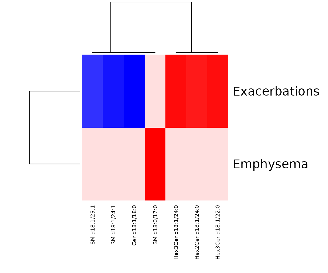
The heatmap of linear regression for lipid species analysis The heatmap shows only the variables that pass the user-defined cut-offs for p-value and correlation coefficient. The rows are clinical features, and the columns are lipid species.
Next, we move on to conduct a correlation analysis of lipid
characteristics. Set the type parameter to
Char and specify a lipid characteristic for the
char parameter. You can use
LipidSigR::list_lipid_char to view a list of available
lipid characteristics. For more detailed information, please refer to
vignette("1_tool_function").
NOTE: The side_color_char parameter must be set to
NULL for lipid characteristics correlation.
# list the available lipid characteristics for `char`
list_lipid_char(processed_corr)$common_list
#>            Lipid classification            Lipid classification
#>                      "Category"                    "Main.Class"
#>            Lipid classification            Lipid classification
#>                     "Sub.Class"                         "class"
#>           Fatty acid properties           Fatty acid properties
#>                            "FA"                          "FA.C"
#>           Fatty acid properties           Fatty acid properties
#>     "FA.Chain.Length.Category1"     "FA.Chain.Length.Category2"
#>           Fatty acid properties           Fatty acid properties
#>     "FA.Chain.Length.Category3"                         "FA.DB"
#>           Fatty acid properties           Fatty acid properties
#>                         "FA.OH"     "FA.Unsaturation.Category1"
#>           Fatty acid properties           Fatty acid properties
#>     "FA.Unsaturation.Category2"                       "Total.C"
#>           Fatty acid properties           Fatty acid properties
#>                      "Total.DB"                      "Total.FA"
#>           Fatty acid properties Physical or chemical properties
#>                      "Total.OH"              "Headgroup.Charge"
#> Physical or chemical properties Physical or chemical properties
#>           "Intrinsic.Curvature"        "Transition.Temperature"
#>              Cellular component                        Function
#>            "Cellular.Component"                      "Function"

# compute linear regression and visualize by heatmap
res_char <- corr_lr_heatmap(
    processed_corr, char="class",
    condition_col=c("FEV1_FVC", "Emphysema", "Exacerbations"),
    adjusted_col=c("Age", "Sex", "Smoking", "BMI", "FEV1"),
    side_color_char=NULL, significant='pval', p_cutoff=1,
    adjust_p_method='BH', distfun='spearman', hclustfun='centroid',
    heatmap_col='t_statistic', transform='log10', type='Char')

# result summary
summary(res_char)
#>                        Length Class        Mode
#> all_correlation_result  9     data.frame   list
#> sig_correlation_result  9     data.frame   list
#> interactive_heatmap     8     plotly       list
#> static_heatmap          3     recordedplot list
#> heatmap_matrix         30     -none-       numeric
# view result: heatmap of linear regression
res_char$static_heatmap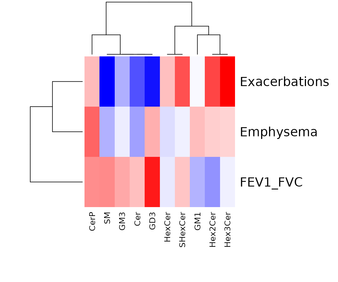
The heatmap of linear regression for lipid characteristics analysis Only the variables that pass the user-defined cut-offs for p-value and correlation coefficient are shown on the heatmap. The rows of the heatmap are clinical features, and the columns are lipid characteristics.
Session info
#> R version 4.2.3 (2023-03-15)
#> Platform: x86_64-pc-linux-gnu (64-bit)
#> Running under: CentOS Stream 8
#>
#> Matrix products: default
#> BLAS/LAPACK: /usr/lib64/libopenblasp-r0.3.15.so
#>
#> locale:
#>  [1] LC_CTYPE=en_US.UTF-8       LC_NUMERIC=C
#>  [3] LC_TIME=en_US.UTF-8        LC_COLLATE=en_US.UTF-8
#>  [5] LC_MONETARY=en_US.UTF-8    LC_MESSAGES=en_US.UTF-8
#>  [7] LC_PAPER=en_US.UTF-8       LC_NAME=C
#>  [9] LC_ADDRESS=C               LC_TELEPHONE=C
#> [11] LC_MEASUREMENT=en_US.UTF-8 LC_IDENTIFICATION=C
#>
#> attached base packages:
#> [1] stats     graphics  grDevices utils     datasets  methods   base
#>
#> other attached packages:
#> [1] LipidSigR_1.0.0 dplyr_1.1.3
#>
#> loaded via a namespace (and not attached):
#>   [1] backports_1.4.1             Hmisc_5.1-1
#>   [3] fastmatch_1.1-4             systemfonts_1.0.4
#>   [5] plyr_1.8.8                  igraph_1.5.1
#>   [7] lazyeval_0.2.2              BiocParallel_1.32.6
#>   [9] crosstalk_1.2.0             GenomeInfoDb_1.34.9
#>  [11] ggplot2_3.4.3               digest_0.6.33
#>  [13] foreach_1.5.2               ca_0.71.1
#>  [15] htmltools_0.5.6             viridis_0.6.4
#>  [17] fansi_1.0.4                 magrittr_2.0.3
#>  [19] checkmate_2.2.0             memoise_2.0.1
#>  [21] cluster_2.1.4               fastcluster_1.2.3
#>  [23] wordcloud_2.6               matrixStats_1.0.0
#>  [25] rARPACK_0.11-0              pkgdown_2.0.7
#>  [27] colorspace_2.1-0            ggrepel_0.9.3
#>  [29] textshaping_0.3.6           xfun_0.42
#>  [31] RCurl_1.98-1.12             jsonlite_1.8.7
#>  [33] iterators_1.0.14            glue_1.6.2
#>  [35] polyclip_1.10-4             registry_0.5-1
#>  [37] gtable_0.3.4                zlibbioc_1.44.0
#>  [39] XVector_0.38.0              webshot_0.5.5
#>  [41] DelayedArray_0.24.0         car_3.1-2
#>  [43] BiocGenerics_0.44.0         abind_1.4-5
#>  [45] scales_1.3.0                rstatix_0.7.2
#>  [47] ggthemes_4.2.4              Rcpp_1.0.11
#>  [49] viridisLite_0.4.2           htmlTable_2.4.1
#>  [51] foreign_0.8-85              rgoslin_1.2.0
#>  [53] Formula_1.2-5               stats4_4.2.3
#>  [55] htmlwidgets_1.6.2           httr_1.4.7
#>  [57] fgsea_1.24.0                FNN_1.1.3.2
#>  [59] RColorBrewer_1.1-3          factoextra_1.0.7
#>  [61] pkgconfig_2.0.3             farver_2.1.1
#>  [63] nnet_7.3-19                 sass_0.4.7
#>  [65] uwot_0.1.16                 utf8_1.2.3
#>  [67] tidyselect_1.2.0            labeling_0.4.3
#>  [69] rlang_1.1.1                 reshape2_1.4.4
#>  [71] munsell_0.5.0               tools_4.2.3
#>  [73] cachem_1.0.8                cli_3.6.1
#>  [75] generics_0.1.3              broom_1.0.5
#>  [77] evaluate_0.21               stringr_1.5.0
#>  [79] fastmap_1.1.1               heatmaply_1.4.2
#>  [81] yaml_2.3.7                  ragg_1.3.0
#>  [83] knitr_1.44                  fs_1.6.3
#>  [85] purrr_1.0.2                 dendextend_1.17.1
#>  [87] iheatmapr_0.7.0             compiler_4.2.3
#>  [89] rstudioapi_0.15.0           plotly_4.10.4
#>  [91] ggsignif_0.6.4              tibble_3.2.1
#>  [93] tweenr_2.0.3                bslib_0.5.1
#>  [95] stringi_1.7.12              desc_1.4.2
#>  [97] RSpectra_0.16-1             lattice_0.22-5
#>  [99] Matrix_1.6-3                vctrs_0.6.3
#> [101] pillar_1.9.0                lifecycle_1.0.3
#> [103] jquerylib_0.1.4             data.table_1.15.2
#> [105] cowplot_1.1.1               bitops_1.0-7
#> [107] irlba_2.3.5.1               hwordcloud_0.1.0
#> [109] corpcor_1.6.10              seriation_1.5.1
#> [111] GenomicRanges_1.50.2        R6_2.5.1
#> [113] TSP_1.2-4                   gridExtra_2.3
#> [115] IRanges_2.32.0              codetools_0.2-19
#> [117] MASS_7.3-60                 assertthat_0.2.1
#> [119] SummarizedExperiment_1.28.0 rprojroot_2.0.3
#> [121] withr_3.0.0                 S4Vectors_0.36.2
#> [123] GenomeInfoDbData_1.2.9      parallel_4.2.3
#> [125] mixOmics_6.22.0             grid_4.2.3
#> [127] rpart_4.1.19                tidyr_1.3.0
#> [129] rmarkdown_2.25              MatrixGenerics_1.10.0
#> [131] carData_3.0-5               Rtsne_0.16
#> [133] ggpubr_0.6.0                ggforce_0.4.1
#> [135] Biobase_2.58.0              base64enc_0.1-3
#> [137] ellipse_0.5.0