“Differential expression” integrates many useful lipid-focused analyses for identifying significant lipid species or lipid characteristics.
Differential Expression is divided into two main analyses, ‘Lipid species analysis’ and ‘Lipid characteristics analysis’. Further analysis and visualization methods can also be conducted based on the results of differential expressed analysis.
-
Lipid species analysis: The lipid species analysis explores the significant lipid species based on differentially expressed analysis. Data are analyzed based on each lipid species. Further analysis and visualization methods, include
- dimension reduction,
- hierarchical clustering,
- characteristics association.
-
Lipid characteristics analysis: The lipid characteristics analysis explores the significant lipid characteristics. Lipid species are categorized and summarized into a new lipid abundance table according to a selected lipid characteristic. The abundance of all lipid species of the same categories are summed up, then conduct differential expressed analysis. Further analysis and visualization methods include
- dimension reduction,
- hierarchical clustering.
All input data for differential expression and the downstream
functions must be a SummarizedExperiment object constructed using
LipidSigR::as_summarized_experiment and then further
processed withLipidSigR::data_process. Please read
vignette("1_tool_function") before preparing the input
data.
To use our data as an example, follow the steps below.
# load package
library(LipidSigR)

# load the example SummarizedExperiment
data("de_data_twoGroup")

# data processing
processed_se <- data_process(
    de_data_twoGroup, exclude_missing=TRUE, exclude_missing_pct=70,
    replace_na_method='min', replace_na_method_ref=0.5,
    normalization='Percentage')
Lipid species differential expression analysis
For lipid species analysis section, differential expression analysis is performed to figure out significant lipid species. In short, samples will be divided into independent groups according to the input “Group Information” table.
Here, we use two-group data as an example.
# conduct differential expression analysis of lipid species
deSp_se <- deSp_twoGroup(
    processed_se, ref_group='ctrl', test='t-test',
significant='pval', p_cutoff=0.05, FC_cutoff=1, transform='log10')- NOTE: For multi-group data, please use
LipidSigR::deSp_multiGroup.
After running the above code, a SummarizedExperiment object
deSp_se will be returned containing the analysis results.
This object can be used as input for plotting and further analyses such
as dimensionality reduction, hierarchical clustering, and characteristics association
deSp_se includes the input abundance data, lipid
characteristic table, group information table, analysis results, and
input parameter settings. You can view the data in deSp_se
by LipidSigR::extract_summarized_experiment. Please read
vignette("1_tool_function").
The differential expression analysis result can be input for plotting MA plots, volcano plots, and lollipop plots. (Note: Only static plots are displayed here.)
# plot differential expression analysis result
deSp_plot <- plot_deSp_twoGroup(deSp_se)

# result summary
summary(deSp_plot)
#>                         Length Class      Mode
#> interactive_de_lipid     8     plotly     list
#> interactive_maPlot       8     plotly     list
#> interactive_volcanoPlot  8     plotly     list
#> static_de_lipid         10     gg         list
#> static_maPlot            9     gg         list
#> static_volcanoPlot       9     gg         list
#> table_de_lipid           9     data.frame list
#> table_ma_volcano         9     data.frame list
# view result: lollipop chart
deSp_plot$static_de_lipid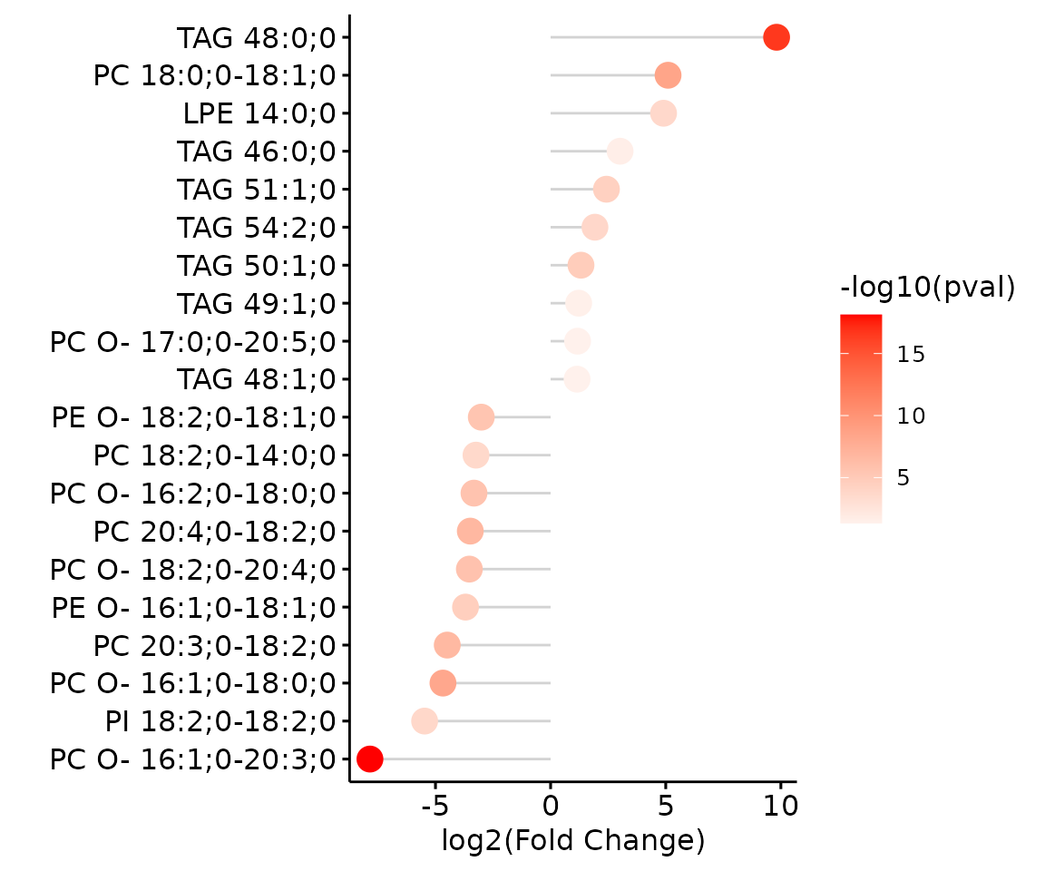
Lollipop chart of lipid species analysis The
lollipop chart reveals the lipid species that pass chosen cut-offs. The
x-axis shows log2 fold change while the y-axis is a list of lipids
species. The color of the point is determined by
-log10(adj_value/p-value).
# view result: MA plot
deSp_plot$static_maPlot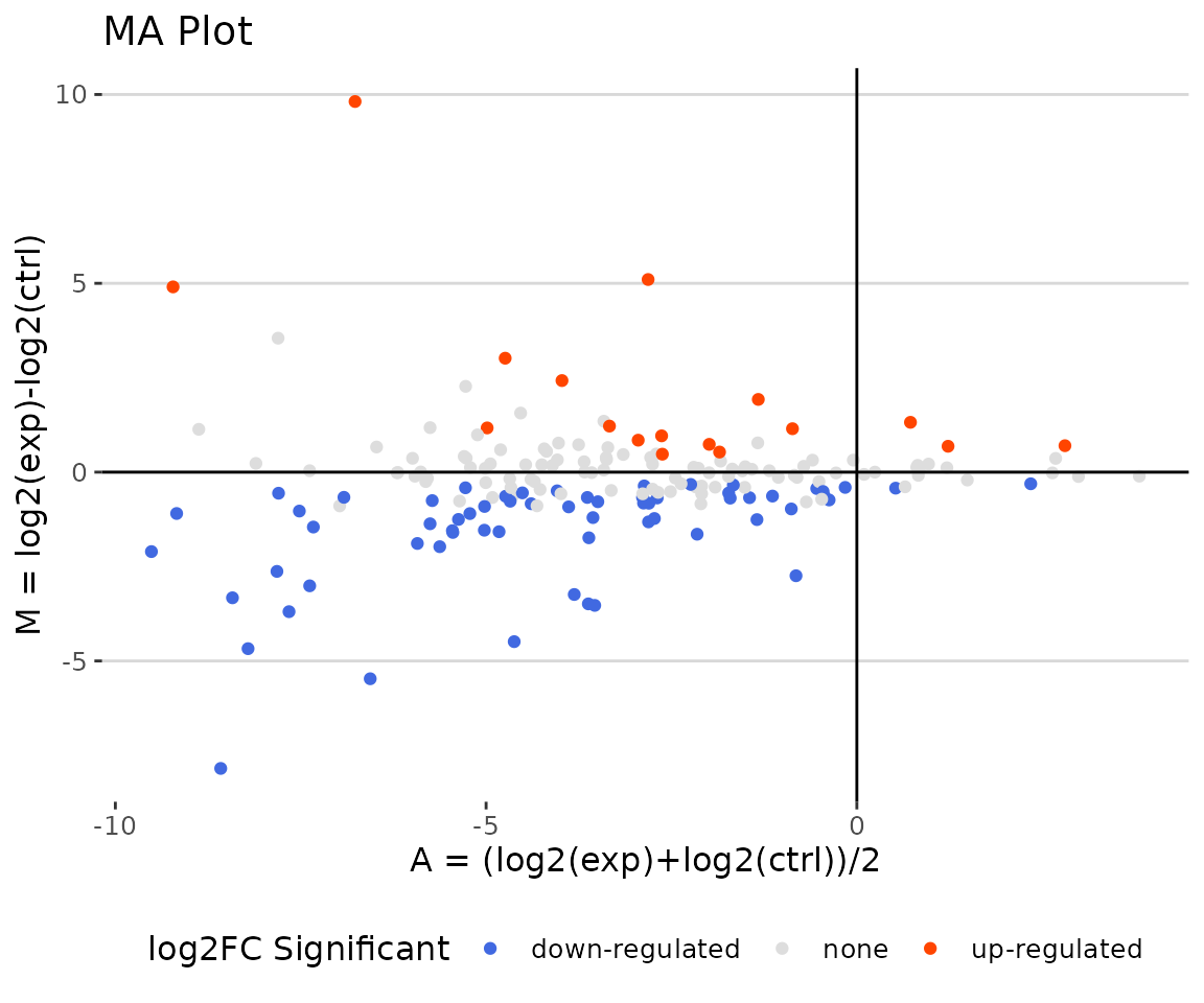
MA plot The MA plot indicates three groups of lipid species, up-regulated(red), down-regulated(blue), and non-significant(grey).
# view result: MA plot
deSp_plot$static_volcanoPlot 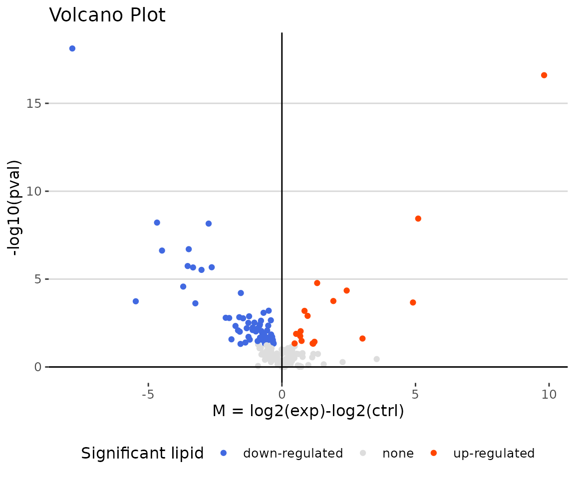
Volcano plot The volcano plot illustrates a similar concept to the MA plot. These points visually identify the most biologically significant lipid species (red for up-regulated, blue for down-regulated, and grey for non-significant).
You can further plot an abundance box plot for any lipid species of
interest by LipidSigR::boxPlot_feature_twoGroup. (for
multi-group data, please use
LipidSigR::boxPlot_feature_multiGroup)
For example, let’s use TAG 48:0;0, a significant lipid
species from the lollipop above.
# plot abundance box plot of 'TAG 48:0;0'
boxPlot_result <- boxPlot_feature_twoGroup(
    processed_se, feature='TAG 48:0;0', ref_group='ctrl', test='t-test',
    transform='log10')

# result summary
summary(boxPlot_result)
#>                Length Class        Mode
#> static_boxPlot 9      gg           list
#> table_boxplot  7      data.frame   list
#> table_stat     5      rstatix_test list

# view result: static box plot
boxPlot_result$static_boxPlot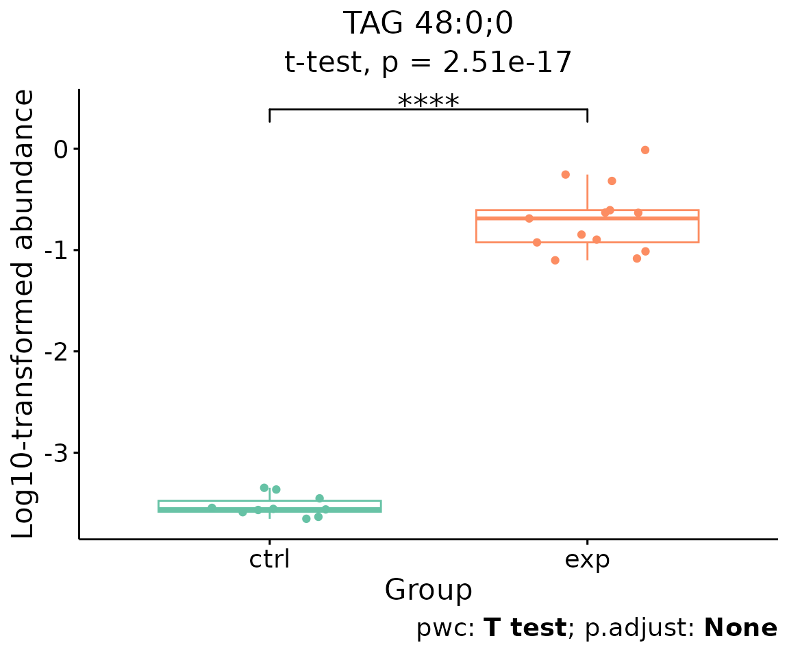
Box plot of lipid abundance An asterisk sign indicates significant differences between groups. The absence of an asterisk or line denotes a non-significant difference between groups.
Lipid characteristics differential expression analysis
The massive degree of structural diversity of lipids contributes to the functional variety of lipids. The characteristics can range from subtle variance (i.e. the number of a double bond in the fatty acid) to major change (i.e. diverse backbones). In this section, lipid species are categorized and summarized into a new lipid abundance table according to two selected lipid characteristics, then conducted differential expressed analysis.
Two procedures of analysis will be conducted - first is ‘Characteristics’ and then ‘Subgroup of characteristics’.
‘Characteristics’ is based on the first selected
‘characteristics’ while ‘Subgroup of characteristics’
is the subgroup analysis of the previous section. Analyses will be
performed based on parameter char and subChar
selected by users.
Before beginning, we suggest calculating the two-way ANOVA and reviewing the results for all lipid characteristics.
# two way anova
twoWayAnova_table <- char_2wayAnova(
    processed_se, ratio_transform='log2', char_transform='log10')
#> There are 4 ratio characteristics that can be converted in your dataset.

# view result table
head(twoWayAnova_table[, 1:4], 5)
#>                  aspect characteristic fval_2factors pval_2factors
#> 1  Lipid classification          class      5.045694  1.208279e-06
#> 2  Lipid classification       Category      5.379765  6.965556e-03
#> 3  Lipid classification     Main.Class      3.657973  1.058632e-03
#> 4  Lipid classification      Sub.Class      4.993823  4.243797e-06
#> 5 Fatty acid properties       Total.FA      7.155695  7.104938e-72
From the table returned by LipidSigR::char_2wayAnova, we
have to selected the lipid characteristics of interest as
char and subChar for characteristics and
subgroup of characteristics analyses.
Here, we use two-group data as an example, and choose
Total.C as the char input.
# conduct differential expression of lipid characteristics
deChar_se <- deChar_twoGroup(
    processed_se, char="Total.C", ref_group="ctrl", test='t-test',
    significant="pval", p_cutoff=0.05, FC_cutoff=1, transform='log10')
#> There are 4 ratio characteristics that can be converted in your dataset.- NOTE: For multi-group data, please use
LipidSigR::deChar_multiGroup.
After running the above code, a SummarizedExperiment object
deChar_se will be returned containing the analysis results.
This object can be used as input for plotting and further analyses such
as dimension reduction, and hierarchical clustering.
deChar_se includes the input abundance data, lipid
characteristic table, group information table, analysis results, and
input parameter settings. You can view the data in
deChar_se by
LipidSigR::extract_summarized_experiment.
Next, you can plot the differential expression analysis result by
LipidSigR::plot_deChar_twoGroup. For multi-group data,
please use LipidSigR::plot_deChar_multiGroup.
# plot differential expression analysis results
deChar_plot <- plot_deChar_twoGroup(deChar_se)

# result summary
summary(deChar_plot)
#>                           Length Class      Mode
#> static_barPlot             9     gg         list
#> static_barPlot_sqrt        9     gg         list
#> static_linePlot            9     gg         list
#> static_linePlot_sqrt       9     gg         list
#> static_boxPlot            10     gg         list
#> interactive_barPlot        8     plotly     list
#> interactive_barPlot_sqrt   8     plotly     list
#> interactive_linePlot       8     plotly     list
#> interactive_linePlot_sqrt  8     plotly     list
#> interactive_boxPlot        8     plotly     list
#> table_barPlot             11     tbl_df     list
#> table_linePlot            11     tbl_df     list
#> table_boxPlot              7     data.frame list
#> table_char_index          24     data.frame list
#> table_index_stat          13     grouped_df list
The results of ‘Characteristics’ analysis in the first section
# view result: bar plot of selected `char`
deChar_plot$static_barPlot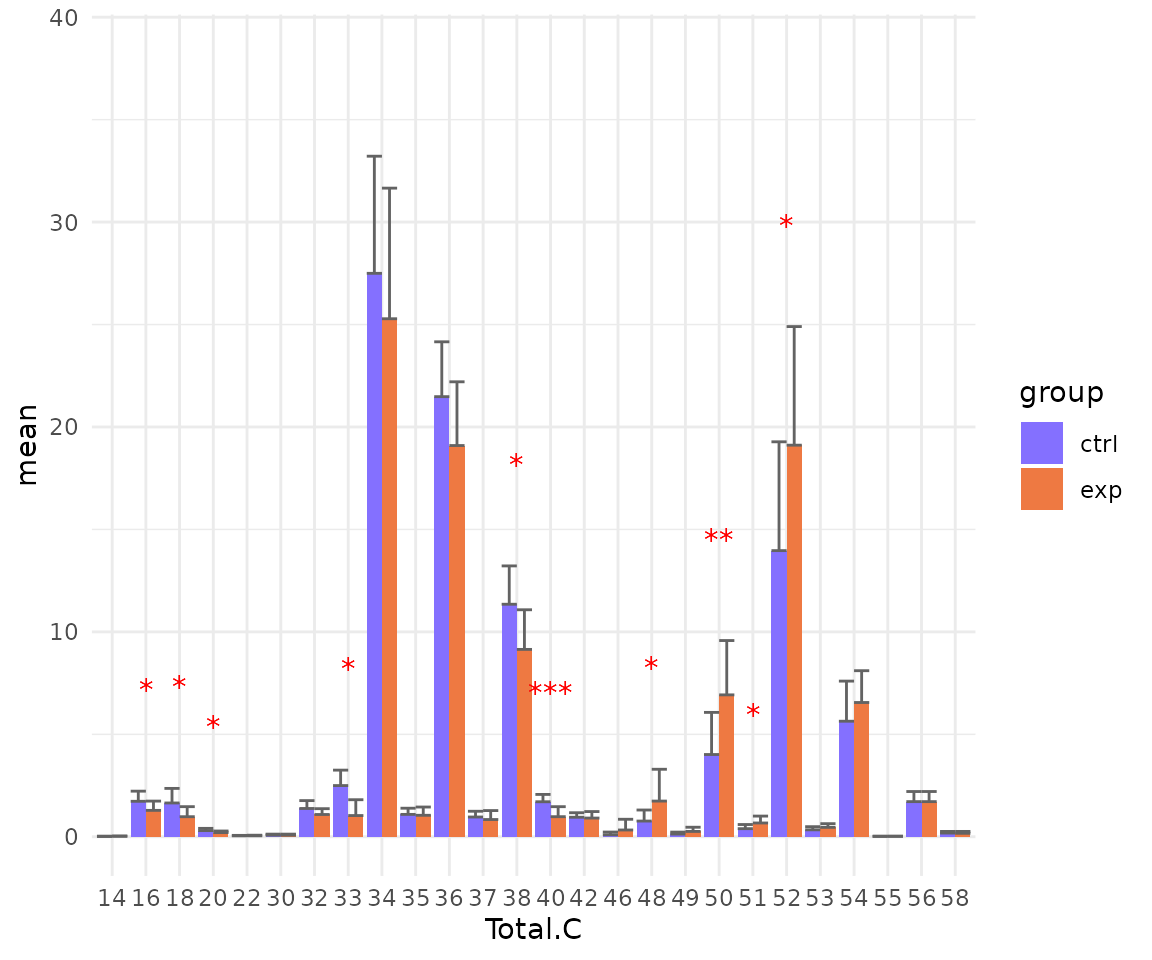
# view result: sqrt-scaled bar plot of selected `char`
deChar_plot$static_barPlot_sqrt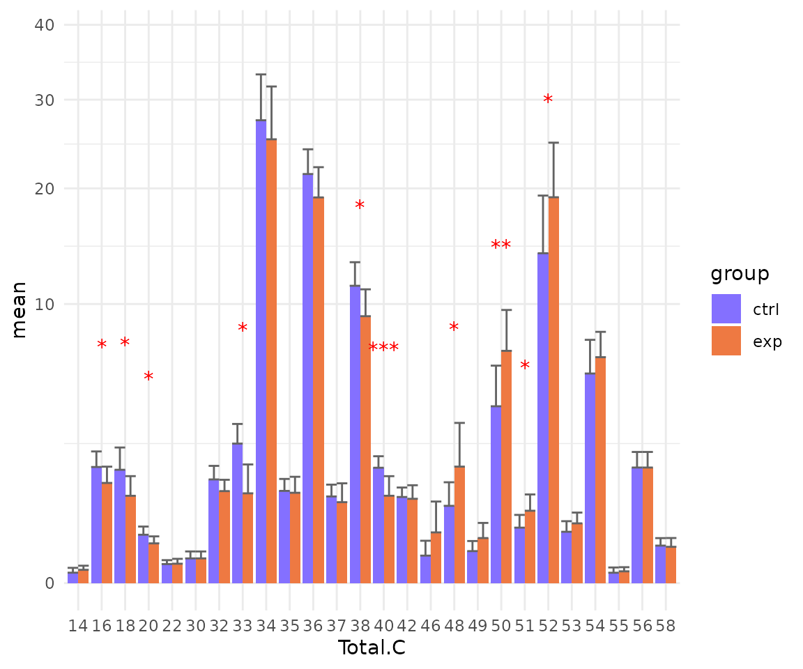
# view result: line plot of `selected char`
deChar_plot$static_linePlot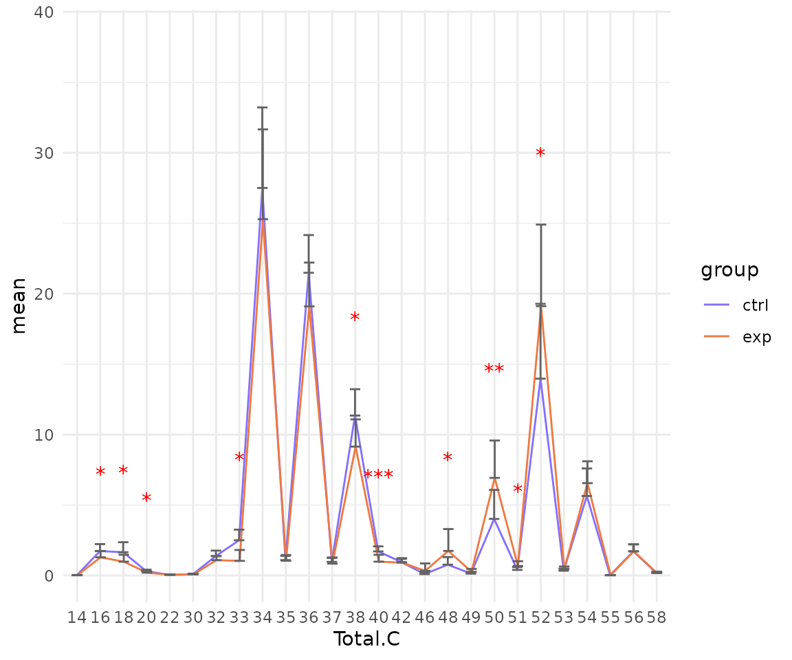
# view result: sqrt-scaled line plot of selected `char`
deChar_plot$static_linePlot_sqrt 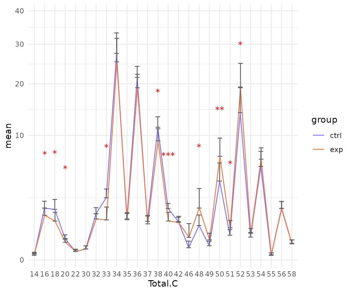
# view result: box plot of selected `char`
deChar_plot$static_boxPlot 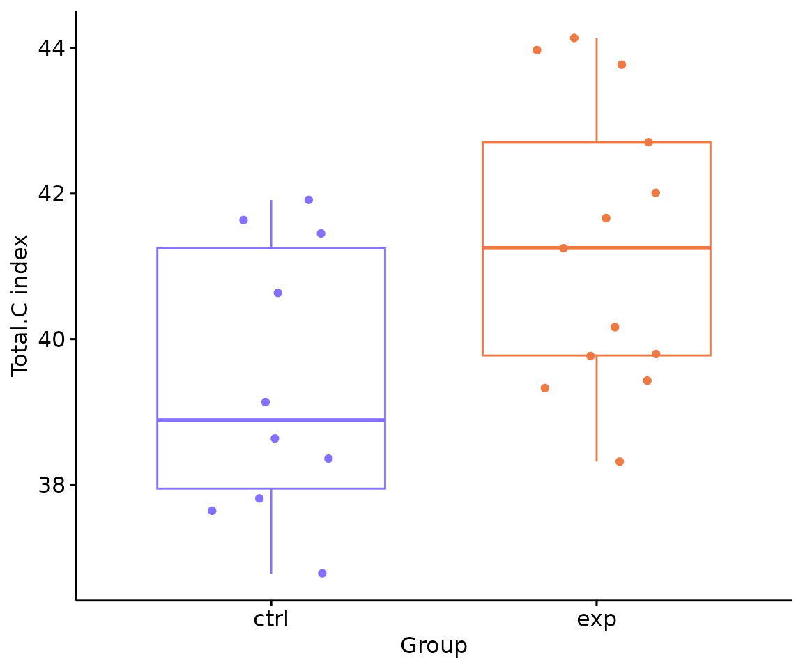
In the ‘Subgroup of characteristics’, besides the
selected characteristic in first section defined by parameter
char, we can further choose another characteristic by
parameter subChar. The two chosen characteristics,
char and subCharshould be either both
continuous data or one continuous and one categorical data.
- NOTE: You can use
LipidSigR::list_lipid_charto get all the selectable lipid characteristics. Please readvignette("1_tool_function").
Here we use Total.C as the char input and
class as the subChar input for an example.
# subgroup differential expression of lipid characteristics
subChar_se <- subChar_twoGroup(
    processed_se, char="Total.C", subChar="class", ref_group="ctrl",
    test='t-test', significant="pval", p_cutoff=0.05,
    FC_cutoff=1, transform='log10')
#> There are 4 ratio characteristics that can be converted in your dataset.- NOTE: For multi-group data, please use
LipidSigR::subChar_multiGroup.
After running the code, the returned subChar_se
contained the input abundance data, lipid characteristic table, group
information table, analysis results, and input parameter settings. You
can view the data in subChar_se by
LipidSigR::extract_summarized_experiment. Please read
vignette("1_tool_function").
Next, you can plot the results of a specific feature within the
subChar. As we have chosen class as
subChar in conducting
LipidSigR::subChar_twoGroup, we can choose a feature within
the class by parameter subChar_feature for
plotting result plots. Obtain all the selectable features for
subChar_feature by following:
# get subChar_feature list
subChar_feature_list <- unique(
    extract_summarized_experiment(subChar_se)$all_deChar_result$sub_feature)
Here we choose Cer as the subChar_feature
input for an example. For multi-group data, please use
LipidSigR::plot_subChar_multiGroup.
# visualize subgroup differential expression of lipid characteristics
subChar_plot <- plot_subChar_twoGroup(subChar_se, subChar_feature="Cer")

# result summary
summary(subChar_plot)
#>                           Length Class      Mode
#> static_barPlot             9     gg         list
#> static_barPlot_sqrt        9     gg         list
#> static_linePlot            9     gg         list
#> static_linePlot_sqrt       9     gg         list
#> static_boxPlot            10     gg         list
#> interactive_barPlot        8     plotly     list
#> interactive_barPlot_sqrt   8     plotly     list
#> interactive_linePlot       8     plotly     list
#> interactive_linePlot_sqrt  8     plotly     list
#> interactive_boxPlot        8     plotly     list
#> table_barPlot             11     tbl_df     list
#> table_linePlot            11     tbl_df     list
#> table_boxPlot              7     data.frame list
#> table_char_index          24     data.frame list
#> table_index_stat          13     grouped_df list
(Note: Only static plots are displayed here.)
The results of ‘Subgroup of characteristics’ analysis in the second section
- Note: The star above the bar shows the significant difference of the specific subgroup of the selected characteristic between control and experimental groups.
# view result: bar plot of `subChar_feature`
subChar_plot$static_barPlot 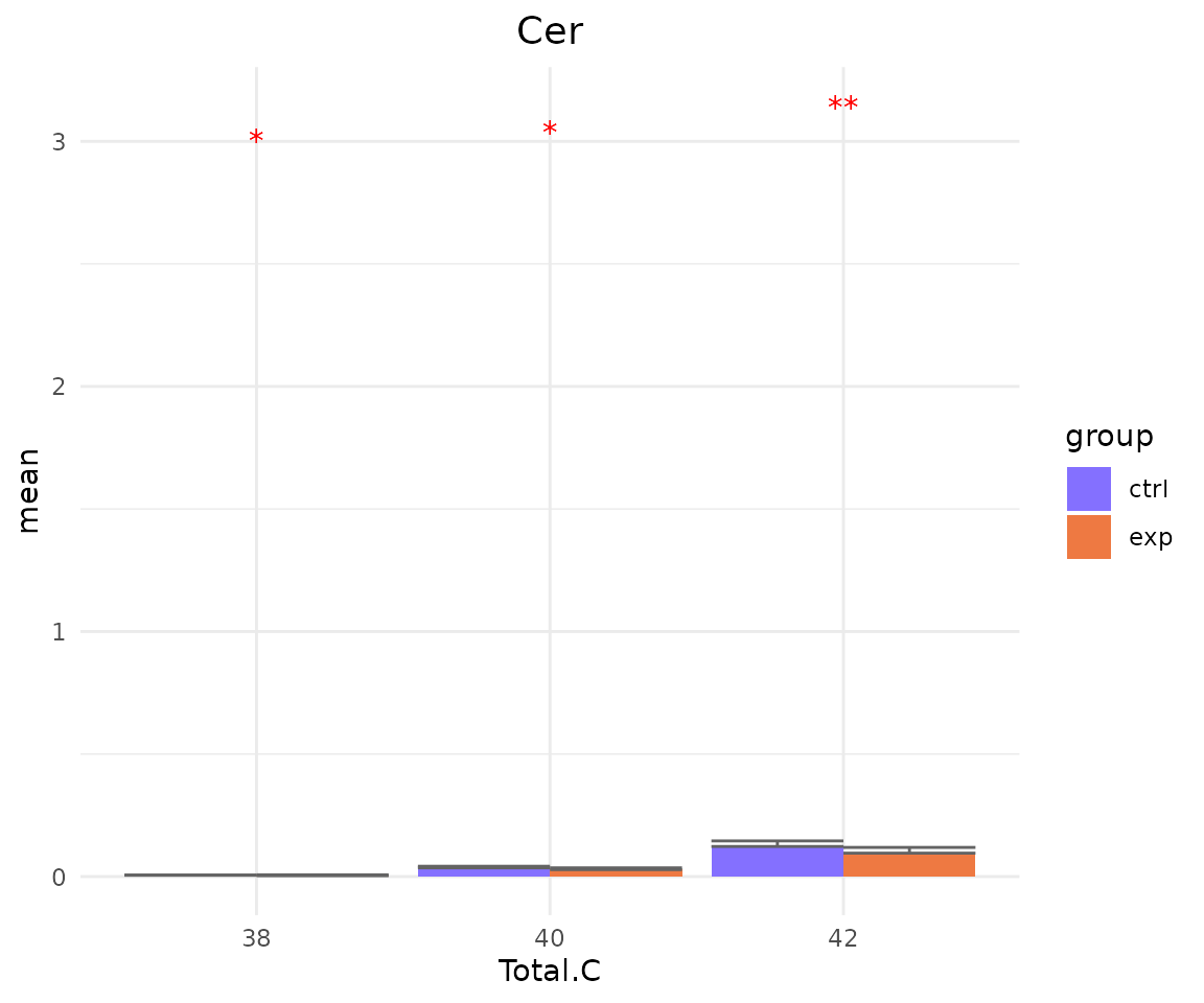
# view result: sqrt-scaled bar plot of `subChar_feature`
subChar_plot$static_barPlot_sqrt 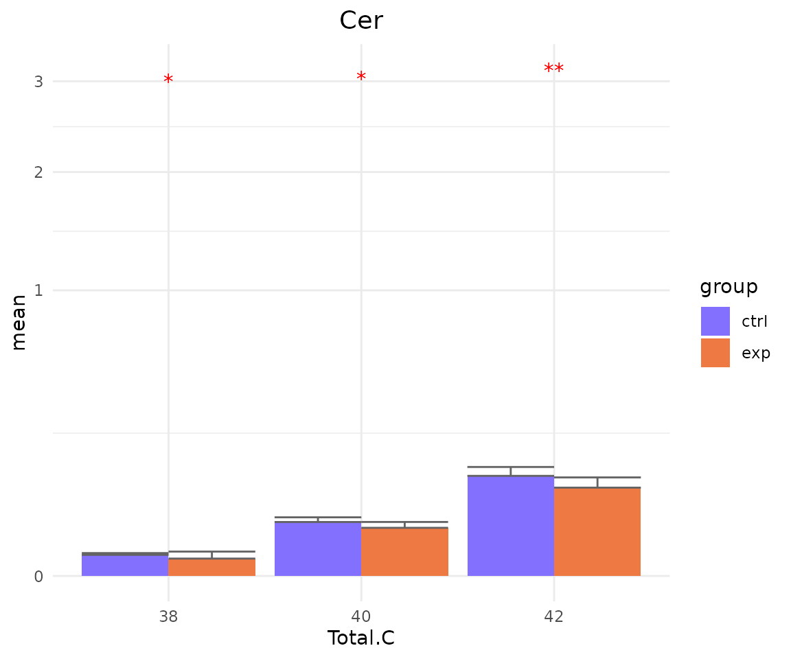
# view result: line plot of `subChar_feature`
subChar_plot$static_linePlot 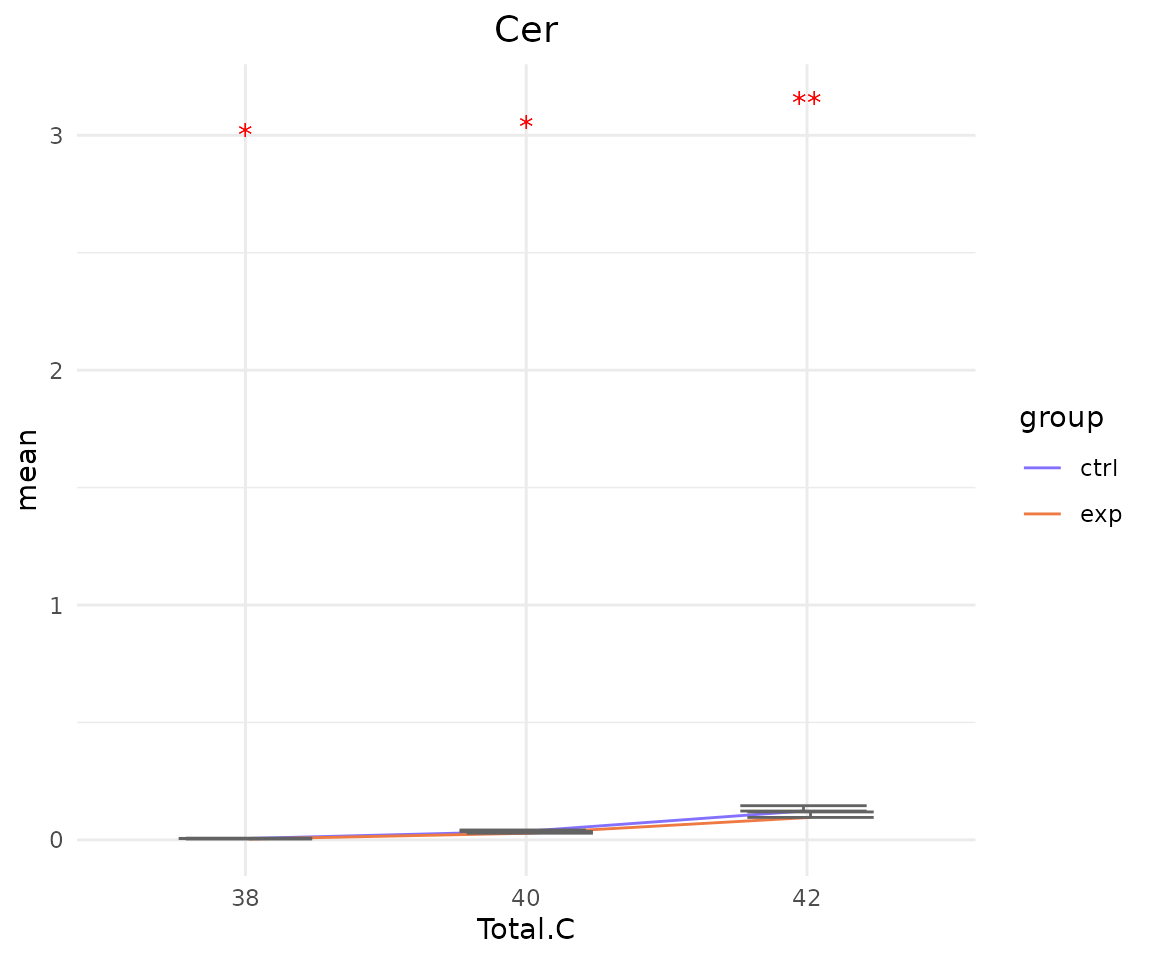
# view result: sqrt-scaled line plot of `subChar_feature`
subChar_plot$static_linePlot_sqrt 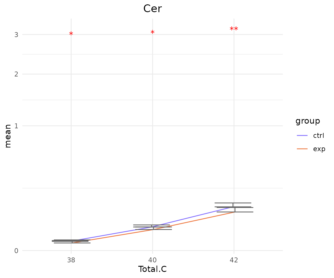
# view result: box plot of `subChar_feature`
subChar_plot$static_boxPlot 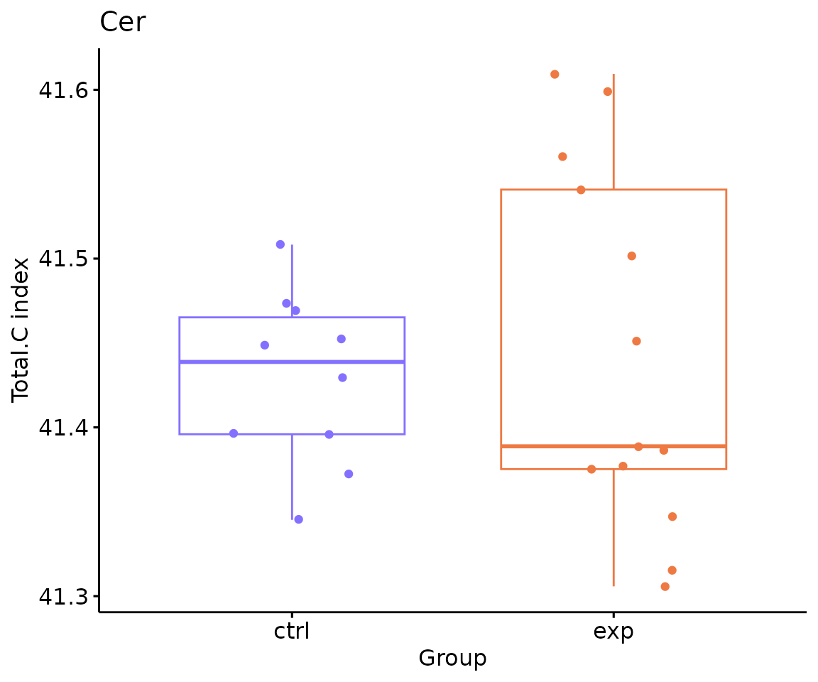
Dimension reduction
Four dimension reduction methods can be applied after lipid species
or lipid characteristic analysis. Three methods—PCA, t-SNE, and
UMAP—have already been introduced. Please read
Dimension reduction in
vignette("2_profiling")
- Note: The input data of this section must be the output
deSp_sefrom lipid species analysis, ordeChar_sefrom lipid characteristics analysis.
PLS-DA
# conduct PLSDA
result_plsda <- dr_plsda(
  deSp_se, ncomp=2, scaling=TRUE, clustering='group_info', cluster_num=2,
  kmedoids_metric=NULL, distfun=NULL, hclustfun=NULL, eps=NULL, minPts=NULL)

# result summary
summary(result_plsda)
#>                         Length Class      Mode
#> plsda_result            4      data.frame list
#> table_plsda_loading     2      data.frame list
#> interacitve_plsda       8      plotly     list
#> interactive_loadingPlot 8      plotly     list
#> static_plsda            9      gg         list
#> static_loadingPlot      9      gg         list
# view result: PLS-DA plot
result_plsda$static_plsda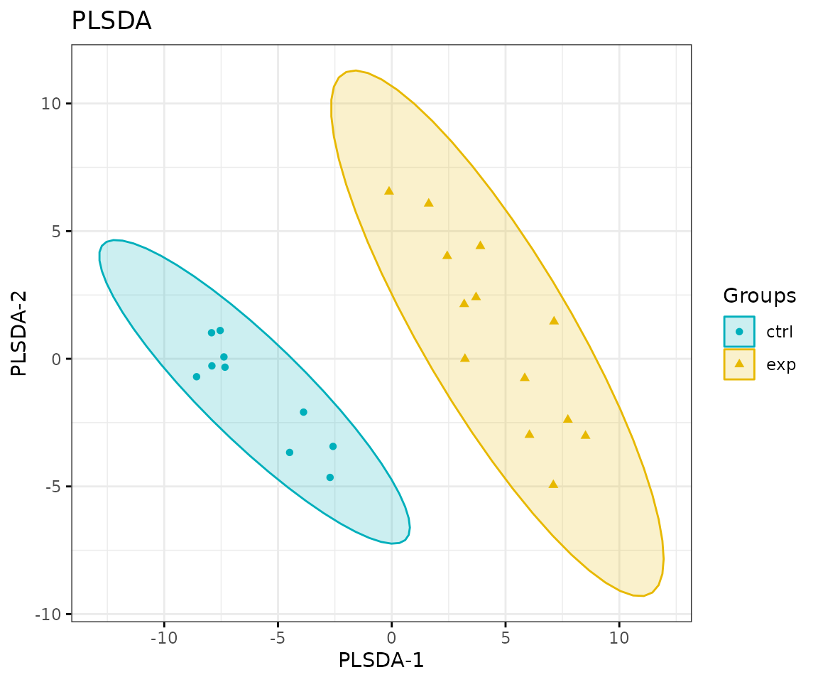
PLS-DA plot
# view result: PLS-DA loading plot
result_plsda$static_loadingPlot 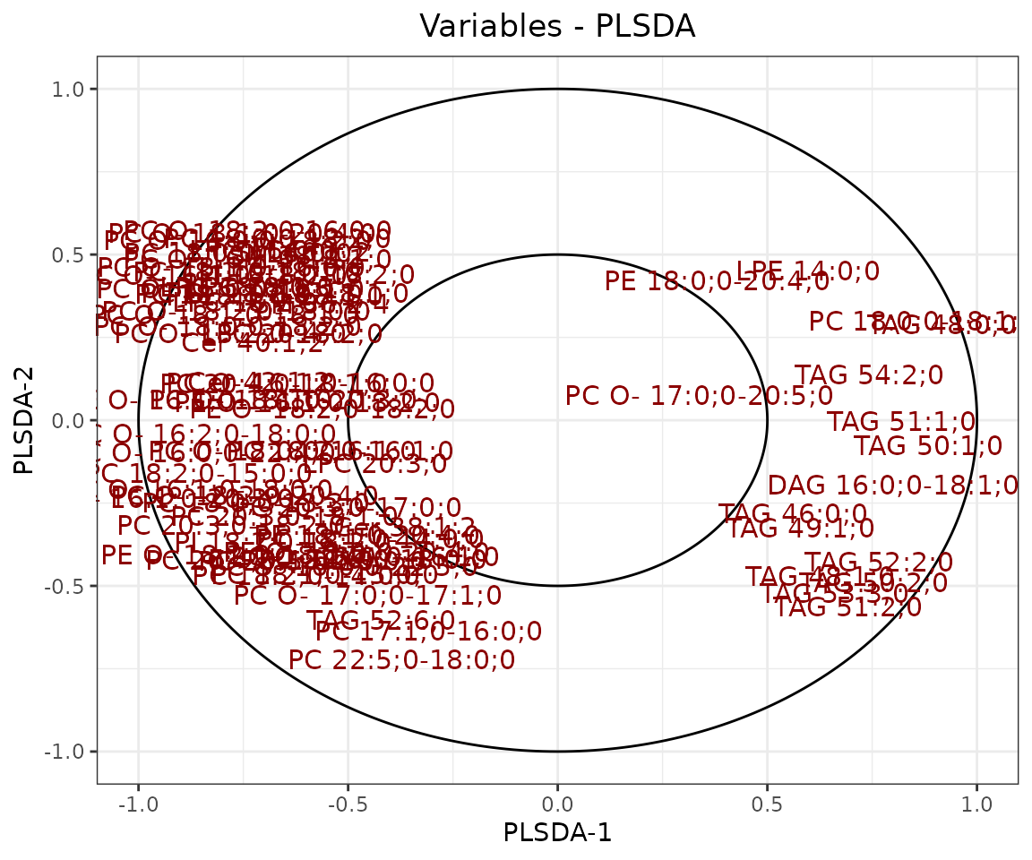
Loading plot In the PLS-DA loading plot, the distance to the center of the variables indicates the contribution of the variable. The value of the x-axis reveals the contribution of the variable to PLS-DA-1, whereas the value of the y-axis discloses the contribution of the variable to PLS-DA-2.
Hierarchical clustering
Based on the results of differential expression analysis, we further
take a look at differences of lipid species between the control group
and the experimental group. Lipid species derived from two groups are
clustered and visualized on heatmap by hierarchical clustering. Users
can choose to output the results of all lipid species or only
significant lipid species by the parameter type.
The top of the heatmap is grouped by sample group (top annotation)
while the side of the heatmap (row annotation) can be chosen from
lipid_char_table, such as class, structural category,
functional category, total length, total double bond (Total.DB),
hydroxyl group number (Total.OH), the double bond of fatty acid(FA.DB),
hydroxyl group number of fatty acid(FA.OH).
Note: The input data of this section must be the output
deSp_sefrom lipid species analysis, ordeChar_sefrom lipid characteristics analysis.You can obtain the selectable lipid characteristics for the
charinput usingLipidSigR::list_lipid_char. Please readvignette("1_tool_function").
Here, we use class as the char input for an
example.
# conduct hierarchical clustering
result_hcluster <- heatmap_clustering(
    de_se=deSp_se, char='class', distfun='pearson',
    hclustfun='complete', type='sig')

# result summary
summary(result_hcluster)
#>                     Length Class              Mode
#> interactive_heatmap    1   IheatmapHorizontal S4
#> static_heatmap         3   recordedplot       list
#> corr_coef_matrix    1840   -none-             numeric
# view result: heatmap of significant lipid species
result_hcluster$static_heatmap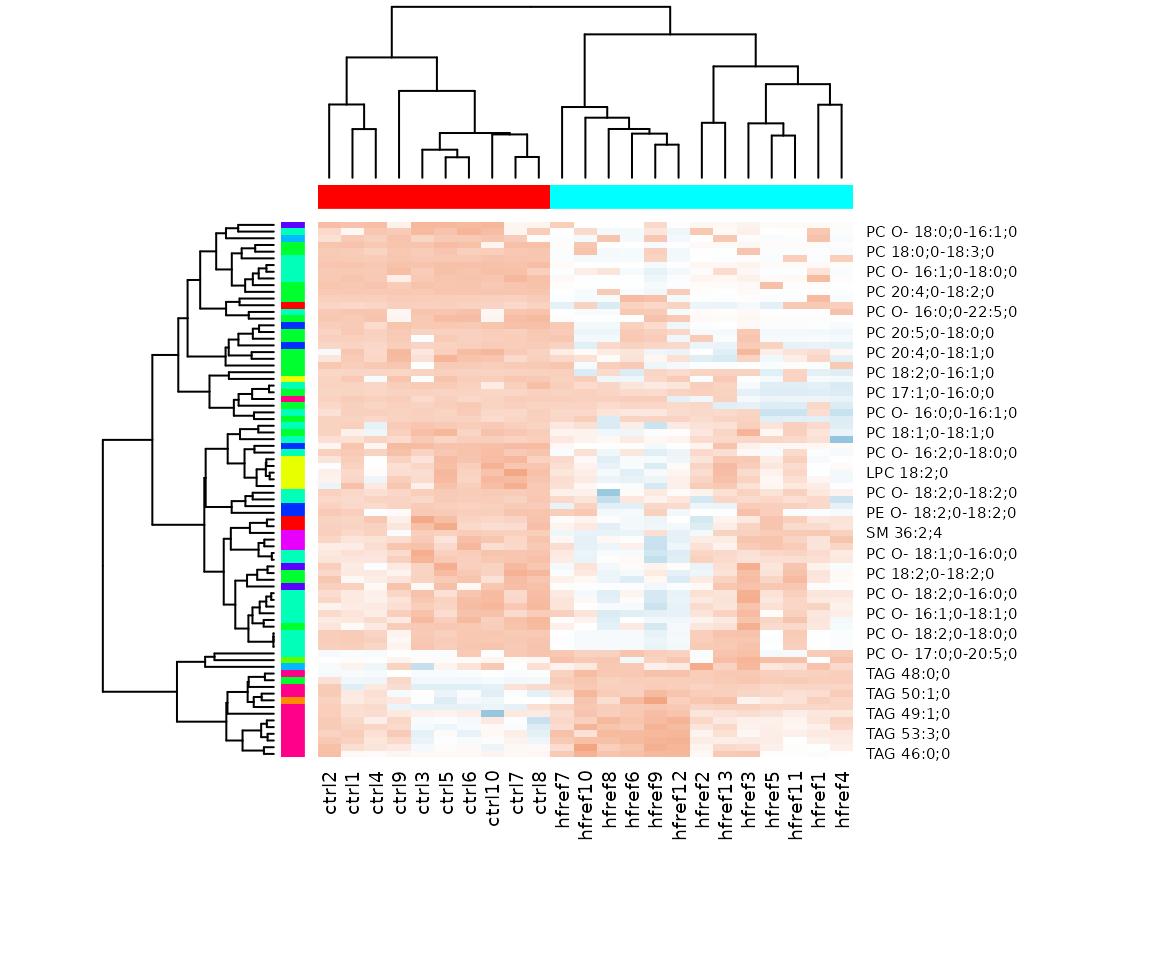
Heatmap of significant lipid species The difference between the two groups by observing the distribution of lipid species.
Characteristics analysis
The characteristics analysis visualizes the difference between
control and experimental groups of significant lipid species categorized
based on different lipid characteristics from
lipid_char_table, such as class, structural category,
functional category, total length, total double bond (Total.DB),
hydroxyl group number (Total.OH), the double bond of fatty acid(FA.DB),
hydroxyl group number of fatty acid(FA.OH).
Note: The input data of this section must be the output
deSp_sefrom lipid species analysis.You can obtain the selectable lipid characteristics for the
charinput usingLipidSigR::list_lipid_char. Please readvignette("1_tool_function").
Here, we use class as the char input for an
example.
# conduct characteristic analysis
result_char <- char_association(deSp_se, char='class')

# result summary
summary(result_char)
#>                       Length Class        Mode
#> interactive_barPlot    8     plotly       list
#> interacitve_lollipop   8     plotly       list
#> interactive_wordCloud  8     hwordcloud   list
#> static_barPlot         9     gg           list
#> static_lollipop        9     gg           list
#> static_wordCloud       3     recordedplot list
#> table_barPlot          7     tbl_df       list
#> table_lollipop        10     tbl_df       list
#> table_wordCloud        2     tbl_df       list
# view result: bar chart
result_char$static_barPlot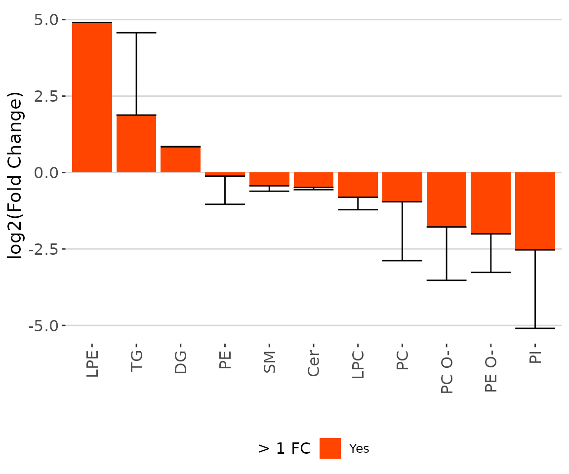
The bar chart of significant groups The bar chart shows the significant groups (values) with mean fold change over 2 in the selected characteristics by colors (red for significant and black for insignificant).
# view result: lollipop plot
result_char$static_lollipop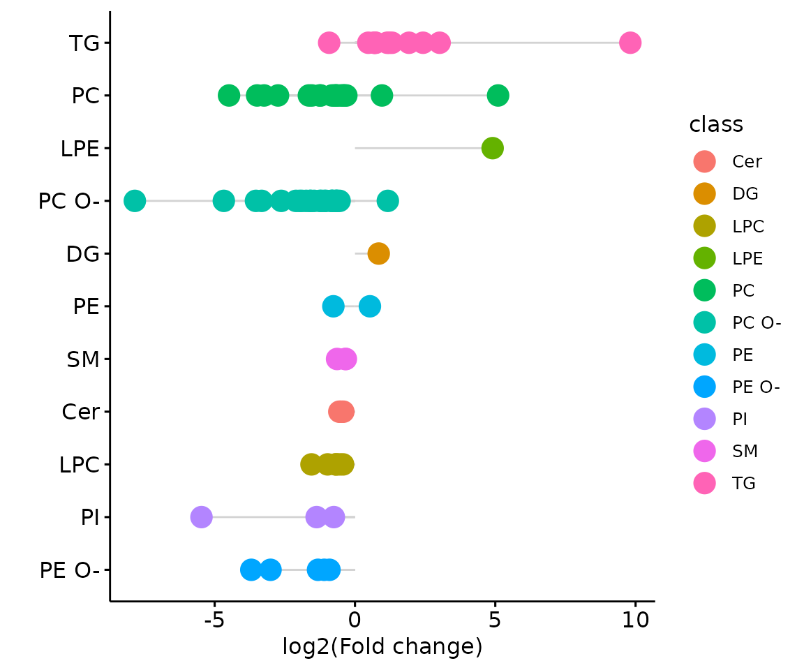
The lollipop chart of all significant groups The lollipop chart compares multiple values simultaneously and it aligns the log2(fold change) of all significant groups (values) within the selected characteristics.
# view result: word cloud
result_char$static_wordCloud
Word cloud with the count of each group The word cloud shows the count of each group(value) of the selected characteristics.
Double bond-chain length analysis
This section provides heatmaps that illustrates the correlation between the double bond and chain length of lipid species. The color in the heatmaps is gradient according to log2FC.
The correlation is visually represented by cell colors—red indicates a positive correlation, while blue indicates a negative. Significant correlations are highlighted with an asterisk sign on the plot.
- You can obtain the selectable lipid characteristics for the
charinput usingLipidSigR::list_lipid_char. Please readvignette("1_tool_function").
Here, we use class as the char input for an
example.
# conduct double bond-chain length analysis (without setting `char_feature`)
heatmap_all <- heatmap_chain_db(
    processed_se, char='class', char_feature=NULL, ref_group='ctrl',
    test='t-test', significant='pval', p_cutoff=0.05,
    FC_cutoff=1, transform='log10')

# result summary
summary(heatmap_all)
#>             Length Class  Mode
#> total_chain 5      -none- list
#> each_chain  5      -none- list

# summary of total chain result
summary(heatmap_all$total_chain)
#>                       Length Class                Mode
#> static_heatmap         9     gg                   list
#> table_heatmap         21     data.frame           list
#> processed_abundance   24     data.frame           list
#> transformed_abundance 24     data.frame           list
#> chain_db_se           86     SummarizedExperiment S4

# view result: heatmap of total chain
heatmap_all$total_chain$static_heatmap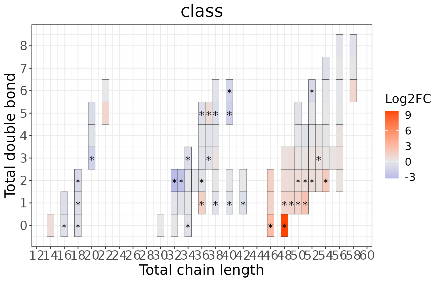
# summary of each chain result
summary(heatmap_all$each_chain)
#>                       Length Class                Mode
#> static_heatmap         9     gg                   list
#> table_heatmap         21     data.frame           list
#> processed_abundance   24     data.frame           list
#> transformed_abundance 24     data.frame           list
#> chain_db_se           19     SummarizedExperiment S4

# view result: heatmap of each chain
heatmap_all$each_chain$static_heatmap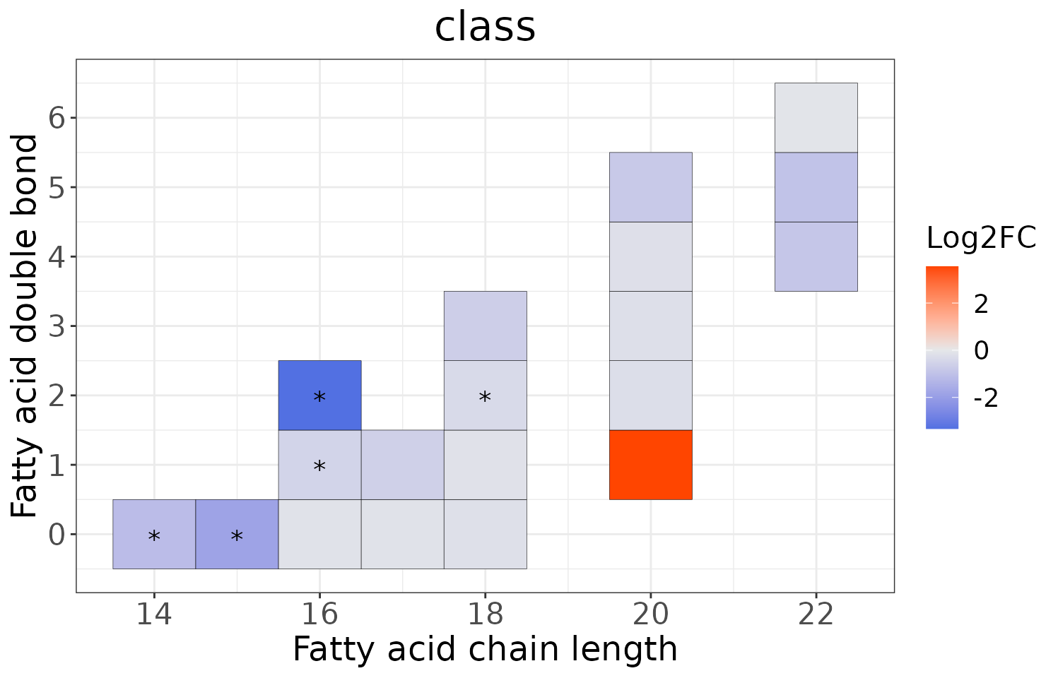
# conduct double bond-chain length analysis (a specific `char_feature`)
heatmap_one <- heatmap_chain_db(
    processed_se, char='class', char_feature='PC', ref_group='ctrl',
    test='t-test', significant='pval', p_cutoff=0.05,
    FC_cutoff=1, transform='log10')

# result summary
summary(heatmap_one)
#>             Length Class  Mode
#> total_chain 5      -none- list
#> each_chain  5      -none- list

# summary of total chain result
summary(heatmap_one$total_chain)
#>                       Length Class                Mode
#> static_heatmap         9     gg                   list
#> table_heatmap         22     data.frame           list
#> processed_abundance   24     data.frame           list
#> transformed_abundance 24     data.frame           list
#> chain_db_se           25     SummarizedExperiment S4

# view result: heatmap of total chain
heatmap_one$total_chain$static_heatmap
# summary of each chain result
summary(heatmap_one$each_chain)
#>                       Length Class                Mode
#> static_heatmap         9     gg                   list
#> table_heatmap         22     data.frame           list
#> processed_abundance   24     data.frame           list
#> transformed_abundance 24     data.frame           list
#> chain_db_se           18     SummarizedExperiment S4

# view result: heatmap of each chain
heatmap_one$each_chain$static_heatmap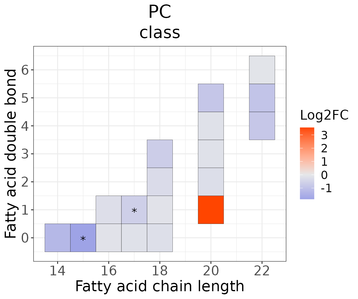
The data in chain_db_se can be viewed using
LipidSigR::extract_summarized_experiment. Please read
vignette("1_tool_function").
You can further plot an abundance box plot for any lipid species of
interest by LipidSigR::boxPlot_feature_twoGroup. For
multi-group data, please use
LipidSigR::boxPlot_feature_multiGroup.
For example, let’s use 15:0, a significant lipid species
from the heatmap above.
# plot abundance box plot of "15:0"
boxPlot_result <- boxPlot_feature_twoGroup(
    heatmap_one$each_chain$chain_db_se, feature='15:0',
    ref_group='ctrl', test='t-test', transform='log10')

# result summary
summary(boxPlot_result)
#>                Length Class        Mode
#> static_boxPlot 9      gg           list
#> table_boxplot  7      data.frame   list
#> table_stat     5      rstatix_test list

# view result: static box plot
boxPlot_result$static_boxPlot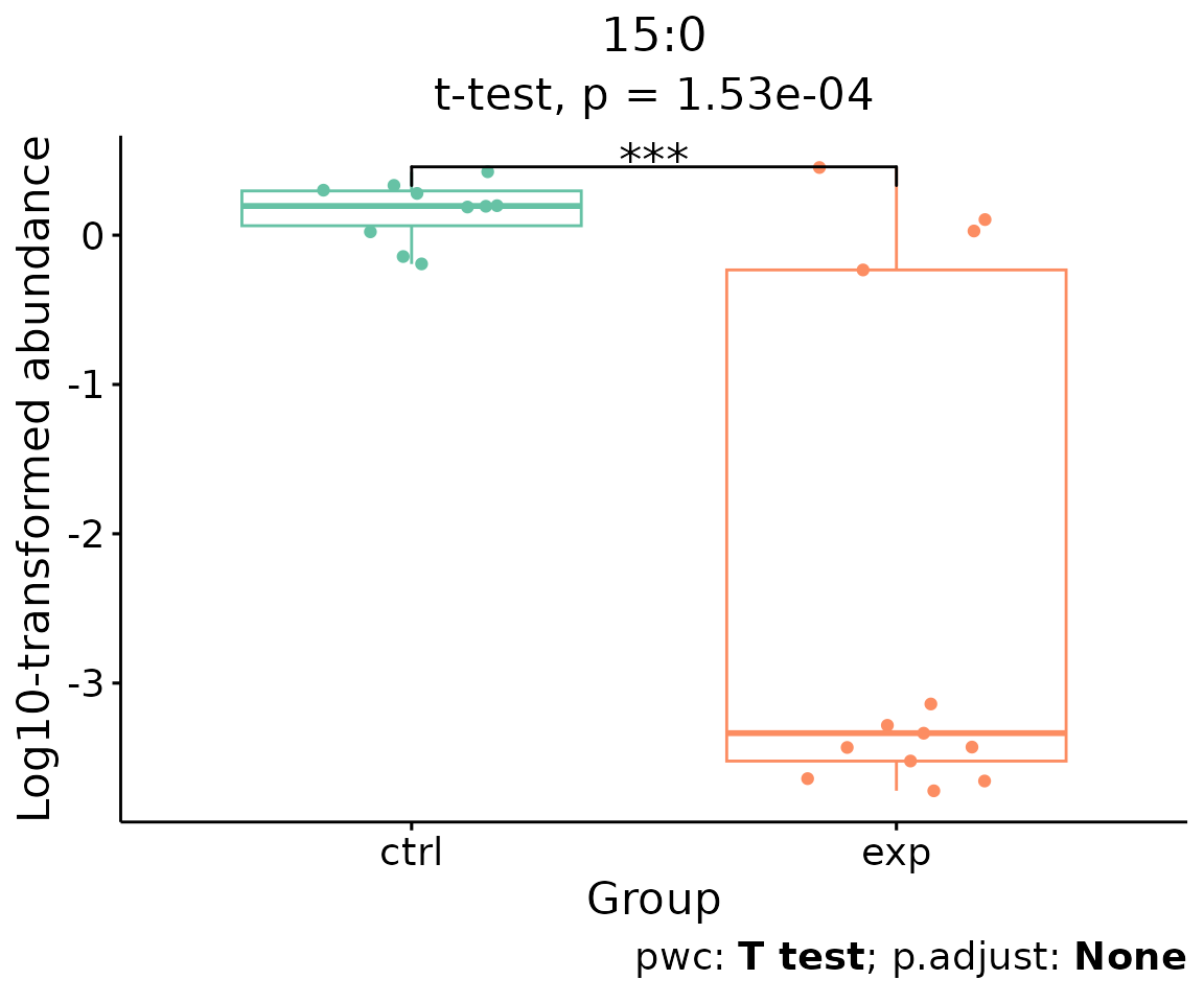
Box plot of lipid abundance An asterisk sign indicates significant differences between groups. The absence of an asterisk or line denotes a non-significant difference between groups.