“Profiling” provides an overview of comprehensive analyses to efficiently examine data quality, the clustering of samples, the correlation between lipid species, and the composition of lipid characteristics.
All of the input data of functions must be a SummarizedExperiment
object constructed by LipidSigR::as_summarized_experiment.
For detailed instructions for constructing SummarizedExperiment object,
please read vignette("1_tool_function")
- NOTE: Some functions will require
processed_se, which is the SummarizedExperiment object after being processed byLipidSigR::data_process. Please readvignette("1_tool_function")
To use our data as an example, follow the steps below.
# load package
library(LipidSigR)

# load the example SummarizedExperiment
data("de_data_twoGroup")
se <- de_data_twoGroup

# data processing
processed_se <- data_process(
    de_data_twoGroup, exclude_missing=TRUE, exclude_missing_pct=70,
    replace_na_method='min', replace_na_method_ref=0.5,
    normalization='Percentage')
Cross-sample variability
There are three types of distribution plots, which could provide a simple view of sample variability a simple view of sample variability to compare the amount/abundance difference of lipid between samples (i.e., patients vs. control).
# conduct profiling
result <- cross_sample_variability(se)

# result summary
summary(result)
#>                                  Length Class      Mode
#> interactive_lipid_number_barPlot 8      plotly     list
#> interactive_lipid_amount_barPlot 8      plotly     list
#> interactive_lipid_distribution   8      plotly     list
#> static_lipid_number_barPlot      9      gg         list
#> static_lipid_amount_barPlot      9      gg         list
#> static_lipid_distribution        9      gg         list
#> table_total_lipid                3      data.frame list
#> table_lipid_distribution         3      data.frame list
After running the above code, you will obtain a list called
result, containing interactive plots, static plots, and
tables for three types of distribution plots. (Note: Only static
plots are displayed here.)
# view result: histogram of lipid numbers
result$static_lipid_number_barPlot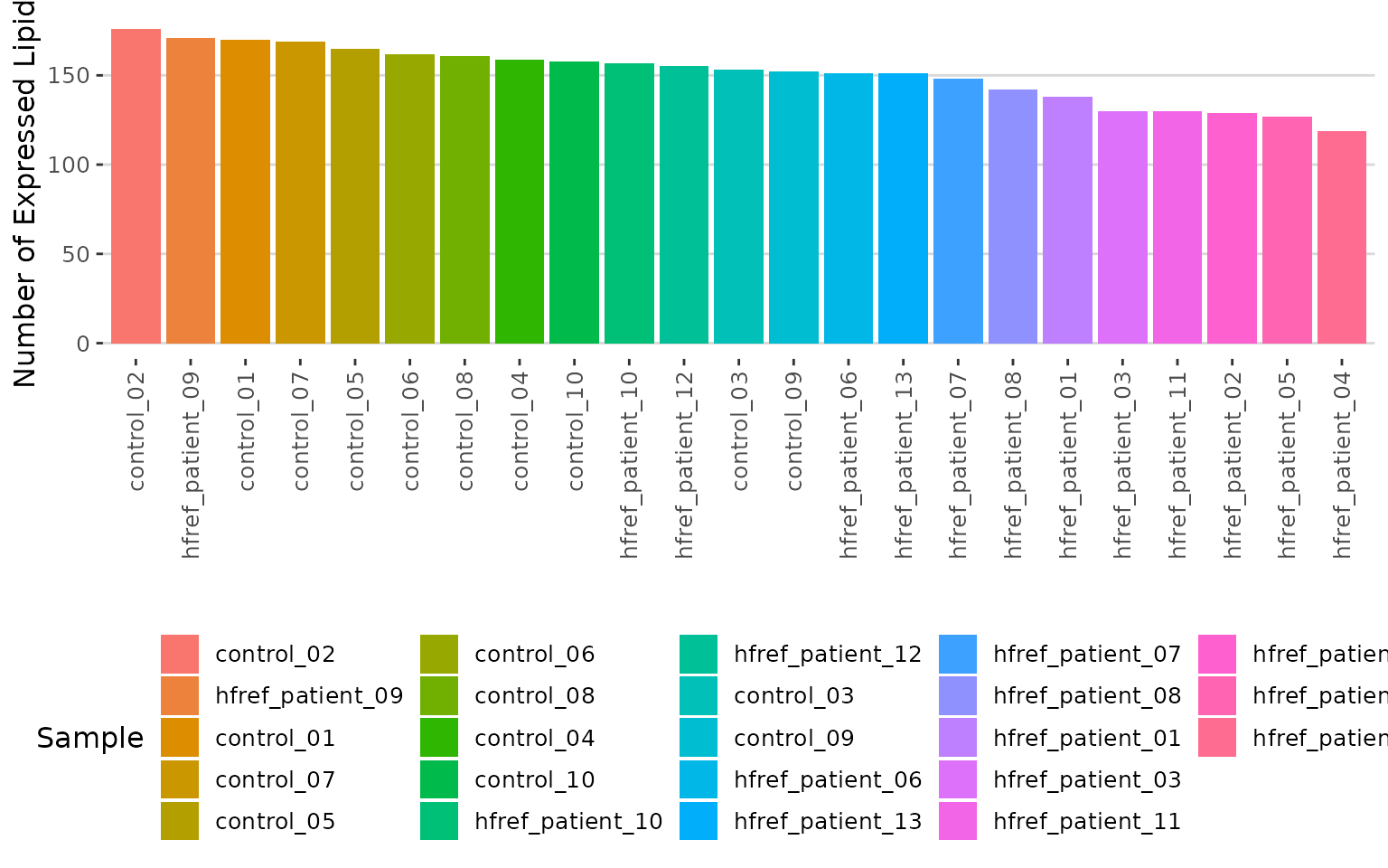
Histogram of lipid numbers The histogram overviews the total number of lipid species over samples. From the plot, we can discover the number of lipid species present in each sample.
# view result: histogram of the total amount of lipid in each sample.
result$static_lipid_amount_barPlot 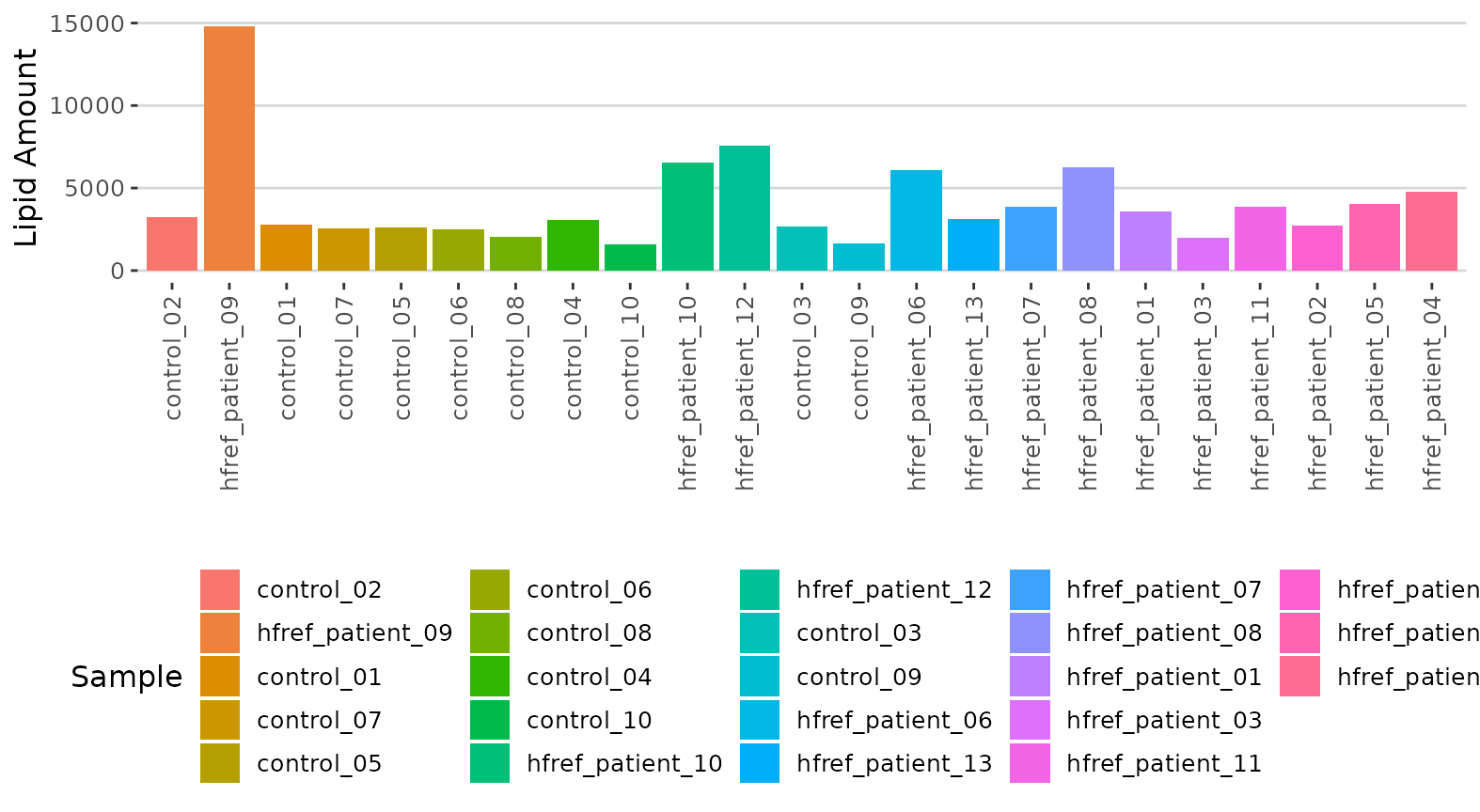
Histogram of lipid amount The histogram describes the variability of the total lipid amount between samples.
# view result: density plot of the underlying probability distribution
result$static_lipid_distribution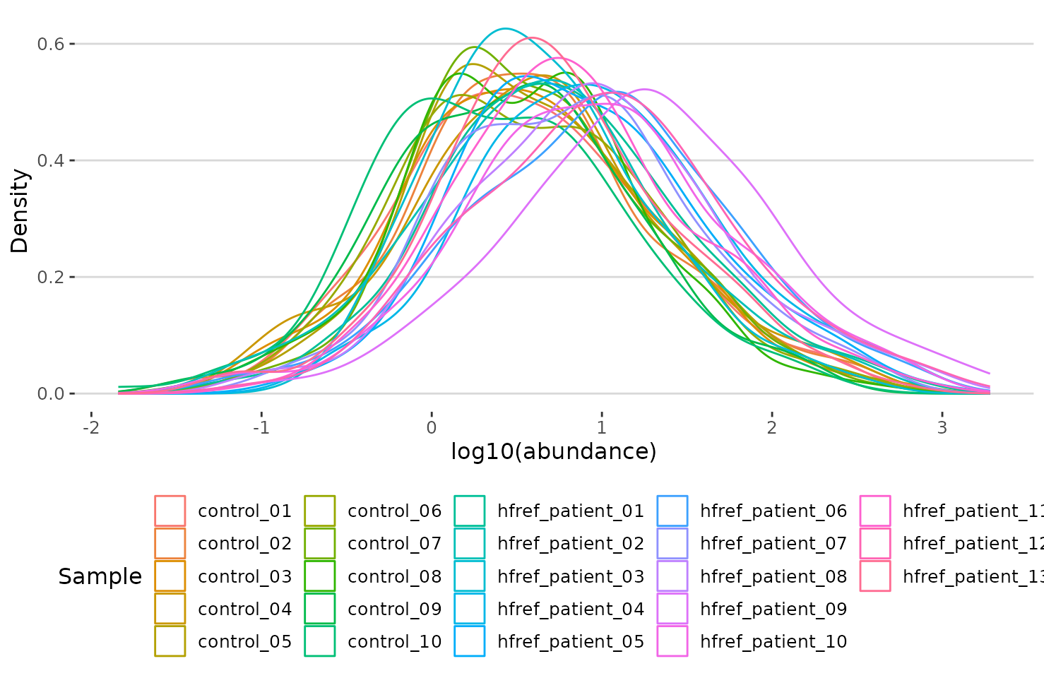
Density plot of abundance distribution The density plot uncovers the distribution of lipid abundance in each sample (line). From this plot, we can have a deeper view of the distribution between samples.
Dimensionality reduction
Dimensionality reduction is commonly used when dealing with large numbers of observations and/or large numbers of variables in lipids analysis. It transforms data from a high-dimensional space into a low-dimensional space so that it retains vital properties of the original data and is close to its intrinsic dimension.
Here we provide 3 dimensionality reduction methods, PCA, t-SNE, UMAP. As for the number of groups shown on the PCA, t-SNE, and UMAP plot, it can be defined by users (default: 2 groups).
PCA
PCA (Principal component analysis) is an unsupervised linear dimensionality reduction and data visualization technique for high dimensional data, which tries to preserve the global structure of the data. Scaling (by default) indicates that the variables should be scaled to have unit variance before the analysis takes place, which removes the bias towards high variances. In general, scaling (standardization) is advisable for data transformation when the variables in the original dataset have been measured on a significantly different scale. As for the centering options (by default), we offer the option of mean-centering, subtracting the mean of each variable from the values, making the mean of each variable equal to zero. It can help users to avoid the interference of misleading information given by the overall mean.
# conduct PCA
result_pca <- dr_pca(
    processed_se, scaling=TRUE, centering=TRUE, clustering='kmeans',
    cluster_num=2, kmedoids_metric=NULL, distfun=NULL, hclustfun=NULL,
    eps=NULL, minPts=NULL, feature_contrib_pc=c(1,2), plot_topN=10)

# result summary
summary(result_pca)
#>                                  Length Class      Mode
#> pca_rotated_data                 25     data.frame list
#> table_pca_contribution           24     data.frame list
#> interactive_pca                   8     plotly     list
#> interactive_screePlot             8     plotly     list
#> interactive_feature_contribution  8     plotly     list
#> interactive_variablePlot          8     plotly     list
#> static_pca                        9     gg         list
#> static_screePlot                  9     gg         list
#> static_feature_contribution       9     gg         list
#> static_variablePlot               9     gg         list
After running the above code, you will obtain a list containing interactive plots, static plots, and tables for three types of distribution plots. (Note: Only static plots are displayed here.)
# view result: PCA plot
result_pca$static_pca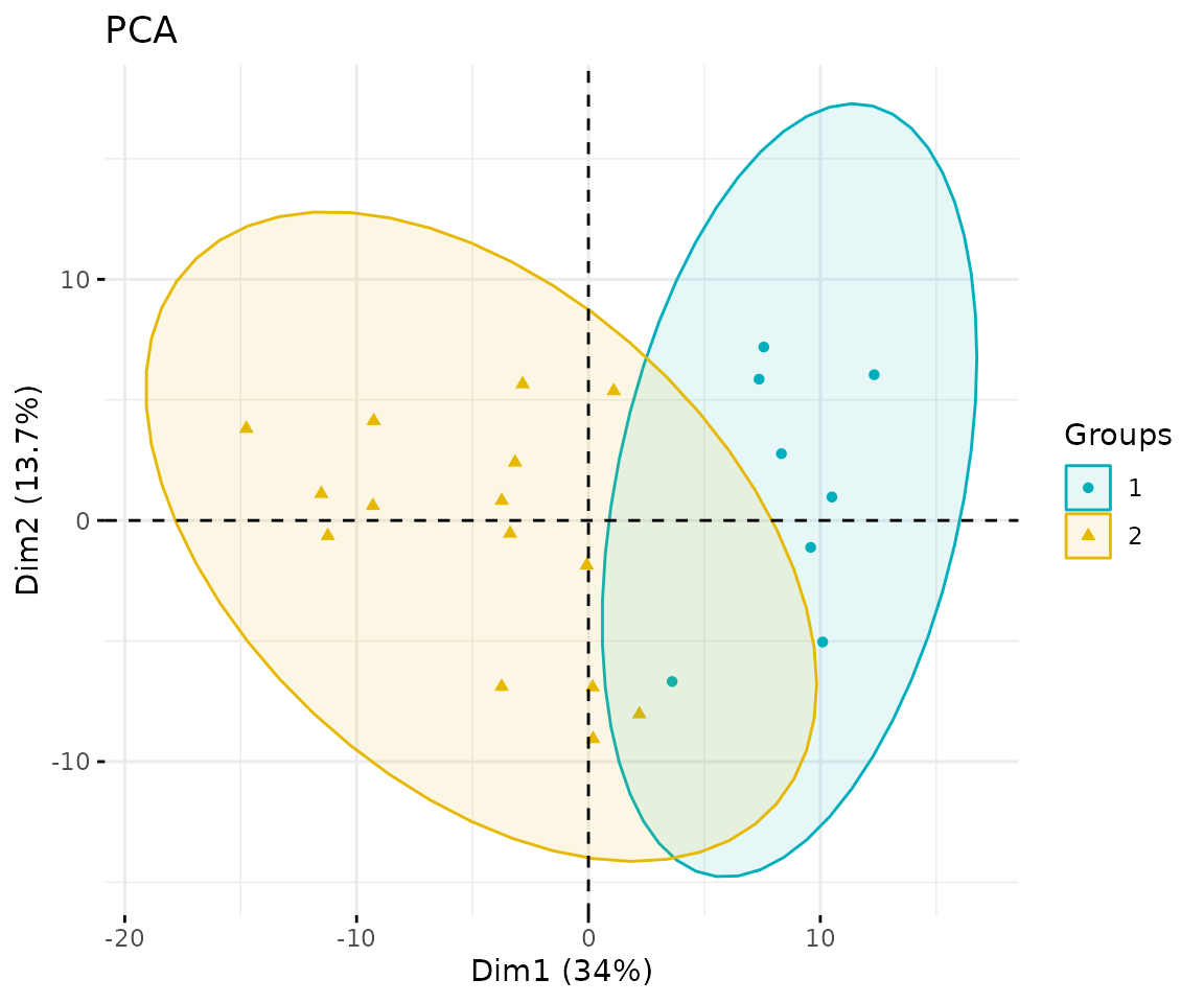
PCA plot
# view result: scree plot of top 10 principle components
result_pca$static_screePlot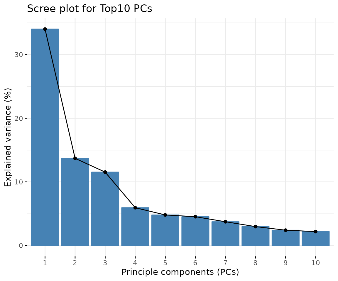
Scree plot A common method for determining the number of PCs to be retained. The ‘elbow’ of the graph indicates all components to the left of this point can explain most variability of the samples
# view result: correlation circle plot of PCA variables
result_pca$static_feature_contribution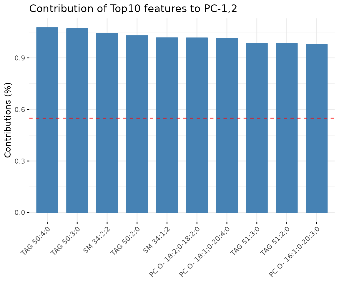
Correlation circle plot The correlation circle plot showing the correlation between a feature (lipid species) and a principal component (PC) used as the coordinates of the variable on the PC (Abdi and Williams 2010). The positively correlated variables are in the same quadrants while negatively correlated variables are on the opposite sides of the plot origin. The closer a variable to the edge of the circle, the better it represents on the factor map.
# view result: bar plot of contribution of top 10 features
result_pca$static_variablePlot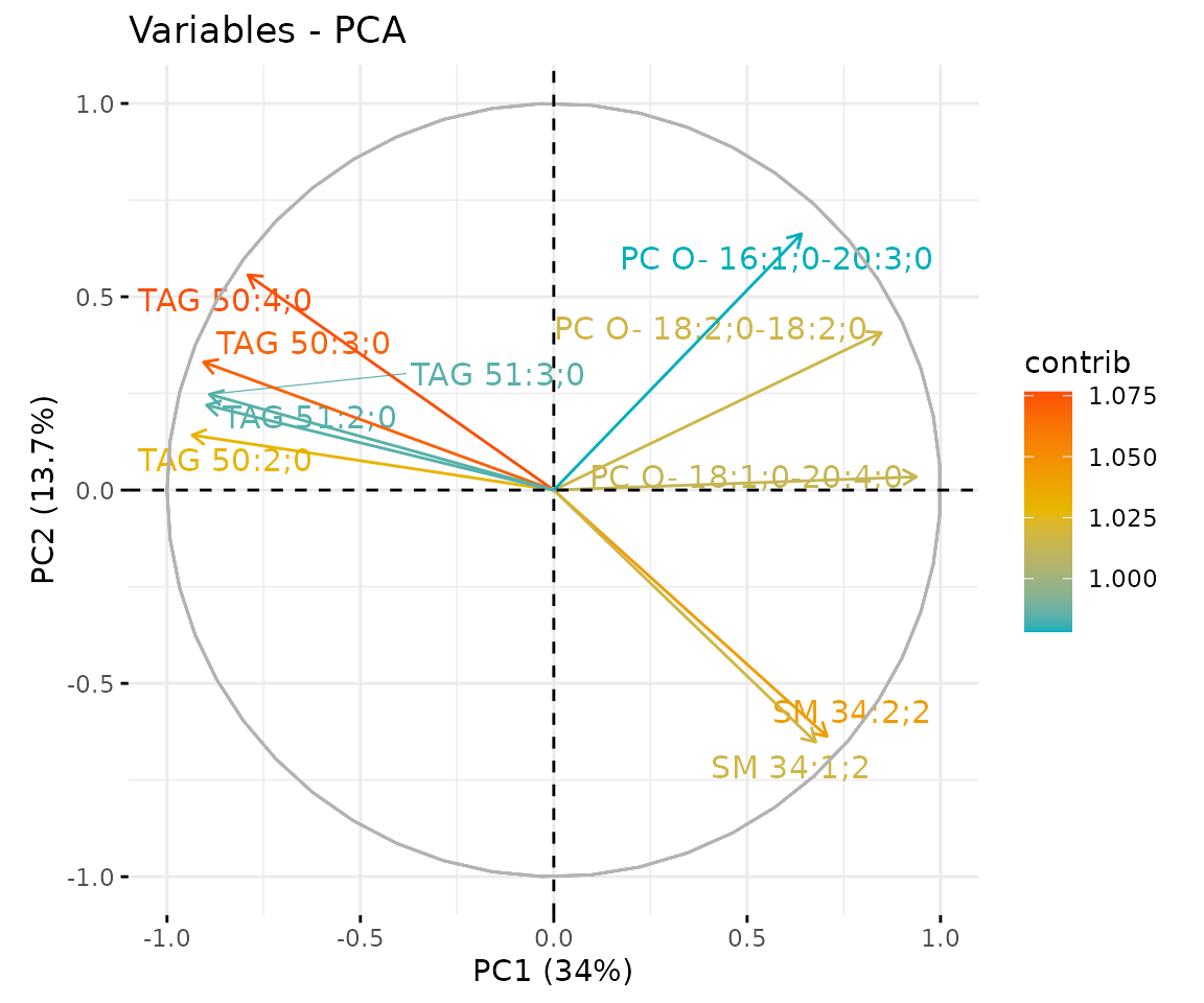
Bar plot of contribution of top 10 features The plot displaysthe features (lipid species) that contribute more to the user-defined principal component.
t-SNE
t-SNE (t-Distributed Stochastic Neighbour Embedding) is an
unsupervised non-linear dimensionality reduction technique that tries to
retain the local structure(cluster) of data when visualising the
high-dimensional datasets. Package Rtsne is used for
calculation, and PCA is applied as a pre-processing step. In t-SNE,
perplexity and max_iter are adjustable for
users. The perplexity may be considered as a knob that sets
the number of effective nearest neighbours, while max_iter
is the maximum number of iterations to perform. The typical perplexity
range between 5 and 50, but if the t-SNE plot shows a ‘ball’ with
uniformly distributed points, you may need to lower your perplexity
(Van der Maaten and Hinton 2008).
# conduct t-SNE
result_tsne <- dr_tsne(
    processed_se, pca=TRUE, perplexity=5, max_iter=500, clustering='kmeans',
    cluster_num=2, kmedoids_metric=NULL, distfun=NULL, hclustfun=NULL,
    eps=NULL, minPts=NULL)
#> Performing PCA
#> Read the 23 x 23 data matrix successfully!
#> OpenMP is working. 1 threads.
#> Using no_dims = 2, perplexity = 5.000000, and theta = 0.000000
#> Computing input similarities...
#> Symmetrizing...
#> Done in 0.00 seconds!
#> Learning embedding...
#> Iteration 50: error is 56.559190 (50 iterations in 0.00 seconds)
#> Iteration 100: error is 65.870763 (50 iterations in 0.00 seconds)
#> Iteration 150: error is 53.136938 (50 iterations in 0.00 seconds)
#> Iteration 200: error is 62.870296 (50 iterations in 0.00 seconds)
#> Iteration 250: error is 53.016960 (50 iterations in 0.00 seconds)
#> Iteration 300: error is 1.363893 (50 iterations in 0.00 seconds)
#> Iteration 350: error is 0.959177 (50 iterations in 0.00 seconds)
#> Iteration 400: error is 0.685417 (50 iterations in 0.00 seconds)
#> Iteration 450: error is 0.427892 (50 iterations in 0.00 seconds)
#> Iteration 500: error is 0.222133 (50 iterations in 0.00 seconds)
#> Fitting performed in 0.00 seconds.

# result summary
summary(result_tsne)
#>                  Length Class      Mode
#> tsne_result      4      data.frame list
#> interactive_tsne 8      plotly     list
#> static_tsne      9      gg         list
# view result: t-SNE plot
result_tsne$static_tsne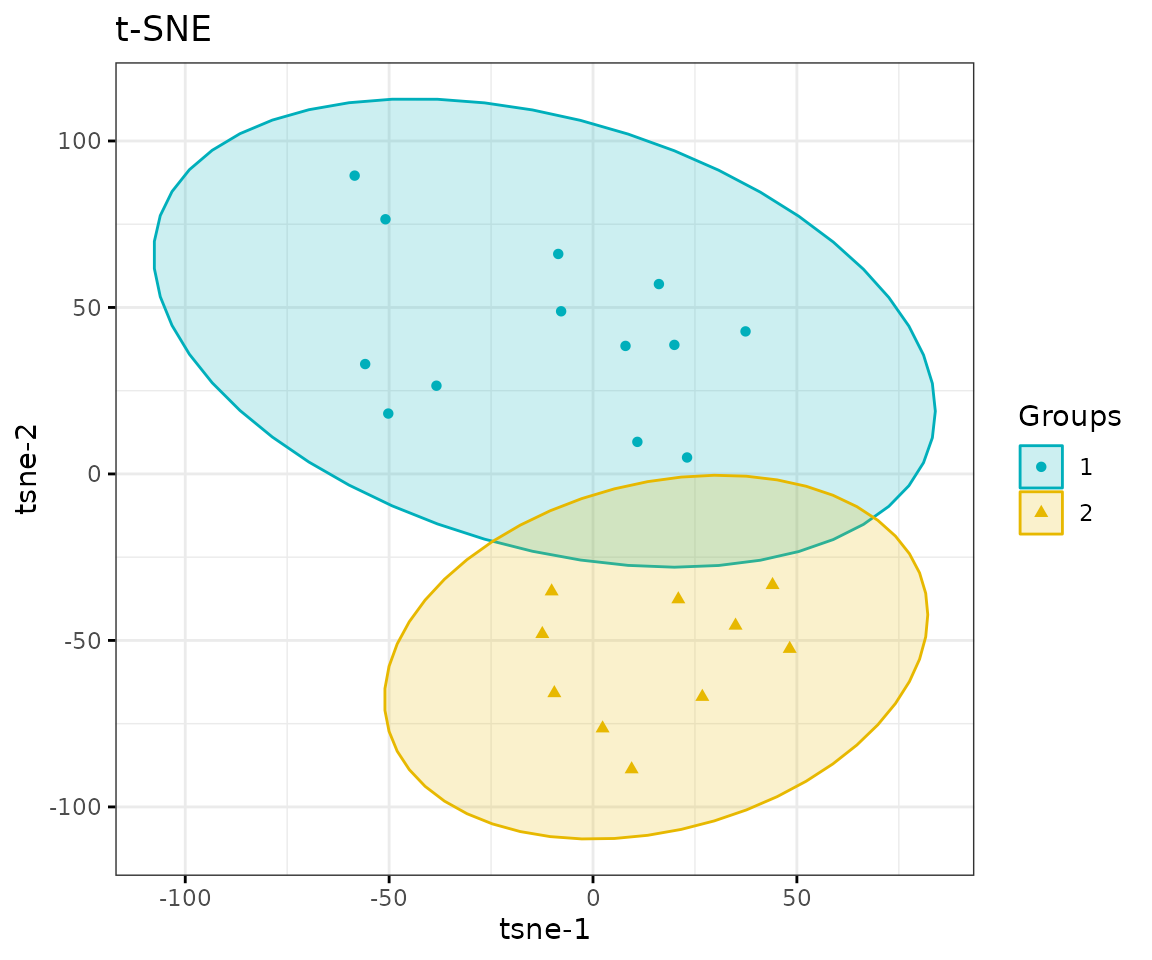
t-SNE plot
UMAP
UMAP (Uniform Manifold Approximation and Projection) using a nonlinear dimensionality reduction method, Manifold learning, which effectively visualizing clusters or groups of data points and their relative proximities. Both tSNE and UMAP are intended to predominantly preserve the local structure that is to group neighbouring data points which certainly delivers a very informative visualization of heterogeneity in the data. The significant difference with t-SNE is scalability, which allows UMAP eliminating the need for applying pre-processing step (such as PCA). Besides, UMAP applies Graph Laplacian for its initialization as tSNE by default implements random initialization. Thus, some people suggest that the key problem of tSNE is the Kullback-Leibler (KL) divergence, which makes UMAP superior over t-SNE. Nevertheless, UMAP’s cluster may not good enough for multi-class pattern classification (McInnes, Healy, and Melville 2018).
The type of distance metric to find nearest neighbors the size of the
local neighborhood (as for the number of neighboring sample points) are
set by parameter metric and n_neighbors.
Larger values lead to more global views of the manifold, while smaller
values result in more local data being preserved. Generally, values are
set in the range of 2 to 100. (default: 15).
# conduct UMAP
result_umap <- dr_umap(
    processed_se, n_neighbors=15, scaling=TRUE, umap_metric='euclidean',
    clustering='kmeans', cluster_num=2, kmedoids_metric=NULL,
    distfun=NULL, hclustfun=NULL, eps=NULL, minPts=NULL)

# result summary
summary(result_umap)
#>                  Length Class      Mode
#> umap_result      4      data.frame list
#> interactive_umap 8      plotly     list
#> static_umap      9      gg         list
# view result: UMAP plot
result_umap$static_umap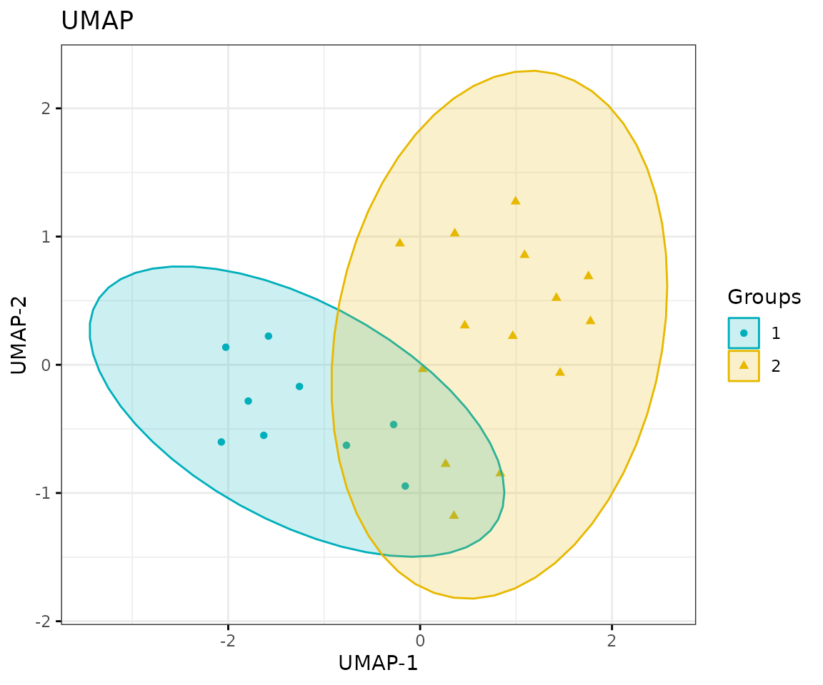
UMAP plot
Correlation heatmap
The correlation heatmap illustrates the correlation between samples
or lipid species and also depicts the patterns in each group. The
correlation is calculated by the method defined by parameter
corr_method, and the correlation coefficient is then
clustered depending on method defined by parameter distfun
and the distance defined by parameter hclustfun. Users can
choose to output the sample correlation or lipid correlation results by
the parameter type.
Please note that if the number of lipids or samples is over 50, the names of lipids/samples will not be shown on the heatmap.
Here, we use type='sample' as example.
# correlation calculation
result_heatmap <- heatmap_correlation(
    processed_se, char=NULL, transform='log10', correlation='pearson',
    distfun='maximum', hclustfun='average', type='sample')

# result summary
summary(result_heatmap)
#>                     Length Class              Mode
#> interactive_heatmap   1    IheatmapHorizontal S4
#> static_heatmap        3    recordedplot       list
#> corr_coef_matrix    529    -none-             numeric
# view result: sample-sample heatmap
result_heatmap$static_heatmap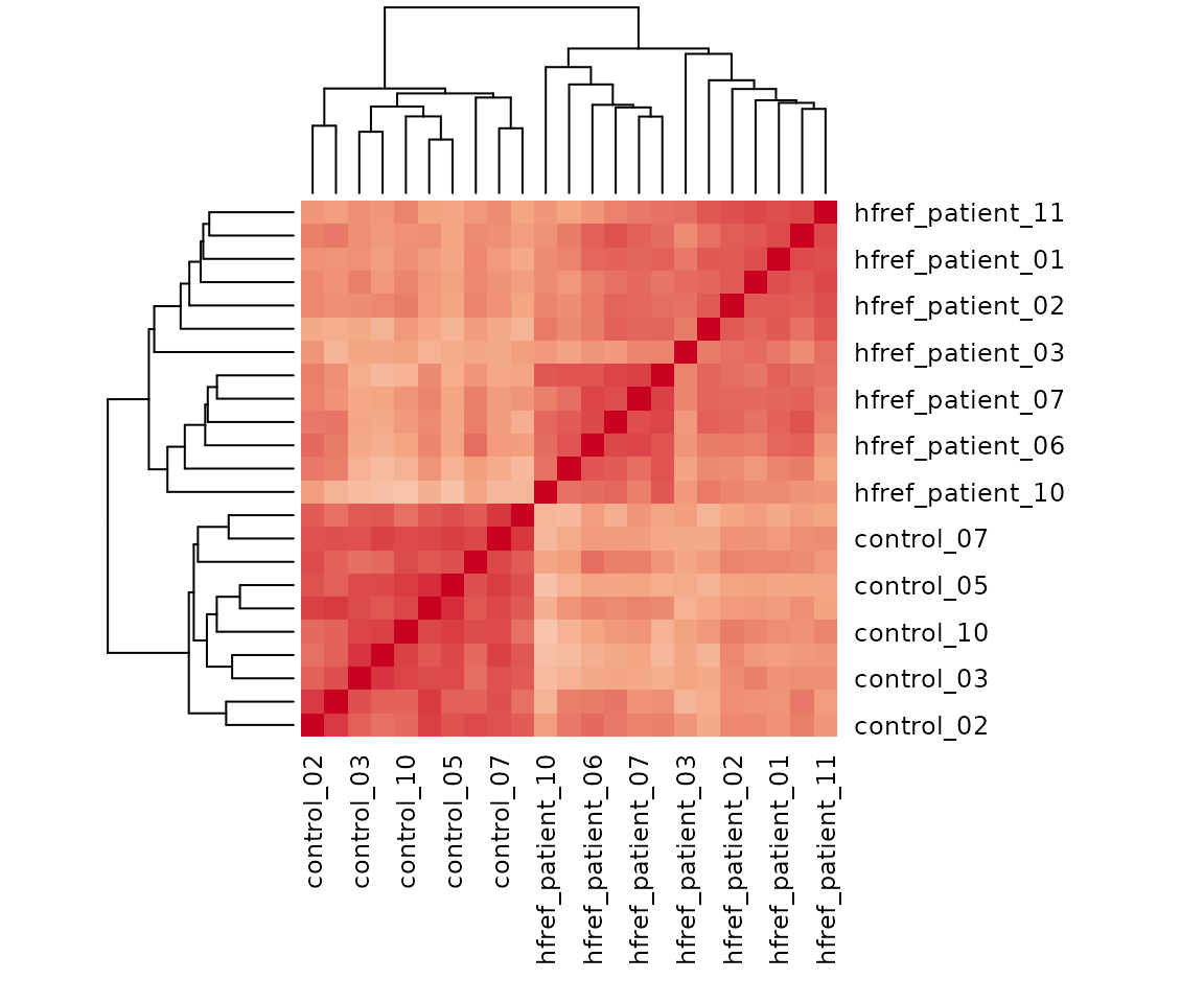
Heatmap of sample to sample correlations Correlations between lipid species are colored from strong positive correlations (red) to no correlation (white).
Lipid characteristics
You can take a view of lipid expression over specific lipid characteristics. First, lipids are classified by characteristics selected from the ‘Lipid characteristics’ table. Here, we select “class” as the selected lipid characteristic. The results will be showed by two plots.
- You can obtain the selectable lipid characteristics for the
charinput usingLipidSigR::list_lipid_char. Please readvignette("1_tool_function").
Here, we use class as the char input for an
example.
# calculate lipid expression of selected characteristic
result_lipid <- lipid_profiling(processed_se, char="class")
#> There are 4 ratio characteristics that can be converted in your dataset.

# result summary
summary(result_lipid)
#>                               Length Class  Mode
#> interactive_char_barPlot      8      plotly list
#> interactive_lipid_composition 8      plotly list
#> static_char_barPlot           9      gg     list
#> static_lipid_composition      9      gg     list
#> table_char_barPlot            5      tbl_df list
#> table_lipid_composition       5      tbl_df list
# view result: bar plot
result_lipid$static_char_barPlot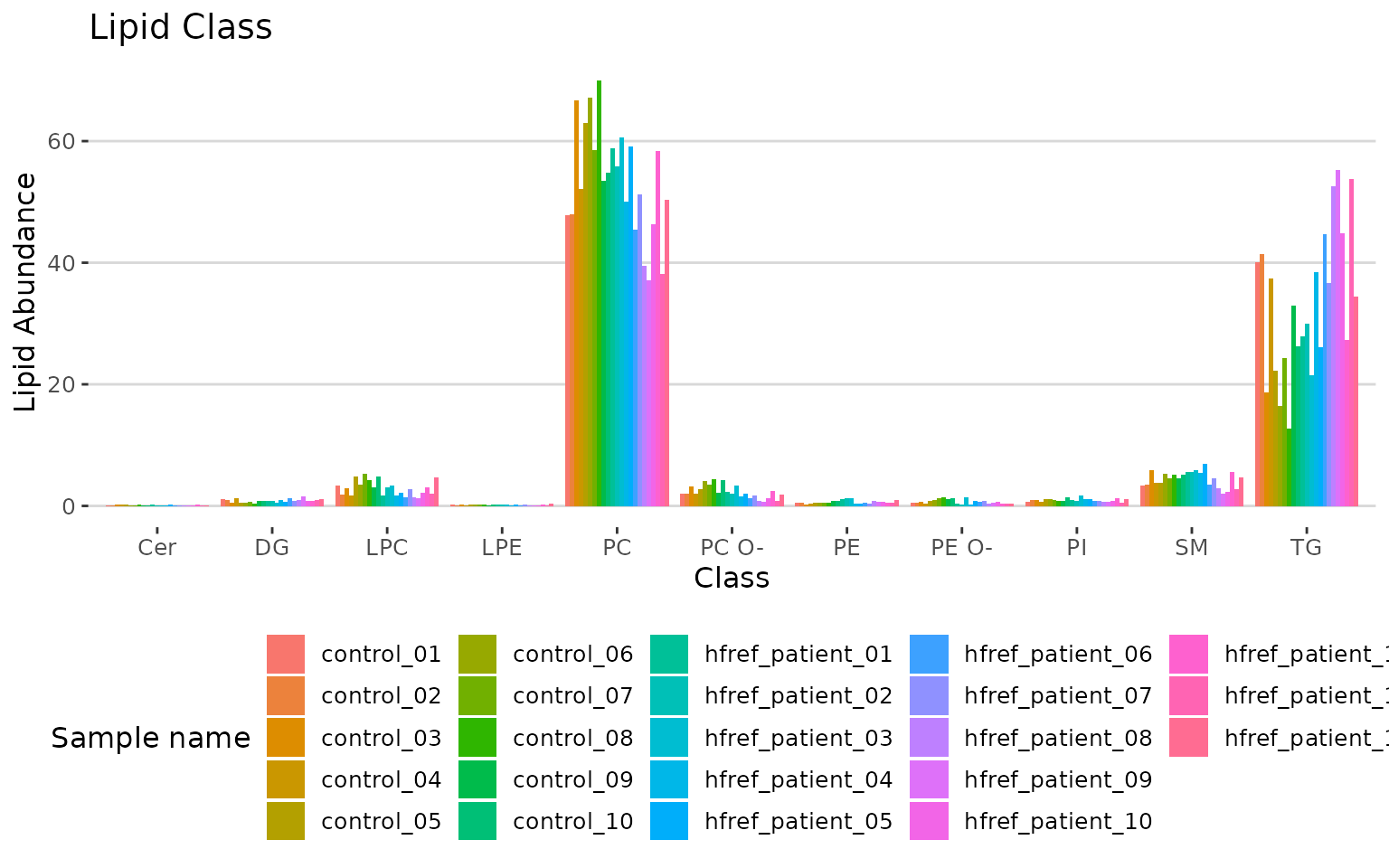
Bar plot classified by selected characteristic The bar plot depicts the abundance level of each sample within each group (e.g., PE, PC) of selected characteristics (e.g., class).
# view result: stacked horizontal bar chart
result_lipid$static_lipid_composition 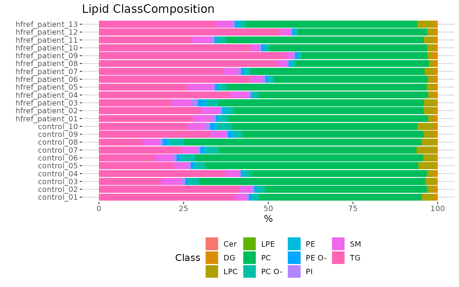
Lipid class composition The stacked horizontal bar chart illustrates the percentage of characteristics in each sample. The variability of percentage between samples can also be obtained from this plot.