“Machine learning” provides many feature selection methods and classifiers for building binary classification models. Additionally, several following analyses help users evaluate algorithm performance and identify key lipid-related variables.
All of the input data of functions must be a SummarizedExperiment
object constructed by LipidSigR::as_summarized_experiment.
For detailed instructions for constructing SummarizedExperiment object,
please read vignette("1_tool_function").
- NOTE: Some functions will require
processed_se, which is the SummarizedExperiment object after being processed byLipidSigR::data_process. Please readvignette("1_tool_function").
To use our data as an example, follow the steps below.
# load package
library(LipidSigR)

# load the example SummarizedExperiment
data("ml_data")

# data processing
processed_se <- data_process(
    ml_data, exclude_missing=TRUE, exclude_missing_pct=70,
    replace_na_method='min', replace_na_method_ref=0.5,
    normalization='Percentage')
Model construction
In the machine learning section, we will apply various feature selection methods and assess each feature’s importance. Data on lipid species and lipid characteristics will be combined to predict a binary outcome using multiple machine-learning approaches, allowing us to identify the optimal feature combination for further analysis. Monte Carlo cross-validation (MCCV) will be used to evaluate model performance and achieve statistical significance.
Monte Carlo cross-validation (MCCV) is a model validation technique that creates multiple random datasets split into training and validation sets. This method helps prevent the development of unnecessarily large models and reduces the risk of over-fitting during calibration. By conducting split-sample cross-validation multiple times and aggregating the results, MCCV allows us to quantify the predictive performance of a candidate model robustly.
Each cross-validation run randomly divides the data into training and
testing sets. The training data is used to select the top 2, 3, 5, 10,
20, 50, or 100 important features for model training. The model is then
validated using the testing data. If the dataset contains fewer than 100
features, the maximum number of features is set to the total available.
The proportion of data used for testing and the number of
cross-validation iterations can be defined by the parameters
split_prop and nfold, respectively. (Note:
Increasing the number of cross-validation iterations will result in
longer computation times.)
Feature selection methods are designed to identify and rank the most
important variables for predicting the target outcome. Our platform
offers two categories of feature selection methods: univariate and
multivariate analysis. In univariate analysis, methods such as p-value,
p-value*Fold Change, and ROC are used to compare each feature between
two groups. The user can set the criteria for ranking the features.
Based on users’ settings, the top N features are chosen using metrics
like -log10(p-value), -log10(p-value)*Fold Change, or the Area Under
Curve (AUC). For multivariate analysis, we provide options including
Random Forest, Linear SVM (e1071), Lasso
(glmnet), Ridge (glmnet), and ElasticNet
(glmnet). Random Forest (ranger) utilizes
built-in feature importance metrics, while the other methods rank
features based on the absolute values of their coefficients. (Note:
The names in parentheses indicate the software packages used.)
The provided 8 feature ranking methods and 6 classification methods for training and selecting the best model are listed below.
1. Feature ranking methods: p-value, p-value*FC, ROC, Random Forest, Linear SVM, Lasso, Ridge, ElasticNet.
2. Classification methods: Random Forest, Linear SVM, Lasso, Ridge, ElasticNet, XGBoost.
# list available lipid characteristic
list_lipid_char(processed_se)$ml_char_list
#>  Lipid classification Fatty acid properties Fatty acid properties
#>               "class"                "FA.C"               "FA.DB"
#> Fatty acid properties Fatty acid properties Fatty acid properties
#>               "FA.OH"            "Total.DB"            "Total.OH"

# construct machine learning model
ml_se <- ml_model(
    processed_se, char=c("class","Total.DB"), transform='log10',
    ranking_method='Random_forest', ml_method='Random_forest',
    split_prop=0.3, nfold=10, alpha=NULL)
#> Processing CV fold 1
#> Processing CV fold 2
#> Processing CV fold 3
#> Processing CV fold 4
#> Processing CV fold 5
#> Processing CV fold 6
#> Processing CV fold 7
#> Processing CV fold 8
#> Processing CV fold 9
#> Processing CV fold 10
After running the above code, a SummarizedExperiment object
ml_se will be returned. It includes the input abundance
data, lipid characteristic table, group information table, model
results, and input parameter settings. You can view the data in
ml_se by
LipidSigR::extract_summarized_experiment. Please read
vignette("1_tool_function").
# view machine learning analysis
ml_model_result <- extract_summarized_experiment(ml_se)

# result summary
summary(ml_model_result)
#>                           Length Class      Mode
#> abundance                 229    data.frame list
#> lipid_char_table           72    data.frame list
#> group_info                  2    data.frame list
#> char                        2    -none-     character
#> transform                   1    -none-     character
#> ranking_method              1    -none-     character
#> ml_method                   1    -none-     character
#> nfold                       1    -none-     numeric
#> feature_option              7    -none-     numeric
#> model_result                8    data.frame list
#> confusion_matrix            6    data.frame list
#> roc_result                  7    data.frame list
#> pr_result                   7    data.frame list
#> mean_roc_result             9    grouped_df list
#> feature_importance_result   6    data.frame list
#> selected_features          10    -none-     list
#> best_model                  7    -none-     list
#> best_model_feature          7    -none-     list
ml_se can also be used as input for plotting and further
analyses such as ROC/PR curve, model performance, predicted
probability, feature importance, and network analysis.
ROC/PR curve
Receiver Operating Characteristic (ROC) and Precision-Recall (PR) curves are commonly used to assess the diagnostic performance of binary classifiers. The mean AUC and 95% confidence interval for each feature count for both ROC and PR curves are calculated across all cross-validation (CV) runs. Generally, a higher AUC indicates better model performance. The PR curve is especially useful for datasets with a highly imbalanced class distribution (i.e., rare positive samples), providing a more informative measure of an algorithm’s effectiveness in these cases (Davis and Goadrich 2006). A random classifier typically yields an ROC-AUC around 0.5 and a PR-AUC close to the positive sample proportion. Conversely, an AUC of 1 for both metrics indicates perfect model performance.
To combine the testing results from all CV runs, 300 thresholds are evenly distributed from 0 to 1. The thresholds are then calculated for the corresponding sensitivity, specificity, precision, and recall with predicted probabilities and accurate labels of testing samples in each CV. These values are then averaged to plot a final ROC and PR curve.
Now, we are going to conduct calculation for plotting ROC curves first, and then the PR curves.
# plotting ROC curves
roc_result <- plot_ml_roc(ml_se, feature_num=10)

# result summary
summary(roc_result)
#>                      Length Class      Mode
#> interactive_mean_auc 8      plotly     list
#> static_mean_auc      9      gg         list
#> initeractive_roc     8      plotly     list
#> static_roc           9      gg         list
#> table_mean_auc_plot  6      data.frame list
#> table_roc            5      data.frame list
For interpreting the results, the ROC curve is generated by plotting ‘sensitivity’ (the proportion of correctly classified positive samples) on the y-axis against ‘1-specificity’ (the proportion of correctly classified negative samples) on the x-axis, using various threshold values. Generally, a more robust model will have an ROC curve approaching the upper left corner.
# view result: ROC curve plot
roc_result$static_mean_auc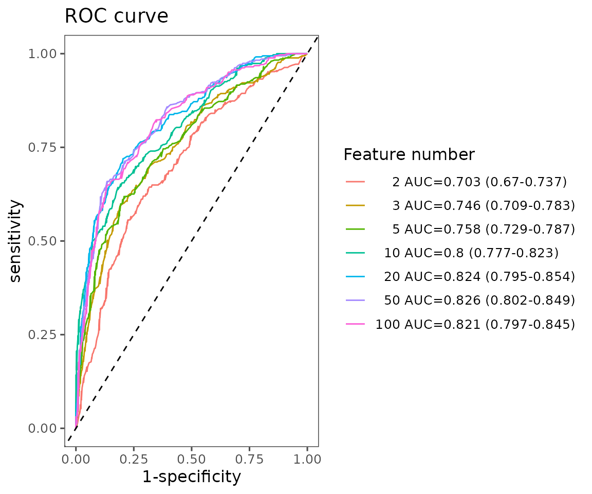
ROC curve plot The plot shows the average ROC curve for different feature numbers with their mean AUC and 95% confidence interval.
# view result: average ROC curve plot of 10 features
roc_result$static_roc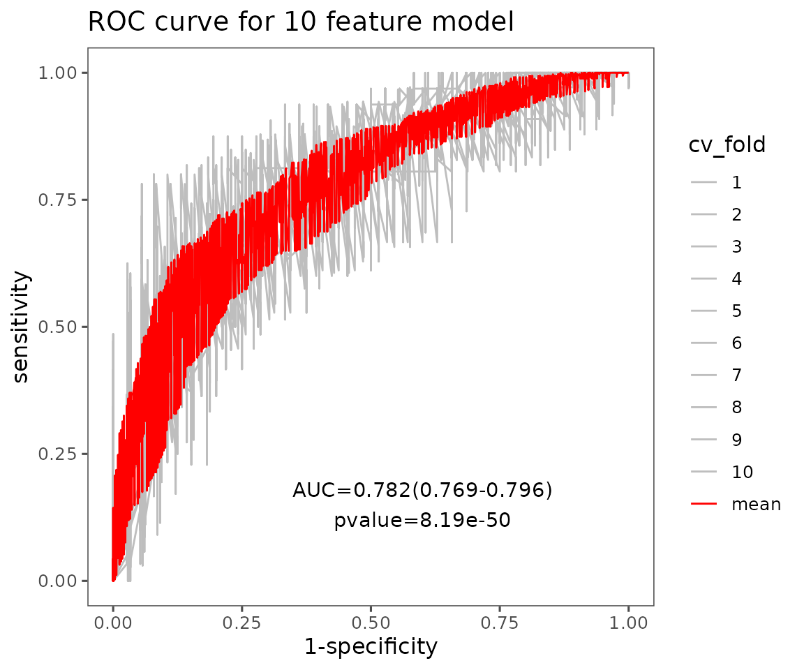
Average ROC curve plot of 10 features The plot displays average ROC curves of user-defined features. Each CV is in grey, and the red line is the average of those cross-validations (CVs) for the ROC curves.
# plotting PR curves
pr_result <- plot_ml_pr(ml_se, feature_num=10)

# result summary
summary(pr_result)
#>                      Length Class      Mode
#> interactive_mean_auc 8      plotly     list
#> static_mean_auc      9      gg         list
#> initeractive_pr      8      plotly     list
#> static_pr            9      gg         list
#> table_mean_auc_plot  6      data.frame list
#> table_pr             5      data.frame list
The PR curve plots ‘precision’ (the proportion of actual positives out of predicted positive samples) on the y-axis and ‘recall’ (equal to sensitivity) on the x-axis. Generally, a more robust model will have a PR curve closer to the upper right corner.
# view result: PR curve plot
pr_result$static_mean_auc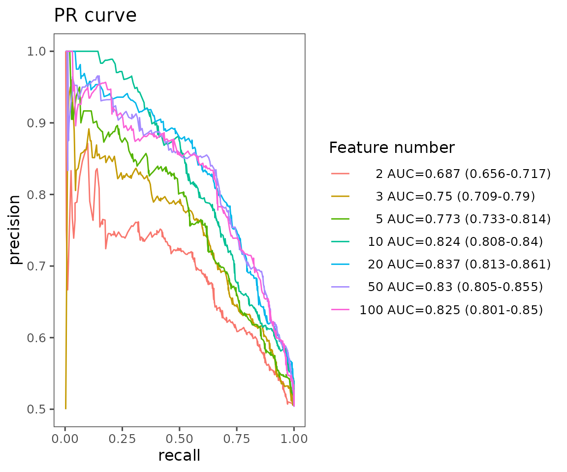
PR curve plot The plot shows the average PR curve for different feature numbers with their mean AUC and 95% confidence interval.
# view result: average PR curve plot of 10 features
pr_result$static_pr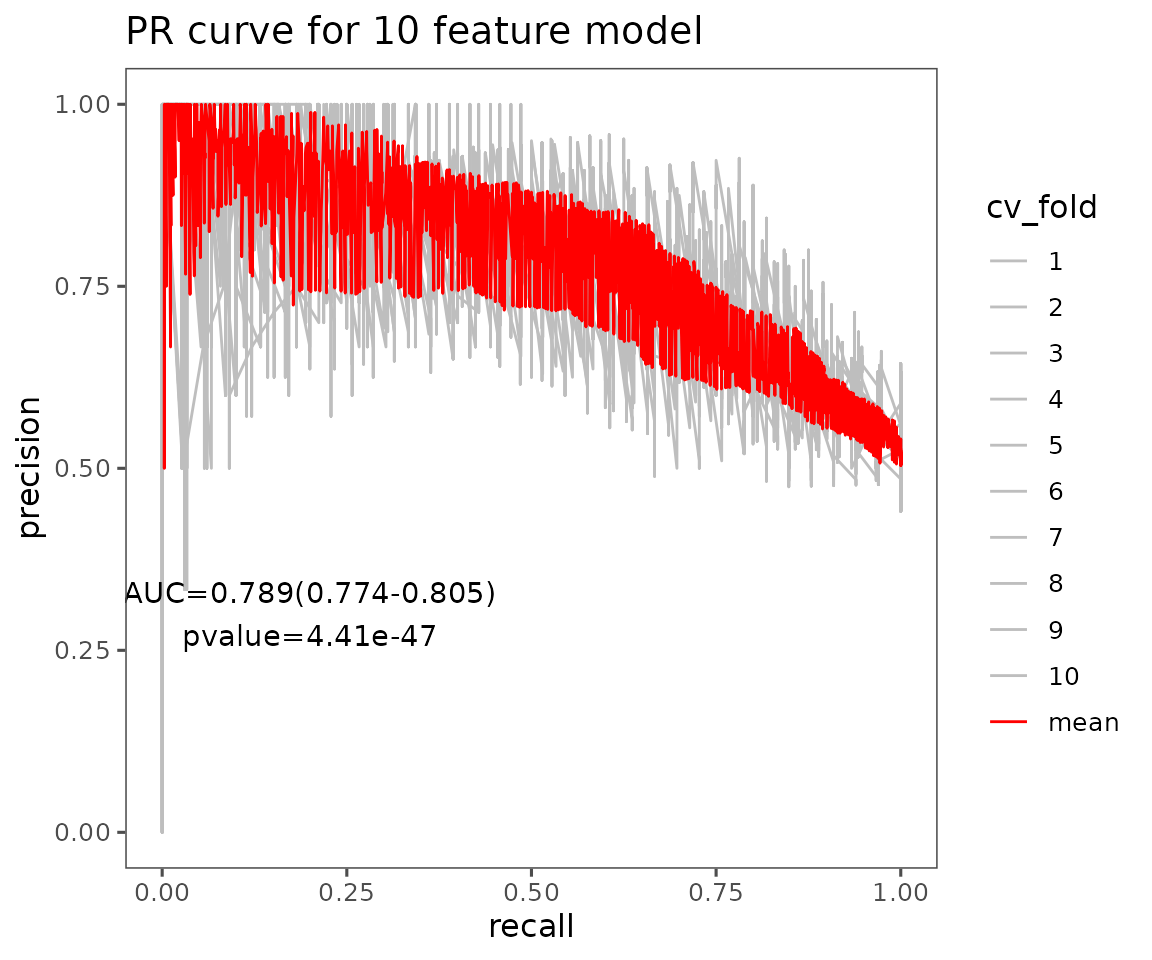
Average PR curve plot of 10 features The plot displays the average PR curves of user-defined features. Each CV is in grey, and the red line is the average of those cross-validations (CVs) for the PR curves.
Model performance
After constructing the model, it is essential to evaluate its performance. We offer several valuable indicators for this purpose. For each feature count, we calculate and plot the average value and 95% confidence interval of metrics such as accuracy, sensitivity (recall), specificity, positive predictive value (precision), negative predictive value, F1 score, prevalence, detection rate, detection prevalence, and balanced accuracy across all CV runs using the confusion matrix function in the caret package. Each of these indicators is defined in terms of true positives (TP), false positives (FP), false negatives (FN), and true negatives (TN).
Here, all the provided evaluation indicators are listed below. We can
define the evaluation method by the parameter
eval_method.
Sensitivity = Recall \(= \frac{TP}{(TP + FN)}\)
Specificity \(= \frac{TN}{(FP + TN)}\)
Prevalence \(= \frac{(TP + FN)}{(TP + FP + FN + TN)}\)
Positive predictive value (PPV) = Precision \(= \frac{TP}{(TP + FP)}\)
Negative predictive value (NPV) \(= \frac{TN}{(FN + TN)}\)
Detection rate \(= \frac{TP}{(TP + FP + FN + TN)}\)
Detection prevalence \(= \frac{(TP + FP)}{(TP + FP + FN + TN)}\)
F1 score \(= \frac{2 \times Precision \times Recall}{(Precision + Recall)}\)
# conduct model evaluation
eval_result <- plot_ml_evaluation(ml_se, eval_method='Accuracy')

# result summary
summary(eval_result)
#>                             Length Class      Mode
#> interactive_evaluation_plot  8     plotly     list
#> static_evaluation_plot      10     gg         list
#> table_evaluation             7     grouped_df list
#> table_evaluation_plot        6     tbl_df     list

# view result: model performance plot
eval_result$static_evaluation_plot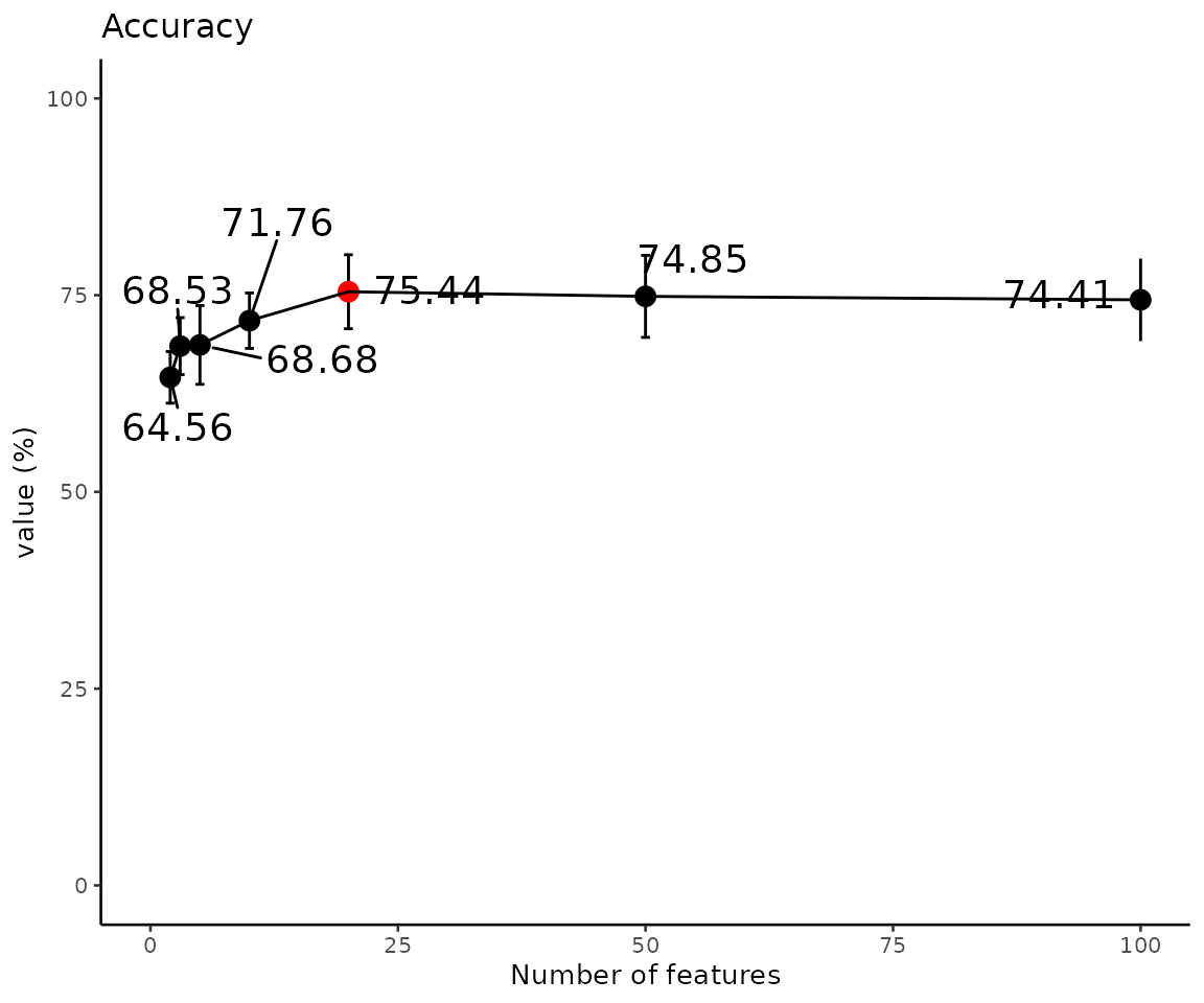
Model performance (Accuracy) The evaluation plot shows the model performance of accuracy. The highest value is marked in red.
Predicted probability
The average predicted probabilities for each sample in the testing data across all CV runs help us identify and investigate incorrect or uncertain labels.
# compute and visualize the average predicted probabilities
prob_result <- plot_ml_probability(ml_se, feature_num=10)

# result summary
summary(prob_result)
#>                              Length Class      Mode
#> interactive_probability_plot  8     plotly     list
#> static_probability_plot      10     gg         list
#> static_confusion_matrix      10     gg         list
#> table_probability_plot        7     data.frame list
#> table_confusion_matrix        5     grouped_df list

# view result: the distribution of predicted probabilities
prob_result$static_probability_plot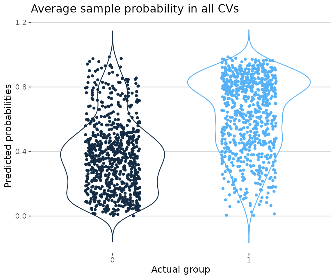
Probability plot In the plot showing the distribution of average sample probabilities across all CV runs, each point represents a sample, with its value being the mean prediction from all models in all cross-validations. The y-axis displays the predicted probabilities, indicating the likelihood that each machine learning model predicts a value of one. Specifically, the blue group represents samples where both the actual and predicted values are one, while the black group represents samples where the actual value is zero but the predicted value is one. Ideally, the black group should be as close to zero as possible, while the blue group should be as close to one.
# view result: confusion matrix of sample number and proportion
prob_result$static_confusion_matrix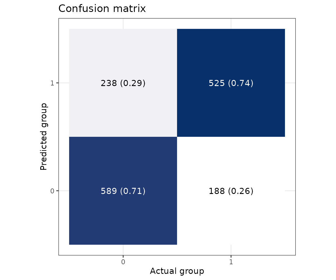
Confusion matrix In the confusion matrix, the y-axis indicates the predicted class, and the x-axis is the actual class. Therefore, the upper left is a true positive, the upper right is a false positive, the lower left is a false negative, and the lower right is a true negative. The numbers are the counts, and the number in the bracket is the percentage.
Feature importance
After building a high-accuracy model, we examine each feature’s contribution. Two methods, ‘Algorithm-based’ and ‘SHAP analysis’, are provided to rank and visualize feature importance.
Algorithm-based
In the ‘Algorithm-based’ section, setting a specific
feature count using the feature_num parameter displays the
selection frequency and average importance of the top 10 features across
all CV runs. For models like Linear SVM, Lasso, Ridge, and ElasticNet,
feature importance will be based on their coefficients’ absolute values,
and Random Forest and XGBoost use their built-in feature importance
metrics.
# compute and rank the contribution of each feature
feature_result <- plot_ml_feature(ml_se, feature_num=10)

# result summary
summary(feature_result)
#>                                Length Class      Mode
#> interactive_selected_frequency  8     plotly     list
#> static_selected_frequency      10     gg         list
#> interactive_feature_importance  8     plotly     list
#> static_feature_importance      10     gg         list
#> table_selected_frequency        5     data.frame list
#> table_feature_importance        5     grouped_df list

# view result: selected frequency plot
feature_result$static_selected_frequency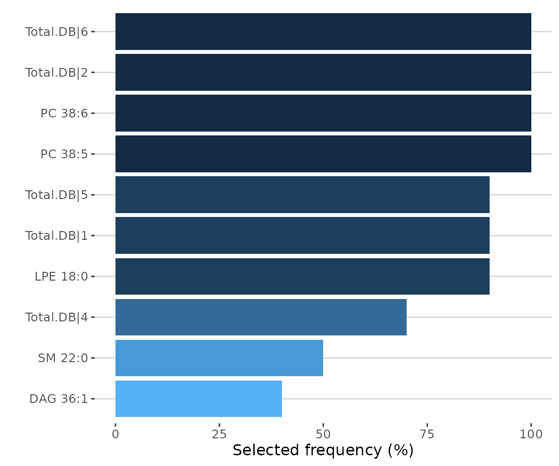
SHAP analysis
The Shapley Additive exPlanations (SHAP) method was recently introduced to explain individual predictions for any machine learning model based on Shapley values from game theory. For more detailed information, refer to the paper “A Unified Approach to Interpreting Model Predictions” (2017). (Lundberg and Lee 2017).
The analysis relies on ROC-AUC and PR-AUC results. The feature number
can be set using the feature_num parameter. Based on this
specified feature count, the best-performing model across all CVs is
selected to compute approximate Shapley values for each feature for all
samples using the fastshap package in R.
# conduct SHAP
shap_se <- ml_shap(ml_se, feature_num=10, nsim=5)
After running the above code, a SummarizedExperiment object
shap_se will be returned. It includes the input abundance
data, lipid characteristic table, group information table, analysis
results, and input parameter settings. You can view the data in
shap_se by
LipidSigR::extract_summarized_experiment. Please read
vignette("1_tool_function").
# view machine learning analysis
shap_result <- extract_summarized_experiment(shap_se)

# result summary
summary(shap_result)
#>                  Length Class      Mode
#> abundance        11     data.frame list
#> lipid_char_table  1     data.frame list
#> feature_num       1     -none-     numeric
#> nsim              1     -none-     numeric
#> shap_result       6     data.frame list
#> shap_score       10     data.frame list
shap_se can used to visualize several plots by further
functions, such as plot_ml_shap,
plot_shap_sample, plot_shap_force, and
plot_shap_dependence. The instructions for these functions
are provided in sequence below.
library(SHAPforxgboost)

# plot SHAP results
shap_plots <- plot_ml_shap(shap_se)

# result summary
summary(shap_plots)
#>                                Length Class      Mode
#> interactive_feature_importance  8     plotly     list
#> static_feature_importance      10     gg         list
#> interactive_summary_plot        8     plotly     list
#> static_summary_plot             9     gg         list
#> table_feature_importance        2     data.frame list
#> table_summary_plot             10     data.table list

# view result: SHAP feature importance plot
shap_plots$static_feature_importance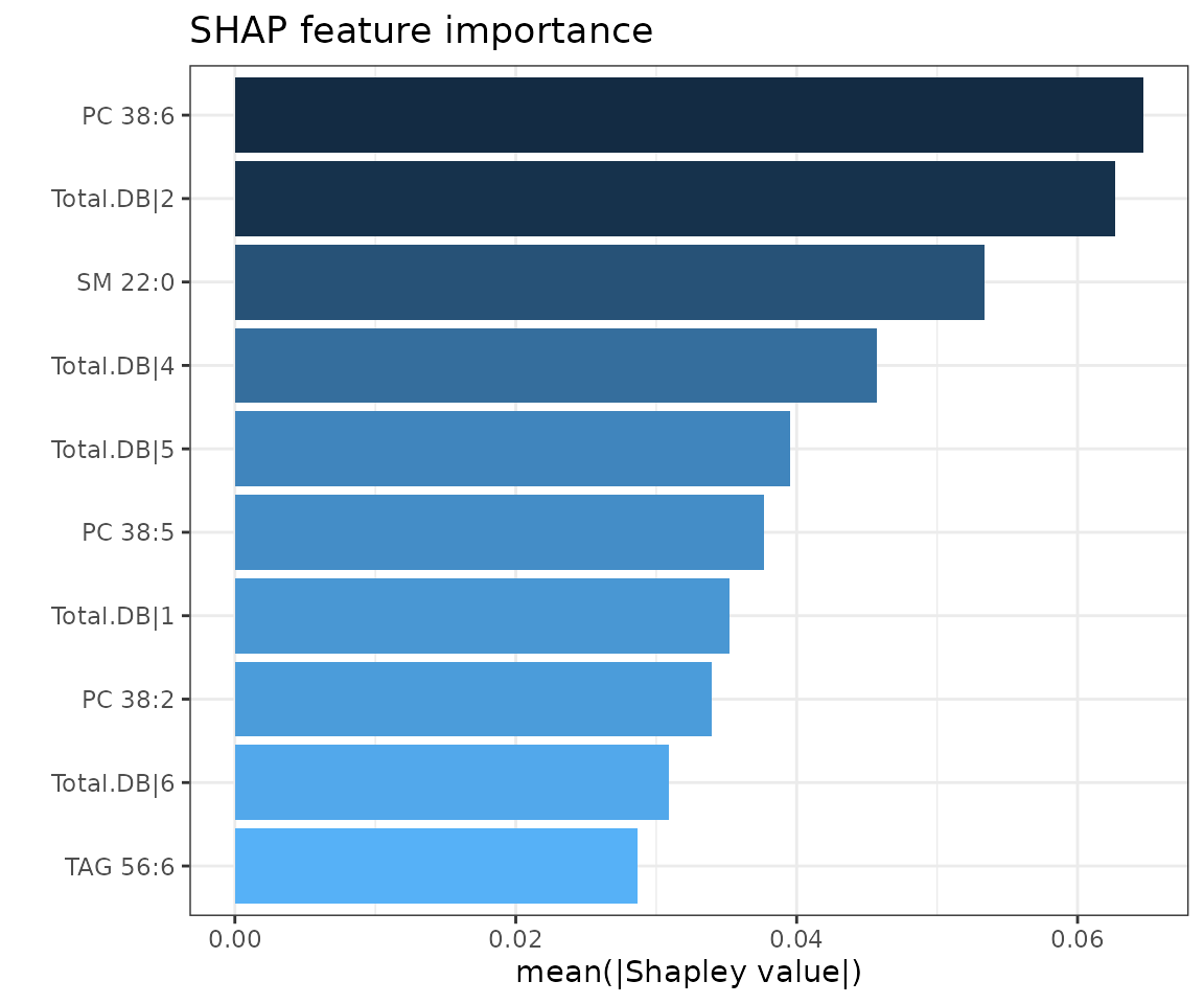
SHAP feature importance plot The top 10 features are ranked and demonstrated according to the average absolute value of shapely values from all samples.
# view result: SHAP summary plot
shap_plots$static_summary_plot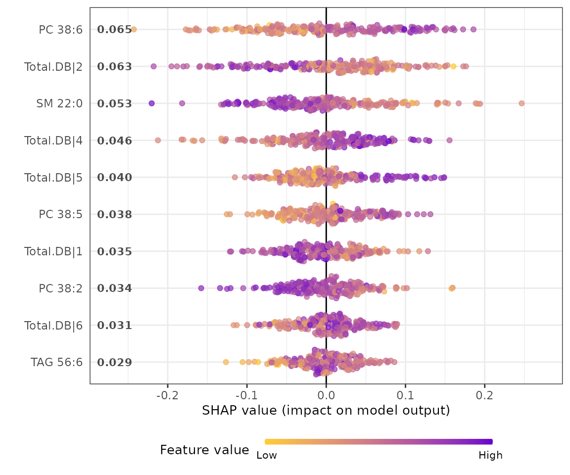
SHAP summary plot The SHAP summary plot illustrates the distribution of all shapely values for each feature. It uses sina plot to present important features by binary patterns. The color exemplifying the value of the feature from low (yellow) to high (purple) indicates the variable is high/low for that observation. The x-axis presents whether the impact is positive or negative on quality rating (target variable). In the summary plot, the relationship between the value of a feature and the influence on the prediction is shown.
Next, we are going to visualize the SHAP feature importance of N samples.
# sample list
sample_id_list <- unique(S4Vectors::metadata(shap_se)$shap_result$ID)

# visualize SHAP feature importance of 10 samples
sample_plots <- plot_shap_sample(shap_se, sample_id=sample_id_list[10])

# result summary
summary(sample_plots)
#>                                       Length Class      Mode
#> interactive_sample_feature_importance  8     plotly     list
#> static_sample_feature_importance      10     gg         list
#> table_sample_feature_importance        7     data.frame list

# view result: SHAP feature importance plot of 10 samples
sample_plots$static_sample_feature_importance 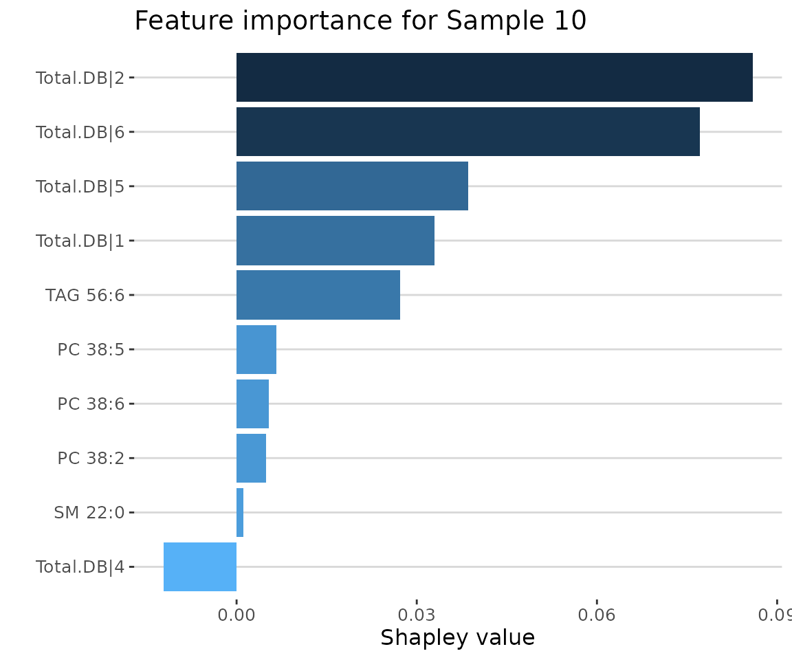
SHAP feature importance of 10 samples
Lastly, we build the SHAP force plot and dependence plot with different parameter sets.
The SHAP force plot visualizes stacked Shapley values, illustrating
how selected features impact the final output for each sample. The
top_feature parameter allows users to set the number of top
features to display, while the group_num parameter defines
the number of clusters for grouping the samples.
# visualize each predictor’s attributions
force_plots <- plot_shap_force(
    shap_se, top_feature=10, cluster_method="ward.D", group_num=10)
#> All the features will be used.

# result summary
summary(force_plots)
#>                       Length Class      Mode
#> interactive_forcePlot  8     plotly     list
#> static_forcePlot       9     gg         list
#> table_forcePlot       13     data.frame list

# view result: SHAP force plot
force_plots$static_forcePlot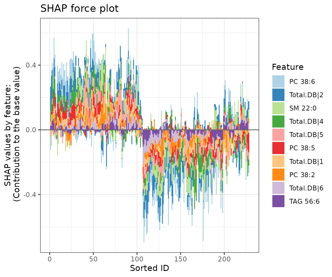
SHAP force plot The colors of the bars are filled according to the features.
The SHAP dependence plot enables exploration of how the model output varies with different feature values, revealing whether the relationship between the target variable and the feature is linear, monotonic, or more complex.
The x-axis, y-axis, and color of the plot can be customized. Typically, the x-axis represents the value of a specific feature, while the y-axis shows the corresponding Shapley value. The color parameter can be set to examine potential interaction effects between a second feature and the plotted feature.
# feature lists
selected_feature <- as.character(
    unique(S4Vectors::metadata(shap_se)$shap_result$variable))

# visualize SHAP values against feature values for each variable
depend_plots <- plot_shap_dependence(
    shap_se, feature=selected_feature[1], shap_feature=selected_feature[2],
    interaction_index=selected_feature[2])

# result summary
summary(depend_plots)
#>                             Length Class      Mode
#> interactive_dependence_plot 8      plotly     list
#> static_dependence_plot      9      gg         list
#> table_dependence_plot       3      data.frame list

# view result: SHAP dependence plot
depend_plots$static_dependence_plot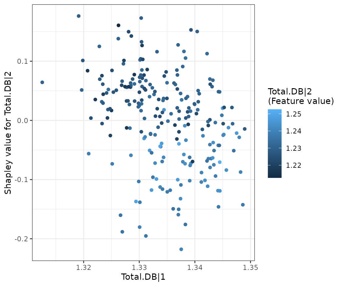
SHAP dependence plot
Network
A correlation network enables us to examine interactions between features in a machine-learning model. Based on prior cross-validation results, an optimal feature count can be selected. The features from the best-performing model (based on ROC-AUC and PR-AUC) are then used to calculate correlation coefficients between each pair of features.
Nodes (features) are shaded based on their importance in constructing the network, while line width represents the correlation coefficient value between features. Two methods, ‘Algorithm-based’ and ‘SHAP analysis,’ are available for evaluating the importance of features. Detailed information on these methods can be found in the Feature Importance section. In SHAP analysis, a positive or negative sign is assigned to feature importance based on the direction of feature values relative to the Shapley values of samples.
# compute correlation coefficients and visualize correlation network
ml_network <- ml_corr_network(
    ml_se, feature_importance='Algorithm-based', correlation='pearson',
    edge_cutoff=0, feature_num=10, nsim=5)

# result summary
summary(ml_network)
#>                                 Length Class      Mode
#> interactive_correlation_network  8     visNetwork list
#> static_correlation_network      10     ggraph     list
#> edge_table                       9     data.frame list
#> node_table                       6     data.frame list

# view result: the network of feature importance
ml_network$static_correlation_network 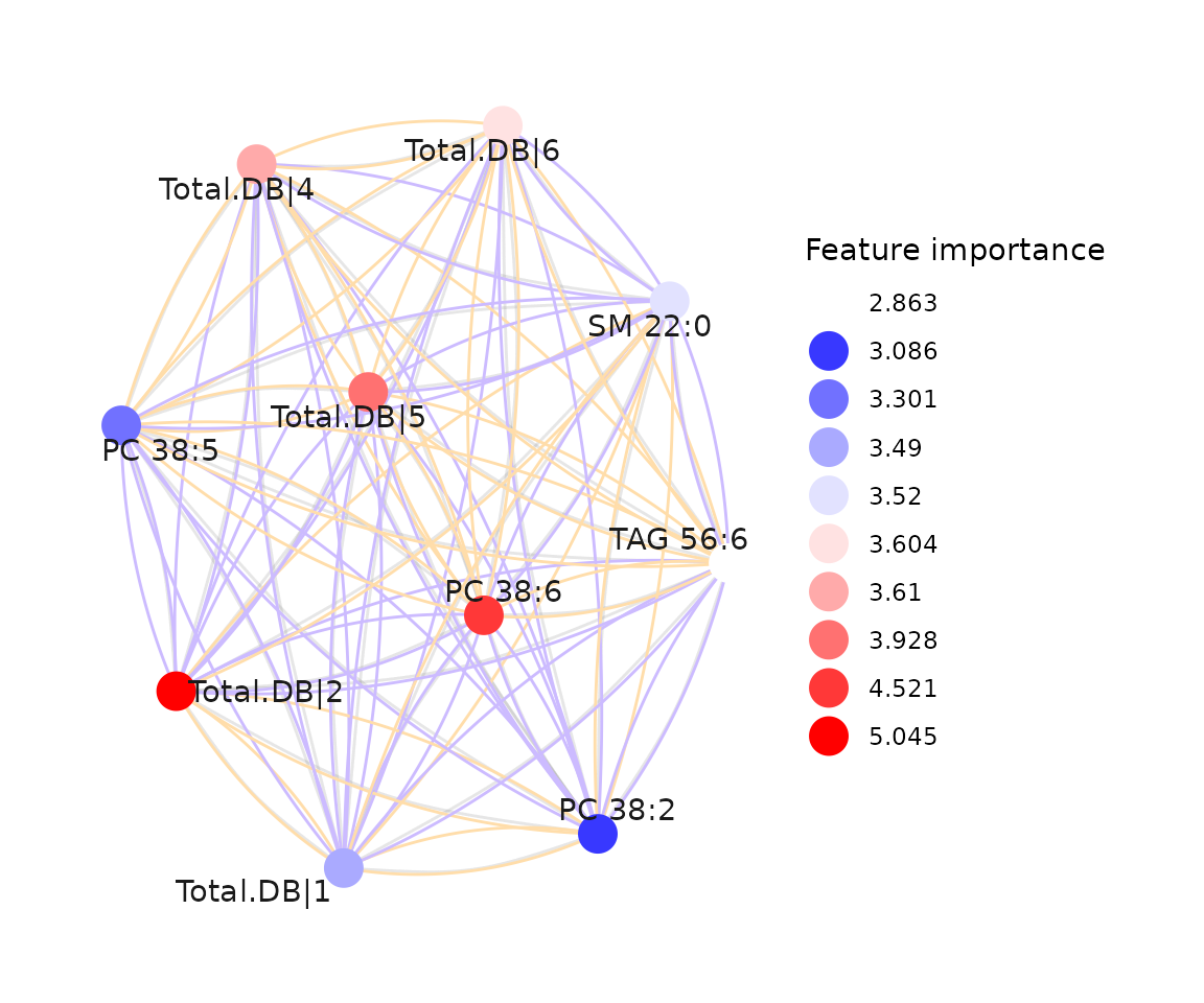
The network of feature importance