Introduction
This documentation will show the complete procedure for analyzing two-group data. We use data from the study “Adipose tissue ATGL modifies the cardiac lipidome in pressure-overload-induced left ventricular failure” as an example (Salatzki et al. 2018). Human plasma lipidome from 10 healthy controls and 13 patients with systolic heart failure (HFrEF) were analyzed by MS-based shotgun lipidomics. Details will shown in later sections.
Getting Started
Installation
Here is the procedures of running the LipidSigR package on your system. We assume that you have already installed the R program (see the R project at http://www.r-project.org and are familiar with it. You need to have R 4.2.0 or a later version installed for running LipidSigR.
Our package is available at the github https://github.com/BioinfOMICS/LipidSigR. There are 2 recommended ways to install our package.
1. Install the package directly from github by using the devtools package.
# Step 1: Install devtools
install.packages("devtools")
library(devtools)

# Step 2: Install LipidSigR
devtools::install_github("BioinfOMICS/LipidSigR")
# LipidSigR package depends on several packages, which can be installed using the below commands:
if (!require("BiocManager", quietly = TRUE))
    install.packages("BiocManager")
BiocManager::install(c("fgsea", "gatom", "mixOmics",
                       "S4Vectors", "SummarizedExperiment", "rgoslin"))

install.packages(c('devtools', 'magrittr', 'plotly', 'tidyverse'))
devtools::install_github("ctlab/mwcsr")
2. Clone Github and install locally
git clone https://github.com/BioinfOMICS/LipidSigR.git
R CMD build LipidSigR
R CMD INSTALL LipidSigR_0.7.0.tar.gz
# LipidSigR package depends on several packages, which can be installed using the below commands:
if (!require("BiocManager", quietly = TRUE))
    install.packages("BiocManager")
BiocManager::install(
    c('fgsea', 'gatom', 'mixOmics', 'S4Vectors', 'SummarizedExperiment', 'rgoslin'))

install.packages(c('devtools', 'magrittr', 'plotly', 'tidyverse'))
devtools::install_github("ctlab/mwcsr")
After the installation, you can load and start using our package!
Data preparation
The input data of our functions must be a SummarizedExperiment object
construct by as_summarized_experiment or output from
upstream analysis function.
Here, we provide a few steps to help you prepare the data.
Input data frames
The abundance data and group information table must be provided as data frames and adhere to the following requirements.
Abundance data: The lipid abundance data includes the abundance values of each feature across all samples.
- The first column of abundance data must contain a list of lipid names (features).
- Each lipid name (feature) is unique.
- All abundance values are numeric.
For example:
rm(list = ls())
data("abundance_twoGroup")
head(abundance_twoGroup[, 1:6], 5)
#>      feature control_01 control_02 control_03 control_04 control_05
#> 1 Cer 38:1;2  0.1167960  0.1638070  0.1759450  0.1446540   0.172092
#> 2 Cer 40:1;2  0.7857833  0.9366095  0.8944465  0.8961396   1.056512
#> 3 Cer 40:2;2  0.1494030  0.1568970  0.1909800  0.1312440   0.248504
#> 4 Cer 42:1;2  1.8530153  2.1946591  2.6377576  2.3418783   2.143355
#> 5 Cer 42:2;2  1.3325520  1.2514943  1.9466750  1.2948319   1.634636
Group information table: The group information table contains the grouping details corresponding to the samples in lipid abundance data.
- The column names are arranged in order of sample_name, label_name, group, and pair.
- All sample names are unique.
- Sample names in ‘sample_name’ column are as same as the sample names in lipid abundance data.
- Columns of ‘sample_name’, ‘label_name’, and ‘group’ columns do not contain NA values.
- The column ‘group’ contain 2 groups.
- In the ‘pair’ column for paired data, each pair must be sequentially numbered from 1 to N, ensuring no missing, blank, or skipped numbers are missing; otherwise, the value should be all marked as NA.
For example:
Mapping lipid characteristics
The purpose of this step is to exclude lipid features not recognized
by rgoslin package. Please follow the instructions below
before constructing the input data as a SummarizedExperiment object.
library(dplyr)
# map lipid characteristics by rgoslin
parse_lipid <- rgoslin::parseLipidNames(lipidNames=abundance_twoGroup$feature)
# filter lipid recognized by rgoslin
recognized_lipid <- parse_lipid$Original.Name[
    which(parse_lipid$Grammar != 'NOT_PARSEABLE')]
abundance <- abundance_twoGroup %>%
    dplyr::filter(feature %in% recognized_lipid)
goslin_annotation <- parse_lipid %>%
    dplyr::filter(Original.Name %in% recognized_lipid)
After running the above code, two data frames,
abundance, and goslin_annotation, will be
generated and used in the next step.
head(abundance[, 1:6], 5)
#>      feature control_01 control_02 control_03 control_04 control_05
#> 1 Cer 38:1;2  0.1167960  0.1638070  0.1759450  0.1446540   0.172092
#> 2 Cer 40:1;2  0.7857833  0.9366095  0.8944465  0.8961396   1.056512
#> 3 Cer 40:2;2  0.1494030  0.1568970  0.1909800  0.1312440   0.248504
#> 4 Cer 42:1;2  1.8530153  2.1946591  2.6377576  2.3418783   2.143355
#> 5 Cer 42:2;2  1.3325520  1.2514943  1.9466750  1.2948319   1.634636
head(goslin_annotation[, 1:6], 5)
#>   Normalized.Name Original.Name Grammar Message Adduct Adduct.Charge
#> 1     Cer 38:1;O2    Cer 38:1;2  Goslin      NA     NA             0
#> 2     Cer 40:1;O2    Cer 40:1;2  Goslin      NA     NA             0
#> 3     Cer 40:2;O2    Cer 40:2;2  Goslin      NA     NA             0
#> 4     Cer 42:1;O2    Cer 42:1;2  Goslin      NA     NA             0
#> 5     Cer 42:2;O2    Cer 42:2;2  Goslin      NA     NA             0
Construct SE object
se <- as_summarized_experiment(
    abundance, goslin_annotation, group_info=group_info_twoGroup,
    n_group='two', paired_sample=FALSE)
#> Input data info
#> Number of lipids (features) available for analysis: 192
#> Number of samples: 23
#> Number of group: 2
#> Not paired samples.
After running the above code, you are ready to begin the analysis
with the output se. After the code execution, a summary of
the input data will be displayed.
(Note: If errors occur during execution, please revise the input data to resolve them.)
Four main analysis workflows—“Profiling,” “Differential Expression,” “Enrichment,” and “Network”—can be conducted for multi-group data.
“Profiling” provides an overview of comprehensive analyses to efficiently examine data quality, the clustering of samples, the correlation between lipid species, and the composition of lipid characteristics.
“Differential expression” integrates many useful lipid-focused analyses for identifying significant lipid species or lipid characteristics.
“Enrichment” provides two main approaches: ‘Over Representation Analysis (ORA)’ and ‘Lipid Set Enrichment Analysis (LSEA)’ to illustrates significant lipid species enriched in the categories of lipid class and determine whether an a priori-defined set of lipids shows statistically significant, concordant differences between two biological states (e.g., phenotypes).
“Network” provides functions for generates input table for constructing pathway activity network, lipid reaction network and GATOM network.
The following sections sequentially describe the functions within the 4 workflows mentioned above.
Profiling
The first step in analyzing lipid data is to take an overview of the data. In this section, you can get comprehensive analyses to explore the quality and clustering of samples, the correlation between lipids and samples, and the abundance and composition of lipids.
Cross-sample variability
Now, let’s start with a simple view of sample variability to compare the amount/abundance difference of lipid between samples (i.e., patients vs. control).
# conduct profiling
result <- cross_sample_variability(se)

# result summary
summary(result)
#>                                  Length Class      Mode
#> interactive_lipid_number_barPlot 8      plotly     list
#> interactive_lipid_amount_barPlot 8      plotly     list
#> interactive_lipid_distribution   8      plotly     list
#> static_lipid_number_barPlot      9      gg         list
#> static_lipid_amount_barPlot      9      gg         list
#> static_lipid_distribution        9      gg         list
#> table_total_lipid                3      data.frame list
#> table_lipid_distribution         3      data.frame list
After running the above code, you will obtain a list called
result, containing interactive plots, static plots, and
tables for three types of distribution plots. (Note: Only static
plots are displayed here.)
# view result: histogram of lipid numbers
result$static_lipid_number_barPlot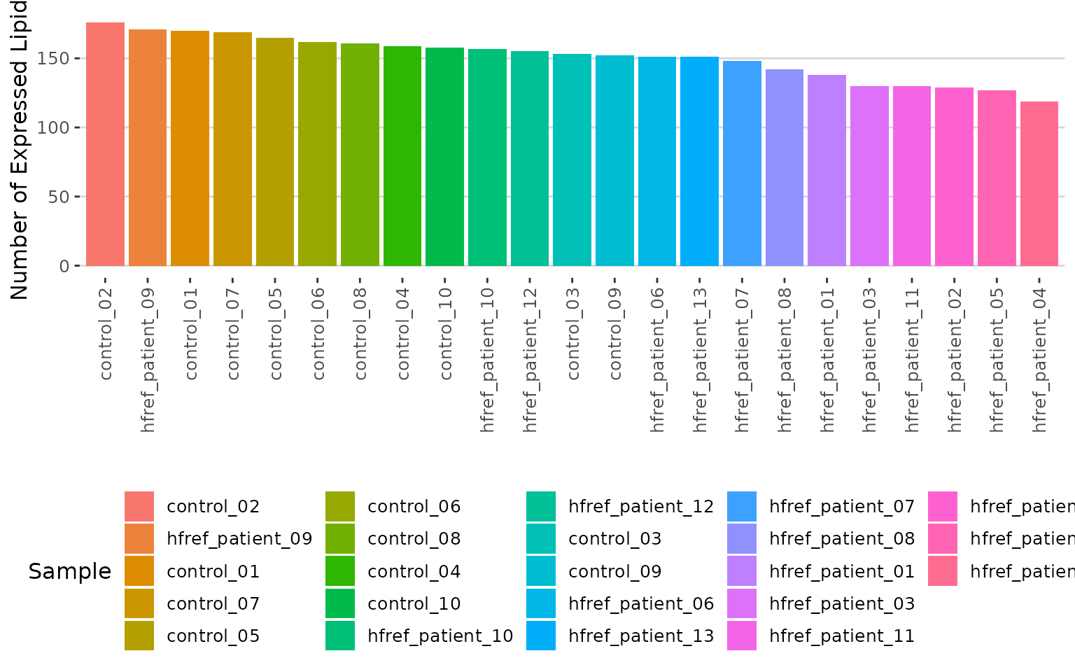
Histogram of lipid numbers The histogram overviews the total number of lipid species over samples. From the plot, we can discover the number of lipid species present in each sample.
# view result: histogram of the total amount of lipid in each sample.
result$static_lipid_amount_barPlot 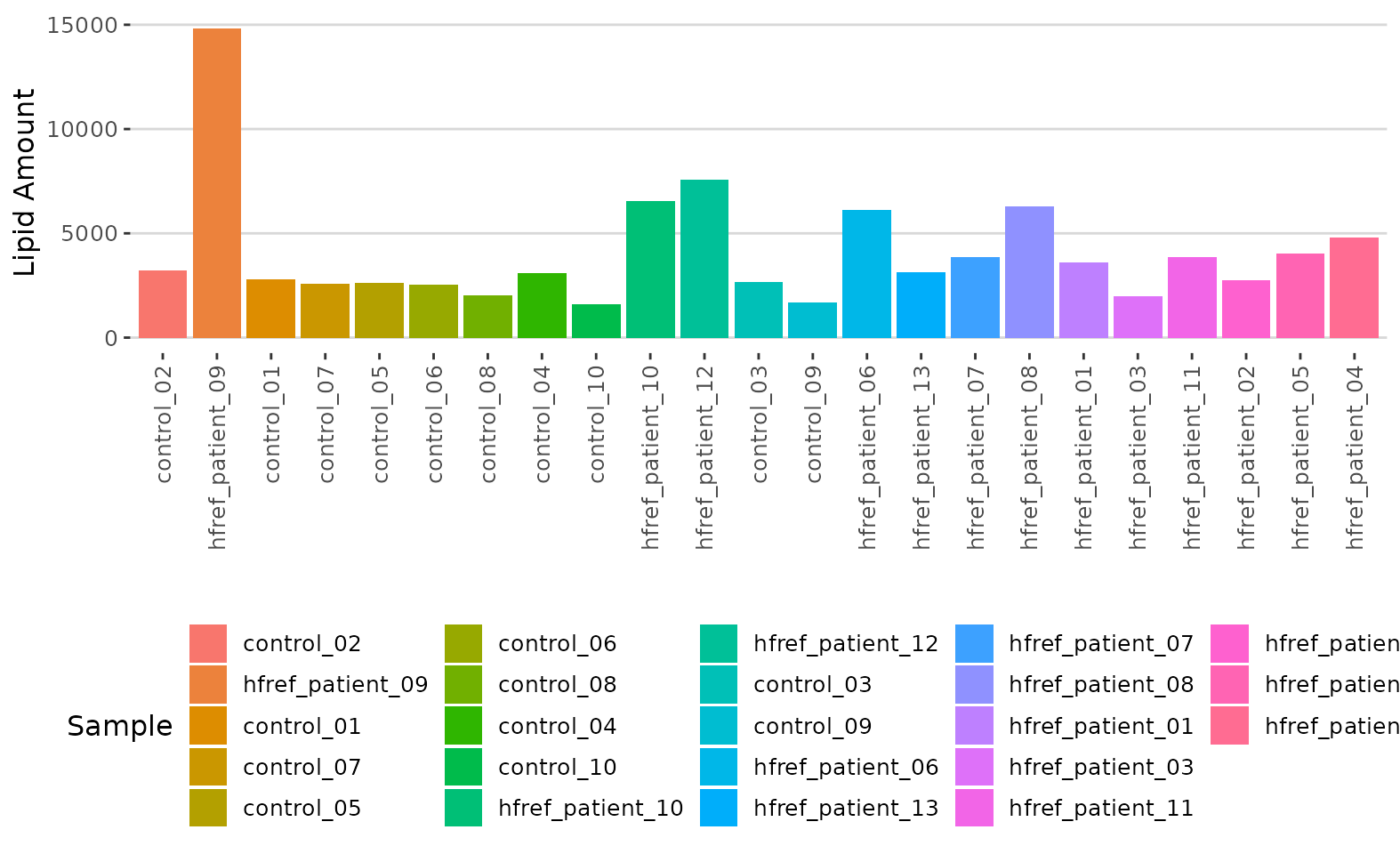
Histogram of lipid amount The histogram describes the variability of the total lipid amount between samples.
# view result: density plot of the underlying probability distribution
result$static_lipid_distribution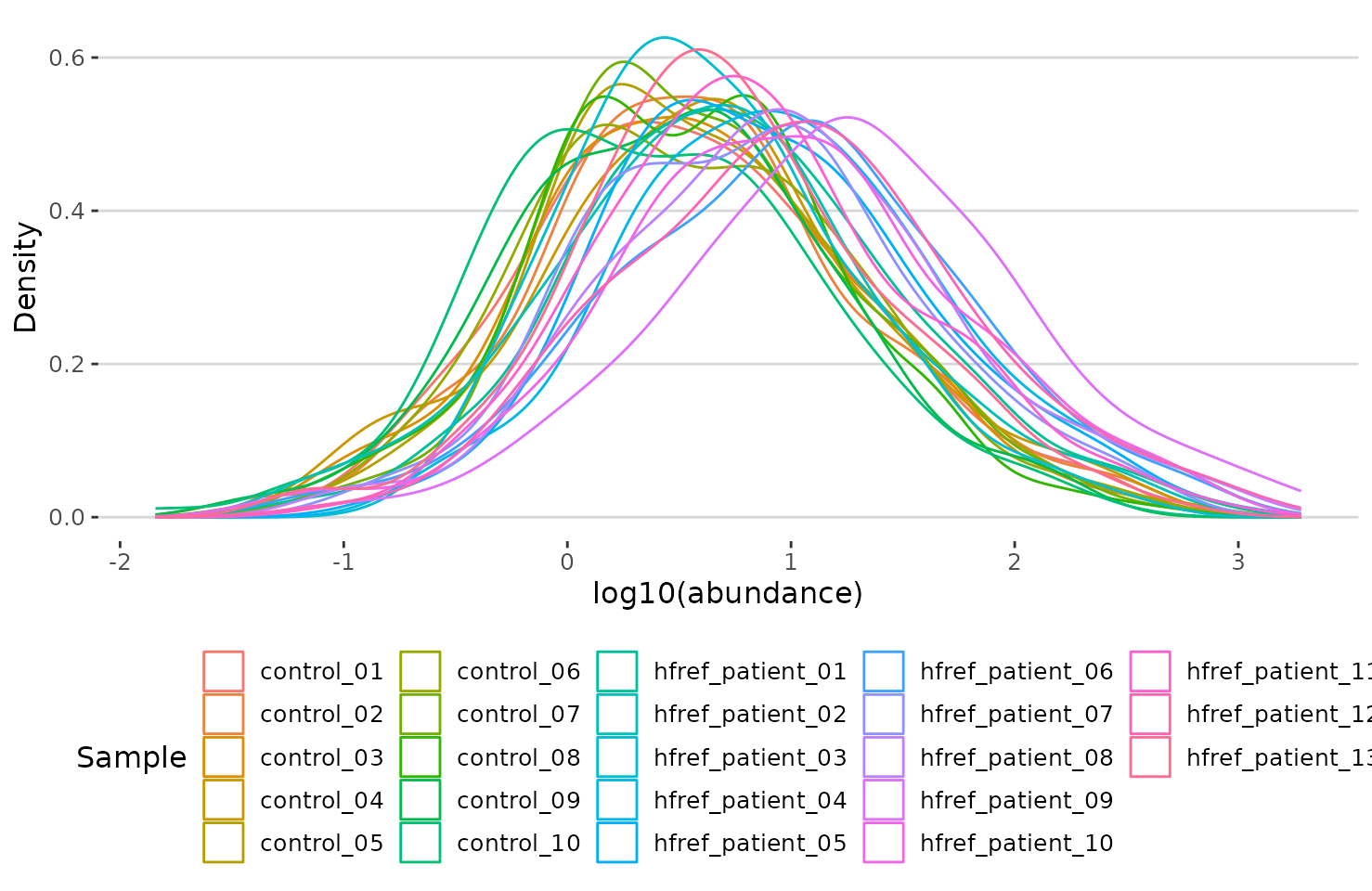
Density plot of abundance distribution The density plot uncovers the distribution of lipid abundance in each sample (line). From this plot, we can have a deeper view of the distribution between samples.
Dimensionality reduction
Dimensionality reduction is commonly used when dealing with large numbers of observations and/or large numbers of variables in lipids analysis. It transforms data from a high-dimensional space into a low-dimensional space so that it retains vital properties of the original data and is close to its intrinsic dimension.
Here we provide 3 dimensionality reduction methods, PCA, t-SNE, UMAP. As for the number of groups shown on the PCA, t-SNE, and UMAP plot, it can be defined by users (default: 2 groups).
PCA
PCA (Principal component analysis) is an unsupervised linear dimensionality reduction and data visualization technique for high dimensional data, which tries to preserve the global structure of the data. Scaling (by default) indicates that the variables should be scaled to have unit variance before the analysis takes place, which removes the bias towards high variances. In general, scaling (standardization) is advisable for data transformation when the variables in the original dataset have been measured on a significantly different scale. As for the centering options (by default), we offer the option of mean-centering, subtracting the mean of each variable from the values, making the mean of each variable equal to zero. It can help users to avoid the interference of misleading information given by the overall mean.
# data processing
processed_se <- data_process(
    se, exclude_missing=TRUE, exclude_missing_pct=70,
    replace_na_method='min', replace_na_method_ref=0.5,
    normalization='Percentage')
# conduct PCA
result_pca <- dr_pca(
    processed_se, scaling=TRUE, centering=TRUE, clustering='kmeans',
    cluster_num=2, kmedoids_metric=NULL, distfun=NULL, hclustfun=NULL,
    eps=NULL, minPts=NULL, feature_contrib_pc=c(1,2), plot_topN=10)

# result summary
summary(result_pca)
#>                                  Length Class      Mode
#> pca_rotated_data                 25     data.frame list
#> table_pca_contribution           24     data.frame list
#> interactive_pca                   8     plotly     list
#> interactive_screePlot             8     plotly     list
#> interactive_feature_contribution  8     plotly     list
#> interactive_variablePlot          8     plotly     list
#> static_pca                        9     gg         list
#> static_screePlot                  9     gg         list
#> static_feature_contribution       9     gg         list
#> static_variablePlot               9     gg         list
After running the above code, you will obtain a list containing interactive plots, static plots, and tables for three types of distribution plots. (Note: Only static plots are displayed here.)
# view result: PCA plot
result_pca$static_pca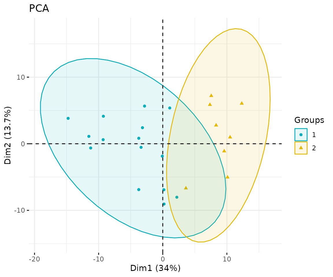
PCA plot
# view result: scree plot of top 10 principle components
result_pca$static_screePlot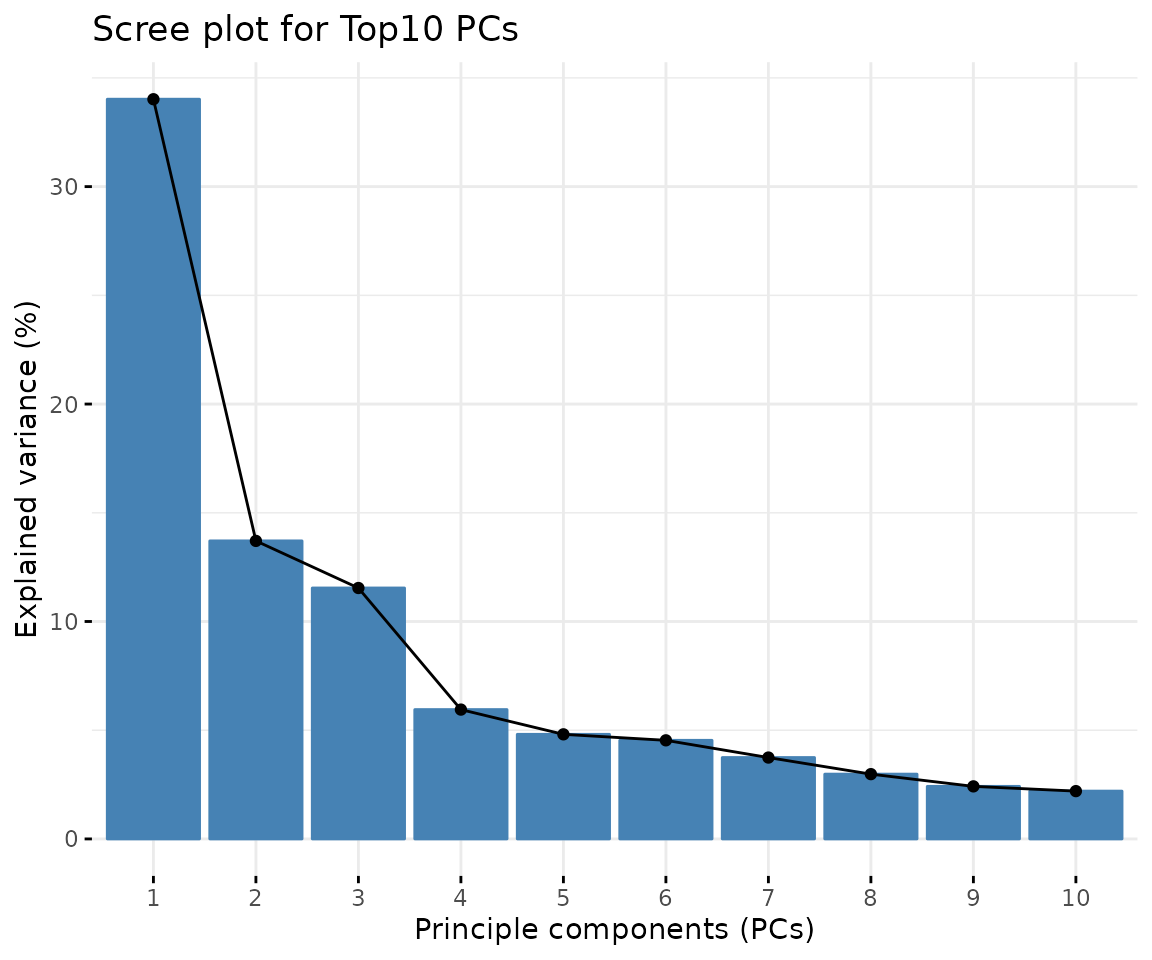
Scree plot A common method for determining the number of PCs to be retained. The ‘elbow’ of the graph indicates all components to the left of this point can explain most variability of the samples
# view result: correlation circle plot of PCA variables
result_pca$static_feature_contribution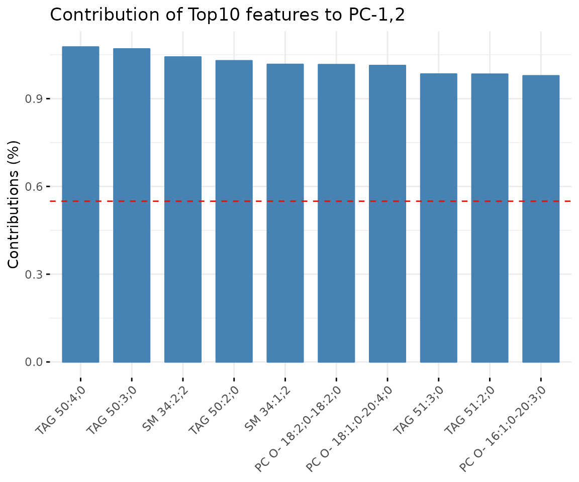
Correlation circle plot The correlation circle plot showing the correlation between a feature (lipid species) and a principal component (PC) used as the coordinates of the variable on the PC (Abdi and Williams 2010). The positively correlated variables are in the same quadrants while negatively correlated variables are on the opposite sides of the plot origin. The closer a variable to the edge of the circle, the better it represents on the factor map.
# view result: bar plot of contribution of top 10 features
result_pca$static_variablePlot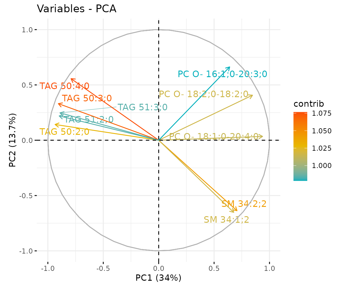
Bar plot of contribution of top 10 features The plot displaysthe features (lipid species) that contribute more to the user-defined principal component.
t-SNE
t-SNE (t-Distributed Stochastic Neighbour Embedding) is an
unsupervised non-linear dimensionality reduction technique that tries to
retain the local structure(cluster) of data when visualising the
high-dimensional datasets. Package Rtsne is used for
calculation, and PCA is applied as a pre-processing step. In t-SNE,
perplexity and max_iter are adjustable for
users. The perplexity may be considered as a knob that sets
the number of effective nearest neighbours, while max_iter
is the maximum number of iterations to perform. The typical perplexity
range between 5 and 50, but if the t-SNE plot shows a ‘ball’ with
uniformly distributed points, you may need to lower your perplexity
(Van der Maaten and Hinton 2008).
# data processing
processed_se <- data_process(
    se, exclude_missing=TRUE, exclude_missing_pct=70,
    replace_na_method='min', replace_na_method_ref=0.5,
    normalization='Percentage')
# conduct t-SNE
result_tsne <- dr_tsne(
    processed_se, pca=TRUE, perplexity=5, max_iter=500, clustering='kmeans',
    cluster_num=2, kmedoids_metric=NULL, distfun=NULL, hclustfun=NULL,
    eps=NULL, minPts=NULL)
#> Performing PCA
#> Read the 23 x 23 data matrix successfully!
#> OpenMP is working. 1 threads.
#> Using no_dims = 2, perplexity = 5.000000, and theta = 0.000000
#> Computing input similarities...
#> Symmetrizing...
#> Done in 0.00 seconds!
#> Learning embedding...
#> Iteration 50: error is 58.433089 (50 iterations in 0.00 seconds)
#> Iteration 100: error is 63.665410 (50 iterations in 0.00 seconds)
#> Iteration 150: error is 54.959642 (50 iterations in 0.00 seconds)
#> Iteration 200: error is 57.010909 (50 iterations in 0.00 seconds)
#> Iteration 250: error is 60.966971 (50 iterations in 0.00 seconds)
#> Iteration 300: error is 1.332270 (50 iterations in 0.00 seconds)
#> Iteration 350: error is 0.848405 (50 iterations in 0.00 seconds)
#> Iteration 400: error is 0.594231 (50 iterations in 0.00 seconds)
#> Iteration 450: error is 0.332379 (50 iterations in 0.00 seconds)
#> Iteration 500: error is 0.274074 (50 iterations in 0.00 seconds)
#> Fitting performed in 0.00 seconds.

# result summary
summary(result_tsne)
#>                  Length Class      Mode
#> tsne_result      4      data.frame list
#> interactive_tsne 8      plotly     list
#> static_tsne      9      gg         list
# view result: t-SNE plot
result_tsne$static_tsne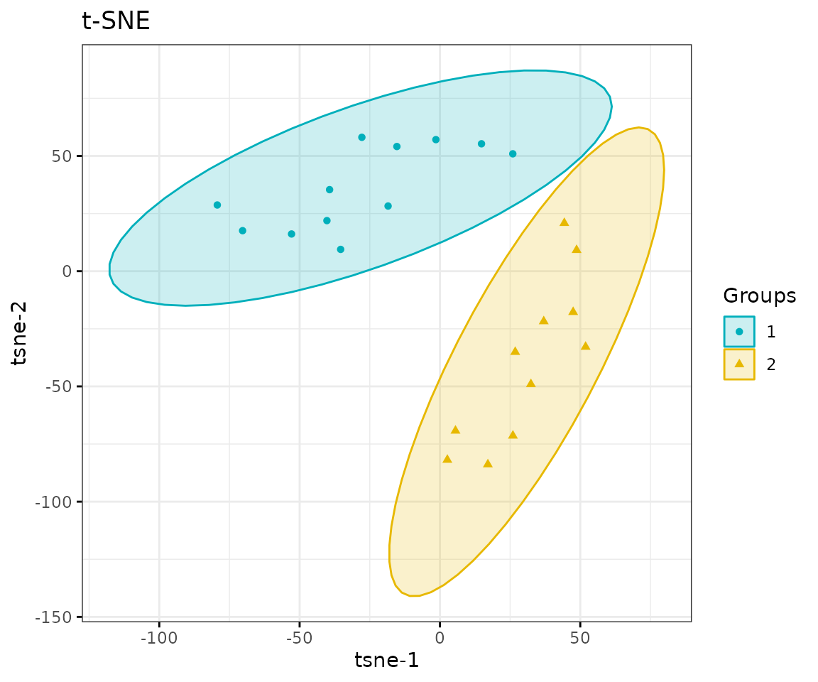
t-SNE plot
UMAP
UMAP (Uniform Manifold Approximation and Projection) using a nonlinear dimensionality reduction method, Manifold learning, which effectively visualizing clusters or groups of data points and their relative proximities. Both tSNE and UMAP are intended to predominantly preserve the local structure that is to group neighbouring data points which certainly delivers a very informative visualization of heterogeneity in the data. The significant difference with t-SNE is scalability, which allows UMAP eliminating the need for applying pre-processing step (such as PCA). Besides, UMAP applies Graph Laplacian for its initialization as tSNE by default implements random initialization. Thus, some people suggest that the key problem of tSNE is the Kullback-Leibler (KL) divergence, which makes UMAP superior over t-SNE. Nevertheless, UMAP’s cluster may not good enough for multi-class pattern classification (McInnes, Healy, and Melville 2018).
The type of distance metric to find nearest neighbors the size of the
local neighborhood (as for the number of neighboring sample points) are
set by parameter metric and n_neighbors.
Larger values lead to more global views of the manifold, while smaller
values result in more local data being preserved. Generally, values are
set in the range of 2 to 100. (default: 15).
# data processing
processed_se <- data_process(
    se, exclude_missing=TRUE, exclude_missing_pct=70,
    replace_na_method='min', replace_na_method_ref=0.5,
    normalization='Percentage')
# conduct UMAP
result_umap <- dr_umap(
    processed_se, n_neighbors=15, scaling=TRUE, umap_metric='euclidean',
    clustering='kmeans', cluster_num=2, kmedoids_metric=NULL,
    distfun=NULL, hclustfun=NULL, eps=NULL, minPts=NULL)

# result summary
summary(result_umap)
#>                  Length Class      Mode
#> umap_result      4      data.frame list
#> interactive_umap 8      plotly     list
#> static_umap      9      gg         list
# view result: UMAP plot
result_umap$static_umap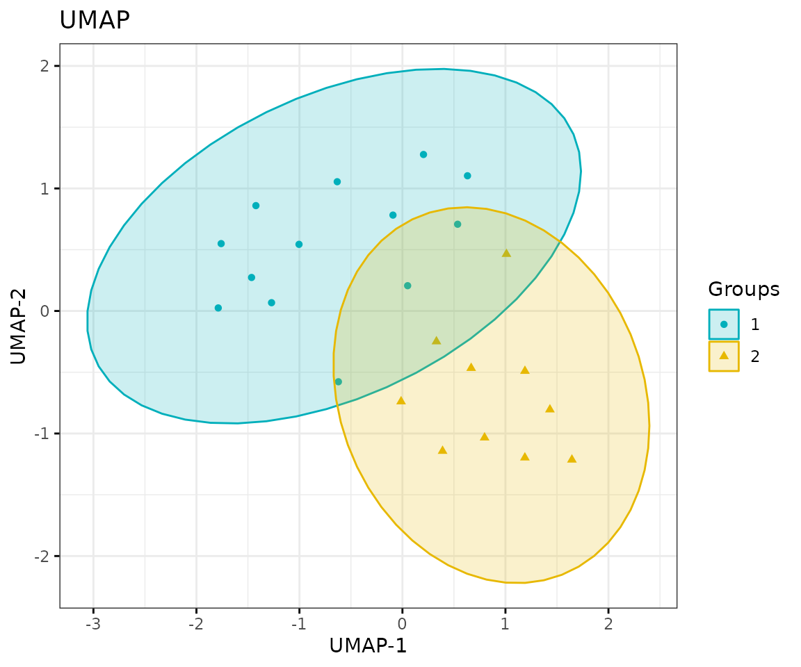
UMAP plot
Correlation heatmap
The correlation heatmap illustrates the correlation between samples
or lipid species and also depicts the patterns in each group. The
correlation is calculated by the method defined by parameter
corr_method, and the correlation coefficient is then
clustered depending on method defined by parameter distfun
and the distance defined by parameter hclustfun. Users can
choose to output the sample correlation or lipid correlation results by
the parameter type.
Please note that if the number of lipids or samples is over 50, the names of lipids/samples will not be shown on the heatmap.
Here, we use type='sample' as example.
# data processing
processed_se <- data_process(
    se, exclude_missing=TRUE, exclude_missing_pct=70,
    replace_na_method='min', replace_na_method_ref=0.5,
    normalization='Percentage')
# correlation calculation
result_heatmap <- heatmap_correlation(
    processed_se, char=NULL, transform='log10', correlation='pearson',
    distfun='maximum', hclustfun='average', type='sample')
# result summary
summary(result_heatmap)
#>                     Length Class              Mode
#> interactive_heatmap   1    IheatmapHorizontal S4
#> static_heatmap        3    recordedplot       list
#> corr_coef_matrix    529    -none-             numeric
# view result: sample-sample heatmap
result_heatmap$static_heatmap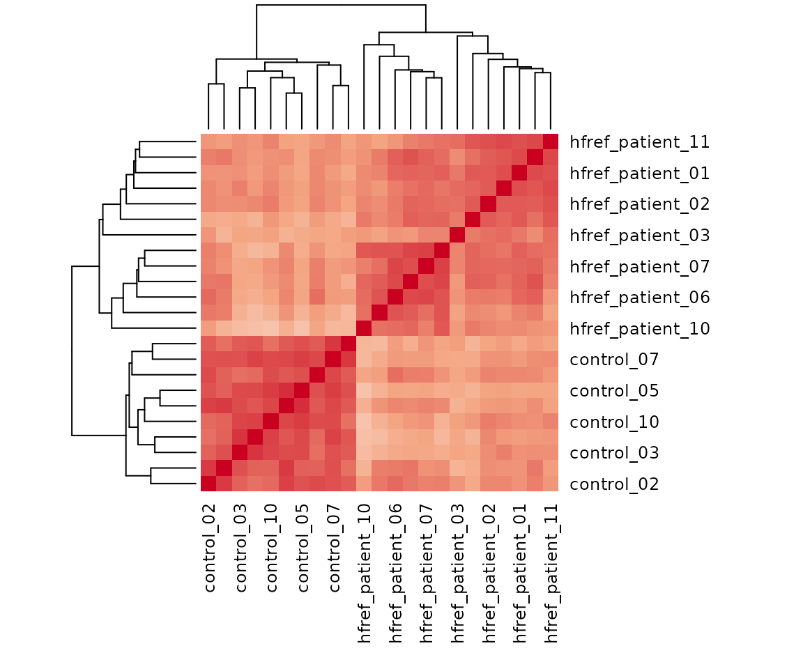
Heatmap of sample to sample correlations Correlations between lipid species are colored from strong positive correlations (red) to no correlation (white).
Lipid characteristics
Now, we are going to take a view of lipid expression over specific lipid characteristics. First, lipids are classified by characteristics selected from the ‘Lipid characteristics’ table. Here, we select “class” as the selected lipid characteristic. The results will be showed by two plots.
# data processing
processed_se <- data_process(
    se, exclude_missing=TRUE, exclude_missing_pct=70,
    replace_na_method='min', replace_na_method_ref=0.5,
    normalization='Percentage')
# lipid characteristic
list_lipid_char(processed_se)$common_list
#> There are 4 ratio characteristics that can be converted in your dataset.
#>            Lipid classification            Lipid classification
#>                      "Category"                    "Main.Class"
#>            Lipid classification            Lipid classification
#>                     "Sub.Class"                         "class"
#>           Fatty acid properties           Fatty acid properties
#>                            "FA"                          "FA.C"
#>           Fatty acid properties           Fatty acid properties
#>     "FA.Chain.Length.Category1"     "FA.Chain.Length.Category2"
#>           Fatty acid properties           Fatty acid properties
#>     "FA.Chain.Length.Category3"                         "FA.DB"
#>           Fatty acid properties           Fatty acid properties
#>                         "FA.OH"     "FA.Unsaturation.Category1"
#>           Fatty acid properties           Fatty acid properties
#>     "FA.Unsaturation.Category2"                       "Total.C"
#>           Fatty acid properties           Fatty acid properties
#>                      "Total.DB"                      "Total.FA"
#>           Fatty acid properties Physical or chemical properties
#>                      "Total.OH"             "Bilayer.Thickness"
#> Physical or chemical properties Physical or chemical properties
#>                     "Bond.type"              "Headgroup.Charge"
#> Physical or chemical properties Physical or chemical properties
#>           "Intrinsic.Curvature"             "Lateral.Diffusion"
#> Physical or chemical properties              Cellular component
#>        "Transition.Temperature"            "Cellular.Component"
#>                        Function
#>                      "Function"
# calculate lipid expression of selected characteristic
result_lipid <- lipid_profiling(processed_se, char="class")
#> There are 4 ratio characteristics that can be converted in your dataset.

# result summary
summary(result_lipid)
#>                               Length Class  Mode
#> interactive_char_barPlot      8      plotly list
#> interactive_lipid_composition 8      plotly list
#> static_char_barPlot           9      gg     list
#> static_lipid_composition      9      gg     list
#> table_char_barPlot            5      tbl_df list
#> table_lipid_composition       5      tbl_df list
# view result: bar plot
result_lipid$static_char_barPlot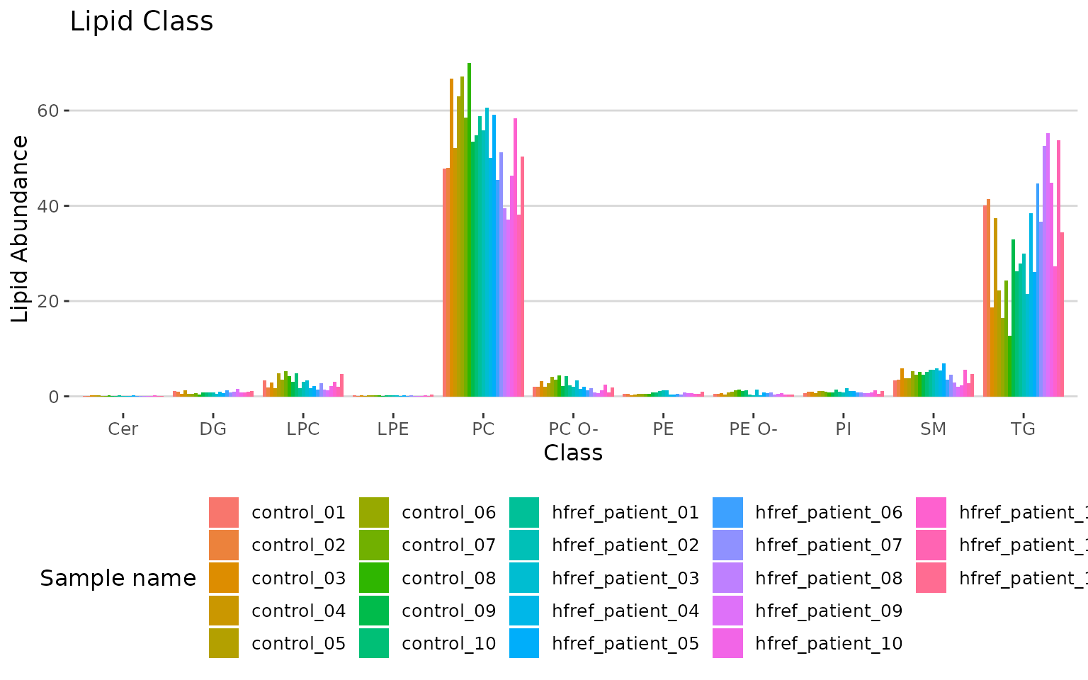
Bar plot classified by selected characteristic The bar plot depicts the abundance level of each sample within each group (e.g., PE, PC) of selected characteristics (e.g., class).
# view result: stacked horizontal bar chart
result_lipid$static_lipid_composition 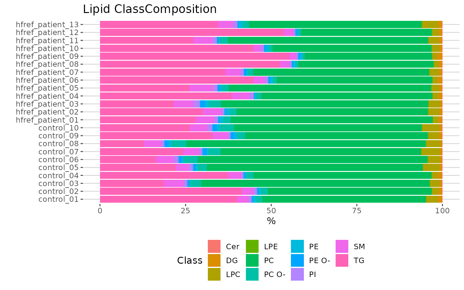
Lipid class composition The stacked horizontal bar chart illustrates the percentage of characteristics in each sample. The variability of percentage between samples can also be obtained from this plot.
Differential expression
After overviewing the lipid data, then we move on to differential expression to identify the significant lipid species and lipid characteristics. Differential Expression is divided into two main analyses, ‘Lipid species analysis’ and ‘Lipid characteristics analysis’. Further analysis and visualization methods can also be conducted based on the results of differential expressed analysis.
-
Lipid species analysis: The lipid species analysis explores the significant lipid species based on differentially expressed analysis. Data are analyzed based on each lipid species. Further analysis and visualization methods, include
- dimensionality reduction,
- hierarchical clustering,
- characteristics association.
-
Lipid characteristics analysis: The lipid characteristics analysis explores the significant lipid characteristics. Lipid species are categorized and summarized into a new lipid abundance table according to a selected lipid characteristic. The abundance of all lipid species of the same categories are summed up, then conduct differential expressed analysis. Further analysis and visualization methods include
- dimensionality reduction,
- hierarchical clustering,
- double bond-chain length analysis.
Lipid species analysis
Now, let’s start with the analysis of lipid species.
Differential expression analysis
For lipid species analysis section, differential expression analysis is performed to figure out significant lipid species. In short, samples will be divided into two groups (independent) according to the input “Group Information” table.
# data processing
processed_se <- data_process(
    se, exclude_missing=TRUE, exclude_missing_pct=70,
    replace_na_method='min', replace_na_method_ref=0.5,
    normalization='Percentage')
# conduct differential expression analysis of lipid species
deSp_se <- deSp_twoGroup(
    processed_se, ref_group='ctrl', test='t-test',
    significant='pval', p_cutoff=0.05, FC_cutoff=1, transform='log10')
After running the above code, a SummarizedExperiment object
deSp_se will be returned containing the analysis results.
This object can be used as input for plotting and further analyses such
as dimensionality reduction, hierarchical clustering, characteristics association, enrichment analysis, and network
analysis.
deSp_se includes the input abundance data, lipid
characteristic table, group information table, analysis results, and
some some setting of input parameters. You can view the data in
deSp_se by
LipidSigR::extract_summarized_experiment.
# view differential expression analysis of lipid species
deSp_result <- extract_summarized_experiment(deSp_se)
# result summary
summary(deSp_result)
#>                     Length Class      Mode
#> abundance           24     data.frame list
#> lipid_char_table    72     data.frame list
#> group_info           5     data.frame list
#> all_deSp_result     15     data.frame list
#> sig_deSp_result     15     data.frame list
#> processed_abundance 24     data.frame list
#> significant          1     -none-     character
#> p_cutoff             1     -none-     numeric
#> FC_cutoff            1     -none-     numeric
#> transform            1     -none-     character
The differential expression analysis result can be input for plotting MA plots, volcano plots, and lollipop plots. (Note: Only static plots are displayed here.)
# plot differential expression analysis result
deSp_plot <- plot_deSp_twoGroup(deSp_se)

# result summary
summary(deSp_plot)
#>                         Length Class      Mode
#> interactive_de_lipid     8     plotly     list
#> interactive_maPlot       8     plotly     list
#> interactive_volcanoPlot  8     plotly     list
#> static_de_lipid         10     gg         list
#> static_maPlot            9     gg         list
#> static_volcanoPlot       9     gg         list
#> table_de_lipid           9     data.frame list
#> table_ma_volcano         9     data.frame list
# view result: lollipop chart
deSp_plot$static_de_lipid
Lollipop chart of lipid species analysis The
lollipop chart reveals the lipid species that pass chosen cut-offs. The
x-axis shows log2 fold change while the y-axis is a list of lipids
species. The color of the point is determined by
-log10(adj_value/p-value).
# view result: MA plot
deSp_plot$static_maPlot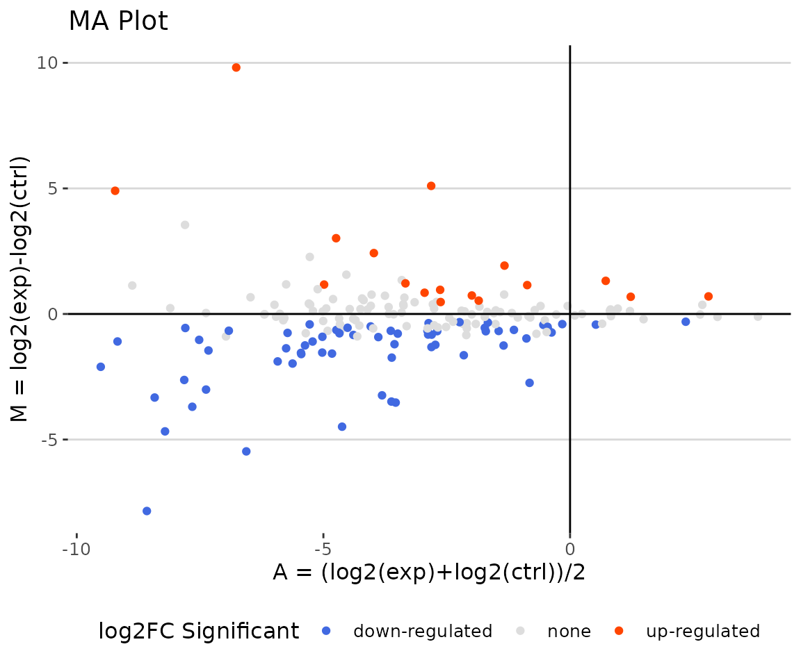
MA plot The MA plot indicates three groups of lipid species, up-regulated(red), down-regulated(blue), and non-significant(grey).
# view result: volcano plot
deSp_plot$static_volcanoPlot 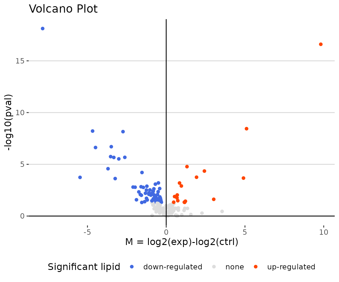
Volcano plot The volcano plot illustrates a similar concept to the MA plot. These points visually identify the most biologically significant lipid species (red for up-regulated, blue for down-regulated, and grey for non-significant).
You can further plot an abundance box plot for any lipid species of
interest by LipidSigR::boxPlot_feature_twoGroup.
For example, let’s use TAG 48:0;0, a significant lipid
species from the lollipop above.
# plot abundance box plot of 'TAG 48:0;0'
boxPlot_result <- boxPlot_feature_twoGroup(
    processed_se, feature='TAG 48:0;0', ref_group='ctrl', test='t-test',
    transform='log10')
# result summary
summary(boxPlot_result)
#>                Length Class        Mode
#> static_boxPlot 9      gg           list
#> table_boxplot  7      data.frame   list
#> table_stat     5      rstatix_test list

# view result: static box plot
boxPlot_result$static_boxPlot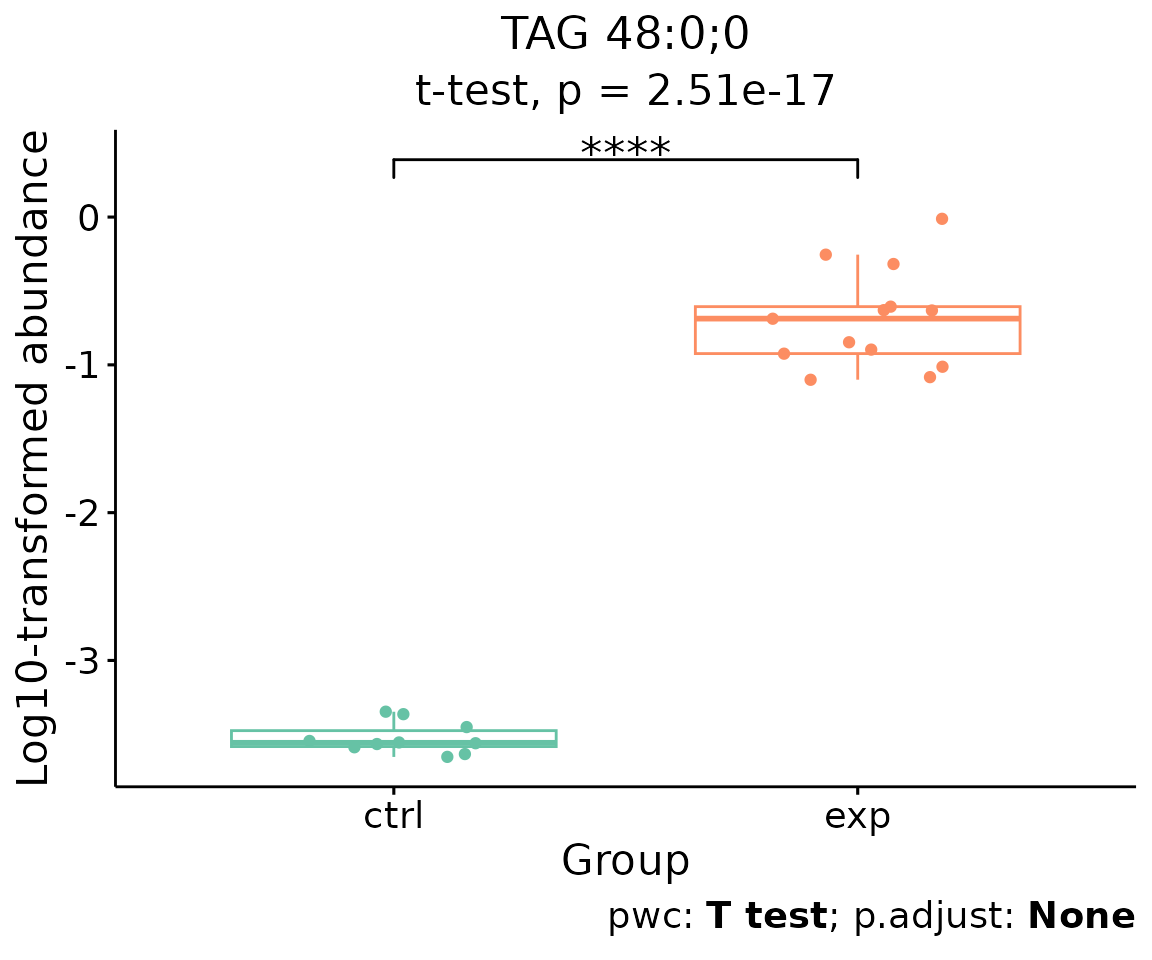
Box plot of lipid abundance An asterisk sign indicates significant differences between groups. The absence of an asterisk or line denotes a non-significant difference between groups.
Dimension reduction
Dimension reduction is common when dealing with large numbers of observations and/or large numbers of variables in lipids analysis. It transforms data from a high-dimensional space into a low-dimensional space to retain vital properties of the original data and close to its intrinsic dimension.
Here, we provide four dimension reduction methods: in addition to the previously introduced PCA, t-SNE, and UMAP (details in Section PCA, t-SNE, UMAP), we include PLS-DA.
- Note: The input data of this section is the output data of
LipidSigR::deSp_twoGroup.
PCA, t-SNE, UMAP
Previous sections introduced details of PCA (Principal Component Analysis), t-SNE (t-distributed stochastic neighbor embedding), and UMAP (Uniform Manifold Approximation and Projection) (please refer to Section PCA, t-SNE, UMAP).
The only difference in running the functions is that the input data
changes from processed_se to deSp_se (output
from lipid species analysis).
Here, we use PCA as an example.
# conduct PCA
result_pca <- dr_pca(
    deSp_se, scaling=TRUE, centering=TRUE, clustering='kmeans',
    cluster_num=2, kmedoids_metric=NULL, distfun=NULL, hclustfun=NULL,
    eps=NULL, minPts=NULL, feature_contrib_pc=c(1,2), plot_topN=10)

# result summary
summary(result_pca)
#>                                  Length Class      Mode
#> pca_rotated_data                 25     data.frame list
#> table_pca_contribution           24     data.frame list
#> interactive_pca                   8     plotly     list
#> interactive_screePlot             8     plotly     list
#> interactive_feature_contribution  8     plotly     list
#> interactive_variablePlot          8     plotly     list
#> static_pca                        9     gg         list
#> static_screePlot                  9     gg         list
#> static_feature_contribution       9     gg         list
#> static_variablePlot               9     gg         list
PLS-DA
The input data is the output data of deSp_twoGroup from
lipid species analysis.
# conduct PLSDA
result_plsda <- dr_plsda(
  deSp_se, ncomp=2, scaling=TRUE, clustering='group_info', cluster_num=2,
  kmedoids_metric=NULL, distfun=NULL, hclustfun=NULL, eps=NULL, minPts=NULL)

# result summary
summary(result_plsda)
#>                         Length Class      Mode
#> plsda_result            4      data.frame list
#> table_plsda_loading     2      data.frame list
#> interacitve_plsda       8      plotly     list
#> interactive_loadingPlot 8      plotly     list
#> static_plsda            9      gg         list
#> static_loadingPlot      9      gg         list
# view result: PLS-DA plot
result_plsda$static_plsda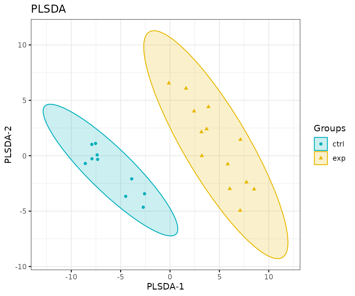
PLS-DA plot
# view result: PLS-DA loading plot
result_plsda$static_loadingPlot 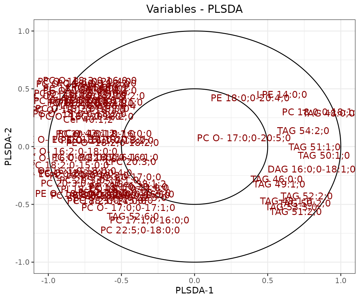
Loading plot In the PLS-DA loading plot, the distance to the center of the variables indicates the contribution of the variable. The value of the x-axis reveals the contribution of the variable to PLS-DA-1, whereas the value of the y-axis discloses the contribution of the variable to PLS-DA-2.
Hierarchical clustering
Based on the results of differential expression analysis, we further
take a look at differences of lipid species between the control group
and the experimental group. Lipid species derived from two groups are
clustered and visualized on heatmap by hierarchical clustering. Users
can choose to output the results of all lipid species or only
significant lipid species by the parameter type.
The top of the heatmap is grouped by sample group (top annotation)
while the side of the heatmap (row annotation) can be chosen from
lipid_char_table, such as class, structural category,
functional category, total length, total double bond (Total.DB),
hydroxyl group number (Total.OH), the double bond of fatty acid(FA.DB),
hydroxyl group number of fatty acid(FA.OH).
# get lipid characteristics
list_lipid_char(processed_se)$common_list
#> There are 4 ratio characteristics that can be converted in your dataset.
#>            Lipid classification            Lipid classification
#>                      "Category"                    "Main.Class"
#>            Lipid classification            Lipid classification
#>                     "Sub.Class"                         "class"
#>           Fatty acid properties           Fatty acid properties
#>                            "FA"                          "FA.C"
#>           Fatty acid properties           Fatty acid properties
#>     "FA.Chain.Length.Category1"     "FA.Chain.Length.Category2"
#>           Fatty acid properties           Fatty acid properties
#>     "FA.Chain.Length.Category3"                         "FA.DB"
#>           Fatty acid properties           Fatty acid properties
#>                         "FA.OH"     "FA.Unsaturation.Category1"
#>           Fatty acid properties           Fatty acid properties
#>     "FA.Unsaturation.Category2"                       "Total.C"
#>           Fatty acid properties           Fatty acid properties
#>                      "Total.DB"                      "Total.FA"
#>           Fatty acid properties Physical or chemical properties
#>                      "Total.OH"             "Bilayer.Thickness"
#> Physical or chemical properties Physical or chemical properties
#>                     "Bond.type"              "Headgroup.Charge"
#> Physical or chemical properties Physical or chemical properties
#>           "Intrinsic.Curvature"             "Lateral.Diffusion"
#> Physical or chemical properties              Cellular component
#>        "Transition.Temperature"            "Cellular.Component"
#>                        Function
#>                      "Function"
# conduct hierarchical clustering
result_hcluster <- heatmap_clustering(
    de_se=deSp_se, char='class', distfun='pearson',
    hclustfun='complete', type='sig')

# result summary
summary(result_hcluster)
#>                     Length Class              Mode
#> interactive_heatmap    1   IheatmapHorizontal S4
#> static_heatmap         3   recordedplot       list
#> corr_coef_matrix    1840   -none-             numeric
# view result: heatmap of significant lipid species
result_hcluster$static_heatmap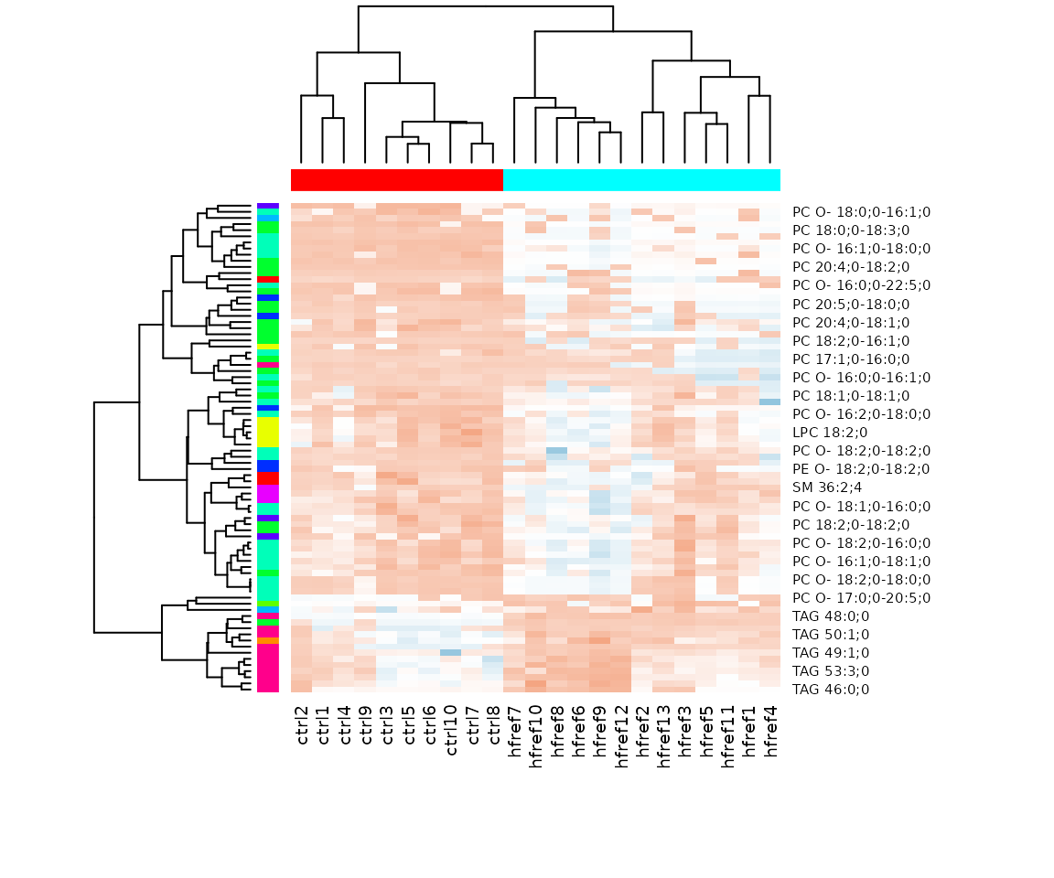
Heatmap of significant lipid species The difference between the two groups by observing the distribution of lipid species.
Characteristics analysis
The characteristics analysis visualizes the difference between
control and experimental groups of significant lipid species categorized
based on different lipid characteristics from
lipid_char_table, such as class, structural category,
functional category, total length, total double bond (Total.DB),
hydroxyl group number (Total.OH), the double bond of fatty acid(FA.DB),
hydroxyl group number of fatty acid(FA.OH).
# get lipid characteristics
list_lipid_char(processed_se)$common_list
#> There are 4 ratio characteristics that can be converted in your dataset.
#>            Lipid classification            Lipid classification
#>                      "Category"                    "Main.Class"
#>            Lipid classification            Lipid classification
#>                     "Sub.Class"                         "class"
#>           Fatty acid properties           Fatty acid properties
#>                            "FA"                          "FA.C"
#>           Fatty acid properties           Fatty acid properties
#>     "FA.Chain.Length.Category1"     "FA.Chain.Length.Category2"
#>           Fatty acid properties           Fatty acid properties
#>     "FA.Chain.Length.Category3"                         "FA.DB"
#>           Fatty acid properties           Fatty acid properties
#>                         "FA.OH"     "FA.Unsaturation.Category1"
#>           Fatty acid properties           Fatty acid properties
#>     "FA.Unsaturation.Category2"                       "Total.C"
#>           Fatty acid properties           Fatty acid properties
#>                      "Total.DB"                      "Total.FA"
#>           Fatty acid properties Physical or chemical properties
#>                      "Total.OH"             "Bilayer.Thickness"
#> Physical or chemical properties Physical or chemical properties
#>                     "Bond.type"              "Headgroup.Charge"
#> Physical or chemical properties Physical or chemical properties
#>           "Intrinsic.Curvature"             "Lateral.Diffusion"
#> Physical or chemical properties              Cellular component
#>        "Transition.Temperature"            "Cellular.Component"
#>                        Function
#>                      "Function"
# conduct characteristic analysis
result_char <- char_association(deSp_se, char='class')

# result summary
summary(result_char)
#>                       Length Class        Mode
#> interactive_barPlot    8     plotly       list
#> interacitve_lollipop   8     plotly       list
#> interactive_wordCloud  8     hwordcloud   list
#> static_barPlot         9     gg           list
#> static_lollipop        9     gg           list
#> static_wordCloud       3     recordedplot list
#> table_barPlot          7     tbl_df       list
#> table_lollipop        10     tbl_df       list
#> table_wordCloud        2     tbl_df       list
# view result: bar chart
result_char$static_barPlot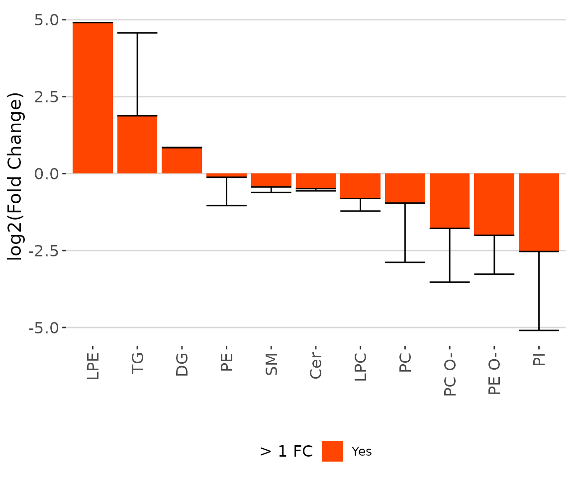
The bar chart of significant groups The bar chart shows the significant groups (values) with mean fold change over 2 in the selected characteristics by colors (red for significant and black for insignificant).
# view result: lollipop plot
result_char$static_lollipop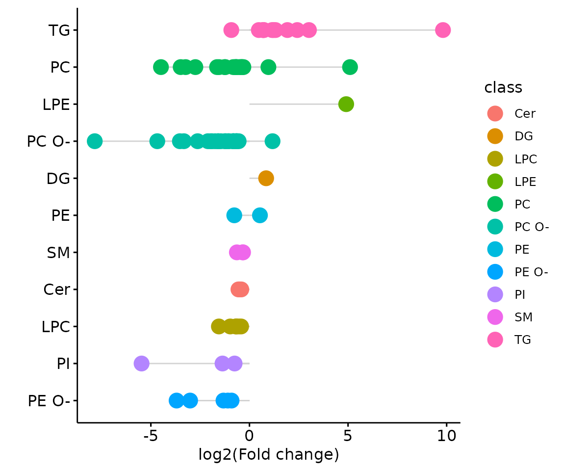
The lollipop chart of all significant groups The lollipop chart compares multiple values simultaneously and it aligns the log2(fold change) of all significant groups (values) within the selected characteristics.
# view result: word cloud
result_char$static_wordCloud
Word cloud with the count of each group The word cloud shows the count of each group(value) of the selected characteristics.
Lipid characteristics analysis
After lipid species analysis, now let’s move on to another main analysis of the Differential expression section – ‘Lipid Characteristics Analysis’. The massive degree of structural diversity of lipids contributes to the functional variety of lipids. The characteristics can range from subtle variance (i.e. the number of a double bond in the fatty acid) to major change (i.e. diverse backbones). In this section, lipid species are categorized and summarized into a new lipid abundance table according to two selected lipid characteristics, then conducted differential expressed analysis. Samples are divided into two groups based on the input ‘Group Information’ table.
Differentially expressed analysis
In differentially expressed analysis, we are going to conduct two procedures of analysis - first is ‘Characteristics’ and then ‘Subgroup of characteristics’.
‘Characteristics’ is based on the first selected
‘characteristics’ while ‘Subgroup of characteristics’
is the subgroup analysis of the previous section. Analyses will be
performed based on parameter char and subChar
selected by users.
Before we begin, let’s calculate the two-way ANOVA and review the results for all lipid characteristics.
# data processing
processed_se <- data_process(
    se, exclude_missing=TRUE, exclude_missing_pct=70,
    replace_na_method='min', replace_na_method_ref=0.5,
    normalization='Percentage')
# two way anova
twoWayAnova_table <- char_2wayAnova(
  processed_se, ratio_transform='log2', char_transform='log10')
#> There are 4 ratio characteristics that can be converted in your dataset.
# view result table
head(twoWayAnova_table[, 1:4], 5)
#>                  aspect characteristic fval_2factors pval_2factors
#> 1  Lipid classification          class      5.045694  1.208279e-06
#> 2  Lipid classification       Category      5.379765  6.965556e-03
#> 3  Lipid classification     Main.Class      3.657973  1.058632e-03
#> 4  Lipid classification      Sub.Class      4.993823  4.243797e-06
#> 5 Fatty acid properties       Total.FA      7.155695  7.104938e-72
From the table returned by LipidSigR::char_2wayAnova, we
have to selected the lipid characteristics of interest as
char and subChar for
LipidSigR::deChar_twoGroup and
LipidSigR::subChar_twoGroup.
Here, we use Total.C as an example.
# data processing
processed_se <- data_process(
    se, exclude_missing=TRUE, exclude_missing_pct=70,
    replace_na_method='min', replace_na_method_ref=0.5,
    normalization='Percentage')
# conduct differential expression of lipid characteristics
deChar_se <- deChar_twoGroup(
    processed_se, char="Total.C", ref_group="ctrl", test='t-test',
    significant="pval", p_cutoff=0.05, FC_cutoff=1, transform='log10')
#> There are 4 ratio characteristics that can be converted in your dataset.
After running the above code, a SummarizedExperiment object
deChar_se will be returned containing the analysis results.
This object can be used as input for plotting and further analyses such
as dimension reduction, and hierarchical clustering.
deChar_se includes the input abundance data, lipid
characteristic table, group information table, analysis results, and
some some setting of input parameters. You can view the data in
deChar_se by
LipidSigR::extract_summarized_experiment.
# view differential expression of lipid characteristics
deChar_result <- extract_summarized_experiment(deChar_se)
# result summary
summary(deChar_result)
#>                     Length Class      Mode
#> abundance           24     data.frame list
#> lipid_char_table     2     data.frame list
#> group_info           5     data.frame list
#> all_deChar_result   23     grouped_df list
#> sig_deChar_result   23     grouped_df list
#> processed_abundance 24     data.frame list
#> char                 1     -none-     character
#> significant          1     -none-     character
#> p_cutoff             1     -none-     numeric
#> FC_cutoff            1     -none-     numeric
The differential expression analysis result can be input for plotting result plots. (Note: Only static plots are displayed here.)
# plot differential expression analysis results
deChar_plot <- plot_deChar_twoGroup(deChar_se)
# result summary
summary(deChar_plot)
#>                           Length Class      Mode
#> static_barPlot             9     gg         list
#> static_barPlot_sqrt        9     gg         list
#> static_linePlot            9     gg         list
#> static_linePlot_sqrt       9     gg         list
#> static_boxPlot            10     gg         list
#> interactive_barPlot        8     plotly     list
#> interactive_barPlot_sqrt   8     plotly     list
#> interactive_linePlot       8     plotly     list
#> interactive_linePlot_sqrt  8     plotly     list
#> interactive_boxPlot        8     plotly     list
#> table_barPlot             11     tbl_df     list
#> table_linePlot            11     tbl_df     list
#> table_boxPlot              7     data.frame list
#> table_char_index          24     data.frame list
#> table_index_stat          13     grouped_df list
The results of ‘Characteristics’ analysis in the first section
# view result: bar plot of selected `char`
deChar_plot$static_barPlot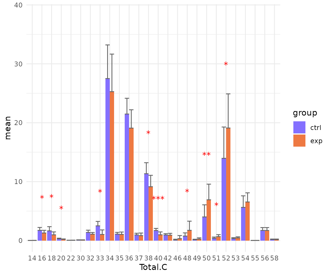
# view result: sqrt-scaled bar plot of selected `char`
deChar_plot$static_barPlot_sqrt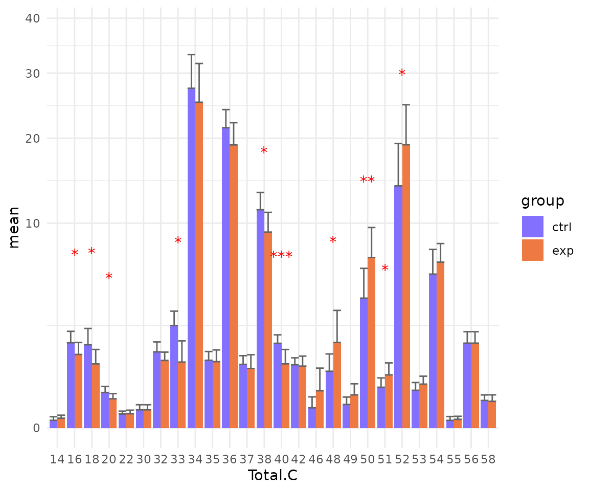
# view result: line plot of `selected char`
deChar_plot$static_linePlot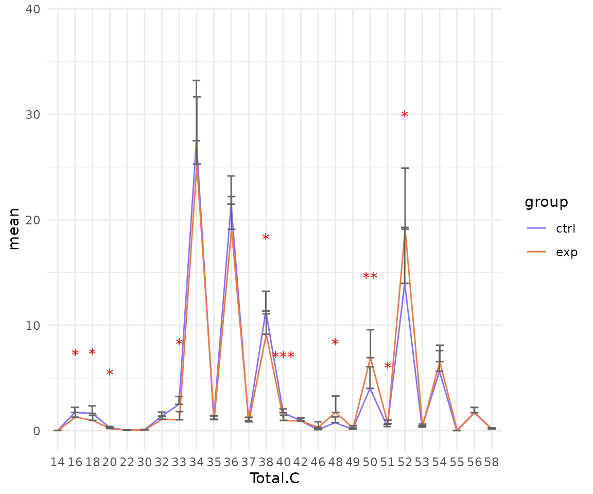
# view result: sqrt-scaled line plot of selected `char`
deChar_plot$static_linePlot_sqrt 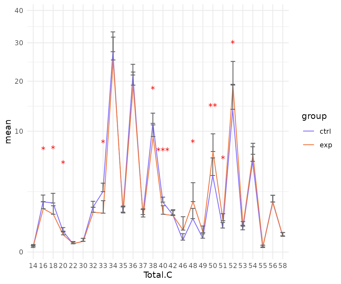
# view result: box plot of selected `char`
deChar_plot$static_boxPlot 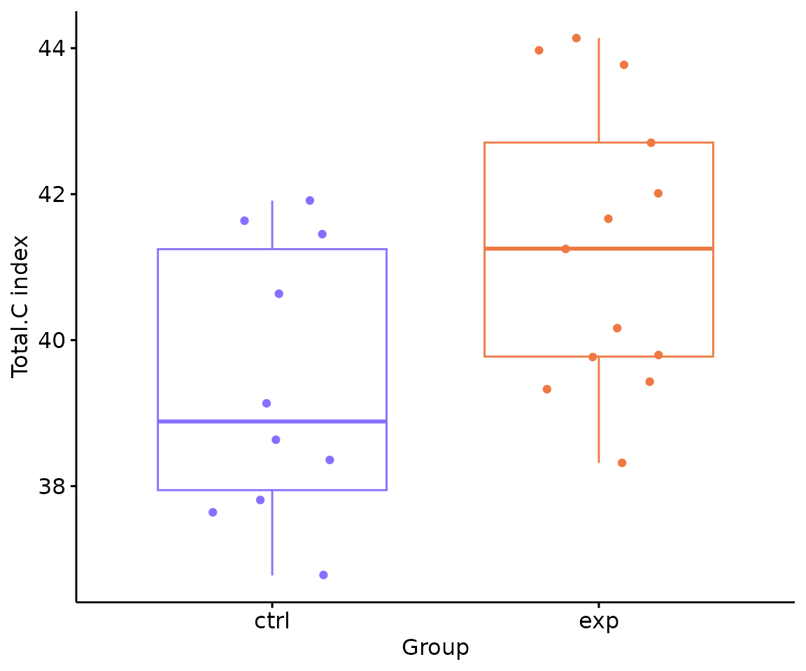
In the ‘Subgroup of characteristics’, besides the
selected characteristic in first section defined by parameter
char, we can further choose another characteristic by
parameter subChar. The two chosen characteristics,
char and subCharshould be either both
continuous data or one continuous and one categorical data.
- NOTE: You can use
LipidSigR::list_lipid_charto get all the selectable lipid characteristics. Please readvignette("1_tool_function").
# data processing
processed_se <- data_process(
    se, exclude_missing=TRUE, exclude_missing_pct=70,
    replace_na_method='min', replace_na_method_ref=0.5,
    normalization='Percentage')
# subgroup differential expression of lipid characteristics
subChar_se <- subChar_twoGroup(
    processed_se, char="Total.C", subChar="class", ref_group="ctrl",
    test='t-test', significant="pval", p_cutoff=0.05,
    FC_cutoff=1, transform='log10')
#> There are 4 ratio characteristics that can be converted in your dataset.
After running the code, the returned subChar_se
contained the input abundance data, lipid characteristic table, group
information table, analysis results, and some some setting of input
parameters. You can view the data in subChar_se by
LipidSigR::extract_summarized_experiment.
# view differential expression of lipid characteristics
subChar_result <- extract_summarized_experiment(subChar_se)
# result summary
summary(subChar_result)
#>                     Length Class      Mode
#> abundance           24     data.frame list
#> lipid_char_table     5     data.frame list
#> group_info           5     data.frame list
#> all_deChar_result   25     tbl_df     list
#> sig_deChar_result   25     tbl_df     list
#> processed_abundance 24     tbl_df     list
#> char                 1     -none-     character
#> subChar              1     -none-     character
#> significant          1     -none-     character
#> p_cutoff             1     -none-     numeric
#> FC_cutoff            1     -none-     numeric
You can also plot the results of a specific feature within the
subChar. For example, if you select “class” as
subChar, you can choose “Cer” within the ‘class’ feature by
parameter subChar_feature for plotting result plots.
(Note: Only static plots are displayed here.)
# get subChar_feature list
subChar_feature_list <- unique(
    extract_summarized_experiment(subChar_se)$all_deChar_result$sub_feature)
# visualize subgroup differential expression of lipid characteristics
subChar_plot <- plot_subChar_twoGroup(subChar_se, subChar_feature="Cer")

# result summary
summary(subChar_plot)
#>                           Length Class      Mode
#> static_barPlot             9     gg         list
#> static_barPlot_sqrt        9     gg         list
#> static_linePlot            9     gg         list
#> static_linePlot_sqrt       9     gg         list
#> static_boxPlot            10     gg         list
#> interactive_barPlot        8     plotly     list
#> interactive_barPlot_sqrt   8     plotly     list
#> interactive_linePlot       8     plotly     list
#> interactive_linePlot_sqrt  8     plotly     list
#> interactive_boxPlot        8     plotly     list
#> table_barPlot             11     tbl_df     list
#> table_linePlot            11     tbl_df     list
#> table_boxPlot              7     data.frame list
#> table_char_index          24     data.frame list
#> table_index_stat          13     grouped_df list
The results of ‘Subgroup of characteristics’ analysis in the second section
- Note: The star above the bar shows the significant difference of the specific subgroup of the selected characteristic between control and experimental groups.
# view result: bar plot of `subChar_feature`
subChar_plot$static_barPlot 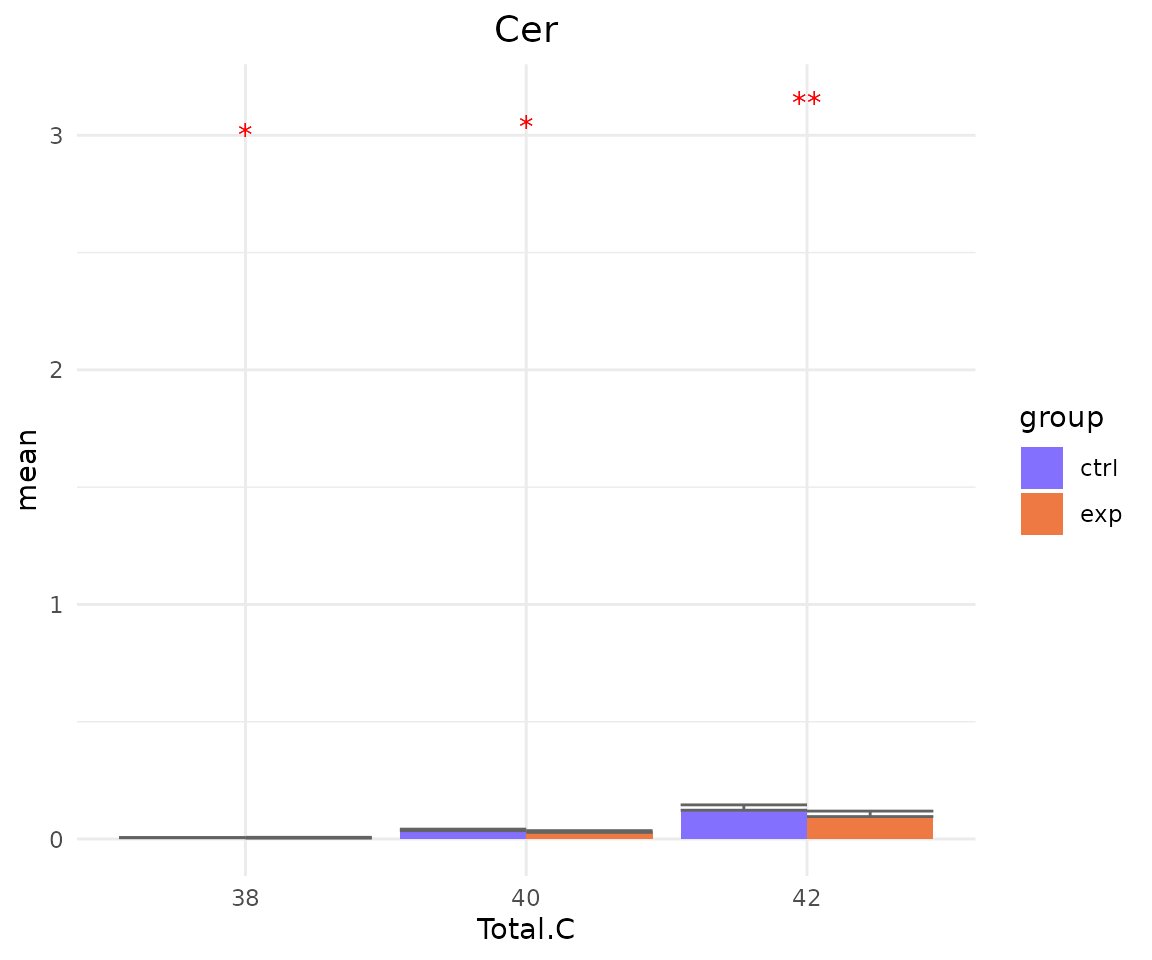
# view result: sqrt-scaled bar plot of `subChar_feature`
subChar_plot$static_barPlot_sqrt 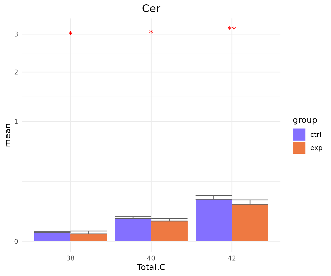
# view result: line plot of `subChar_feature`
subChar_plot$static_linePlot 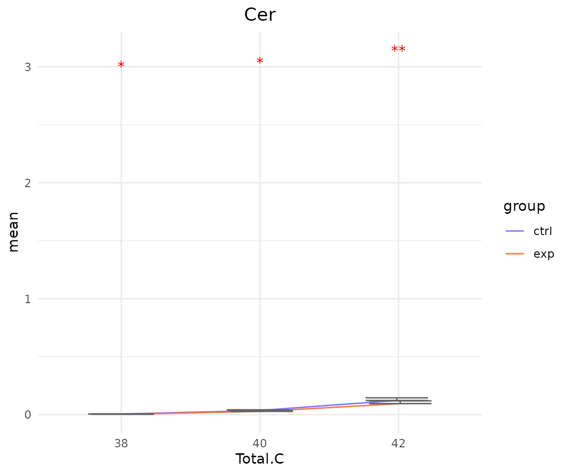
# view result: sqrt-scaled line plot of `subChar_feature`
subChar_plot$static_linePlot_sqrt 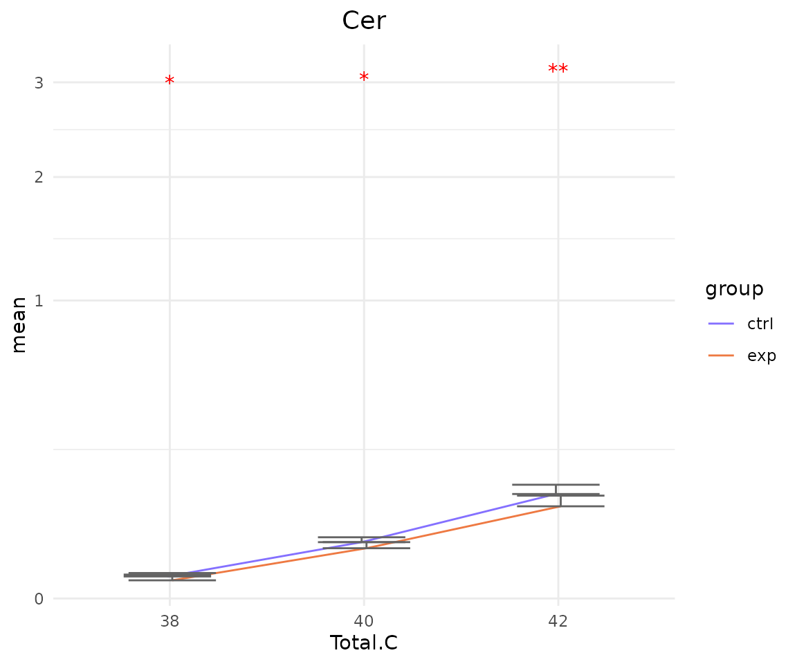
# view result: box plot of `subChar_feature`
subChar_plot$static_boxPlot 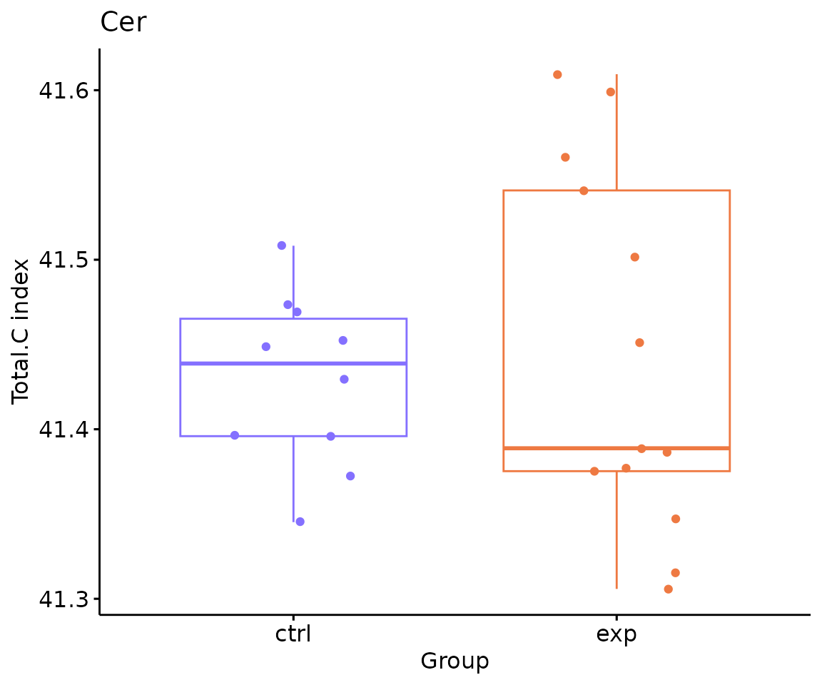
Dimension reduction
Dimension reduction is common when dealing with large numbers of observations and/or large numbers of variables in lipids analysis. It transforms data from a high-dimensional space into a low-dimensional space to retain vital properties of the original data and close to its intrinsic dimension.
Here, we provide 4 dimension reduction methods: PCA, t-SNE, UMAP, and PLS-DA.
The execution of all the functions respectively introduced in Section Section PCA, t-SNE, UMAP, and PLSDA. Links to there for more details manipulation.
The only difference is that the input data should be
deChar_se (output from lipid
characterisitcs analysis).
For example:
# conduct PLSDA
result_plsda <- dr_plsda(
  deChar_se, ncomp=2, scaling=TRUE, clustering='group_info', cluster_num=2,
  kmedoids_metric=NULL, distfun=NULL, hclustfun=NULL, eps=NULL, minPts=NULL)

# result summary
summary(result_plsda)
#>                         Length Class      Mode
#> plsda_result            4      data.frame list
#> table_plsda_loading     2      data.frame list
#> interacitve_plsda       8      plotly     list
#> interactive_loadingPlot 8      plotly     list
#> static_plsda            9      gg         list
#> static_loadingPlot      9      gg         list
Hierarchical clustering
Hierarchical clustering can also be conducted based on the differential expression analysis results of lipid characteristics. It visualizes the differences of lipid characteristics between the control group and the experimental group.
- NOTE: The
charparameter should match the input used in thedeChar_twoGroupfrom lipid characteristics analysis
# conduct hierarchical clustering
result_hcluster <- heatmap_clustering(
    de_se=deChar_se, char='Total.C', distfun='pearson',
    hclustfun='complete', type='all')
#> char Total.C has been selected in upstream function.

# result summary
summary(result_hcluster)
#>                     Length Class              Mode
#> interactive_heatmap   1    IheatmapHorizontal S4
#> static_heatmap        3    recordedplot       list
#> corr_coef_matrix    598    -none-             numeric
# view result: heatmap of significant lipid species
result_hcluster$static_heatmap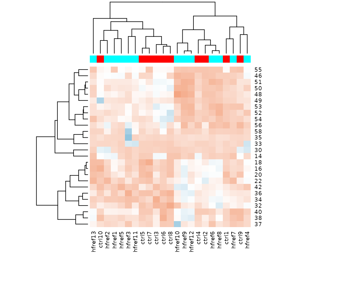
Heatmap of significant lipid species The difference between the two groups by observing the distribution of lipid species.
Double bond-chain length analysis analysis
This section provides heatmaps that illustrates the correlation between the double bond and chain length of lipid species. The color in the heatmaps is gradient according to log2FC.
The correlation is visually represented by cell colors—red indicates a positive correlation, while blue indicates a negative. Significant correlations are highlighted with an asterisk sign on the plot.
# data processing
processed_se <- data_process(
    se, exclude_missing=TRUE, exclude_missing_pct=70,
    replace_na_method='min', replace_na_method_ref=0.5,
    normalization='Percentage')
# get lipid characteristics
list_lipid_char(processed_se)$chain_db_list
#> There are 4 ratio characteristics that can be converted in your dataset.
#>            Lipid classification            Lipid classification
#>                      "Category"                    "Main.Class"
#>            Lipid classification            Lipid classification
#>                     "Sub.Class"                         "class"
#> Physical or chemical properties Physical or chemical properties
#>             "Bilayer.Thickness"                     "Bond.type"
#> Physical or chemical properties Physical or chemical properties
#>              "Headgroup.Charge"           "Intrinsic.Curvature"
#> Physical or chemical properties Physical or chemical properties
#>             "Lateral.Diffusion"        "Transition.Temperature"
#>              Cellular component                        Function
#>            "Cellular.Component"                      "Function"
# conduct double bond-chain length analysis (without setting `char_feature`)
heatmap_all <- heatmap_chain_db(
    processed_se, char='class', char_feature=NULL, ref_group='ctrl',
    test='t-test', significant='pval', p_cutoff=0.05,
    FC_cutoff=1, transform='log10')

# result summary
summary(heatmap_all)
#>             Length Class  Mode
#> total_chain 5      -none- list
#> each_chain  5      -none- list
# summary of total chain result
summary(heatmap_all$total_chain)
#>                       Length Class                Mode
#> static_heatmap         9     gg                   list
#> table_heatmap         21     data.frame           list
#> processed_abundance   24     data.frame           list
#> transformed_abundance 24     data.frame           list
#> chain_db_se           86     SummarizedExperiment S4
# view result: heatmap of total chain
heatmap_all$total_chain$static_heatmap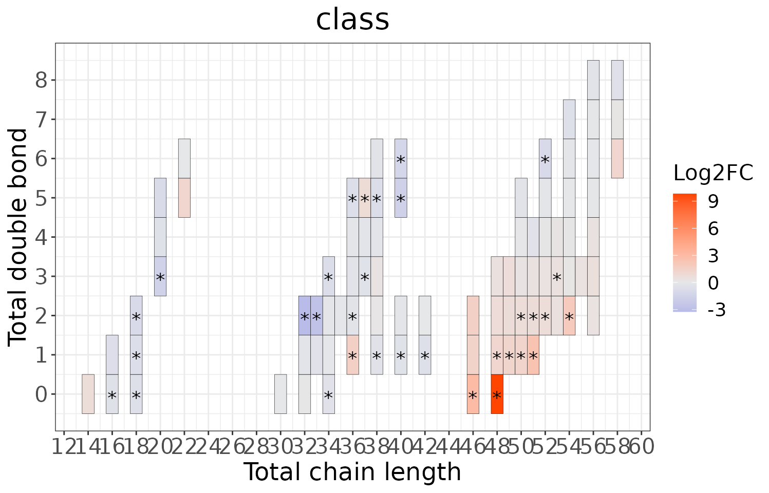
# summary of each chain result
summary(heatmap_all$each_chain)
#>                       Length Class                Mode
#> static_heatmap         9     gg                   list
#> table_heatmap         21     data.frame           list
#> processed_abundance   24     data.frame           list
#> transformed_abundance 24     data.frame           list
#> chain_db_se           19     SummarizedExperiment S4
# view result: heatmap of each chain
heatmap_all$each_chain$static_heatmap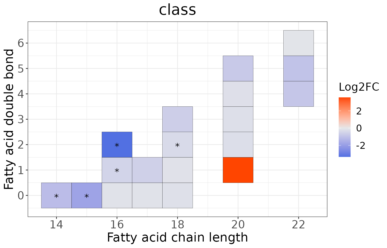
# conduct double bond-chain length analysis (a specific `char_feature`)
heatmap_one <- heatmap_chain_db(
    processed_se, char='class', char_feature='PC', ref_group='ctrl',
    test='t-test', significant='pval', p_cutoff=0.05,
    FC_cutoff=1, transform='log10')

# result summary
summary(heatmap_one)
#>             Length Class  Mode
#> total_chain 5      -none- list
#> each_chain  5      -none- list
# summary of total chain result
summary(heatmap_one$total_chain)
#>                       Length Class                Mode
#> static_heatmap         9     gg                   list
#> table_heatmap         22     data.frame           list
#> processed_abundance   24     data.frame           list
#> transformed_abundance 24     data.frame           list
#> chain_db_se           25     SummarizedExperiment S4
# view result: heatmap of total chain
heatmap_one$total_chain$static_heatmap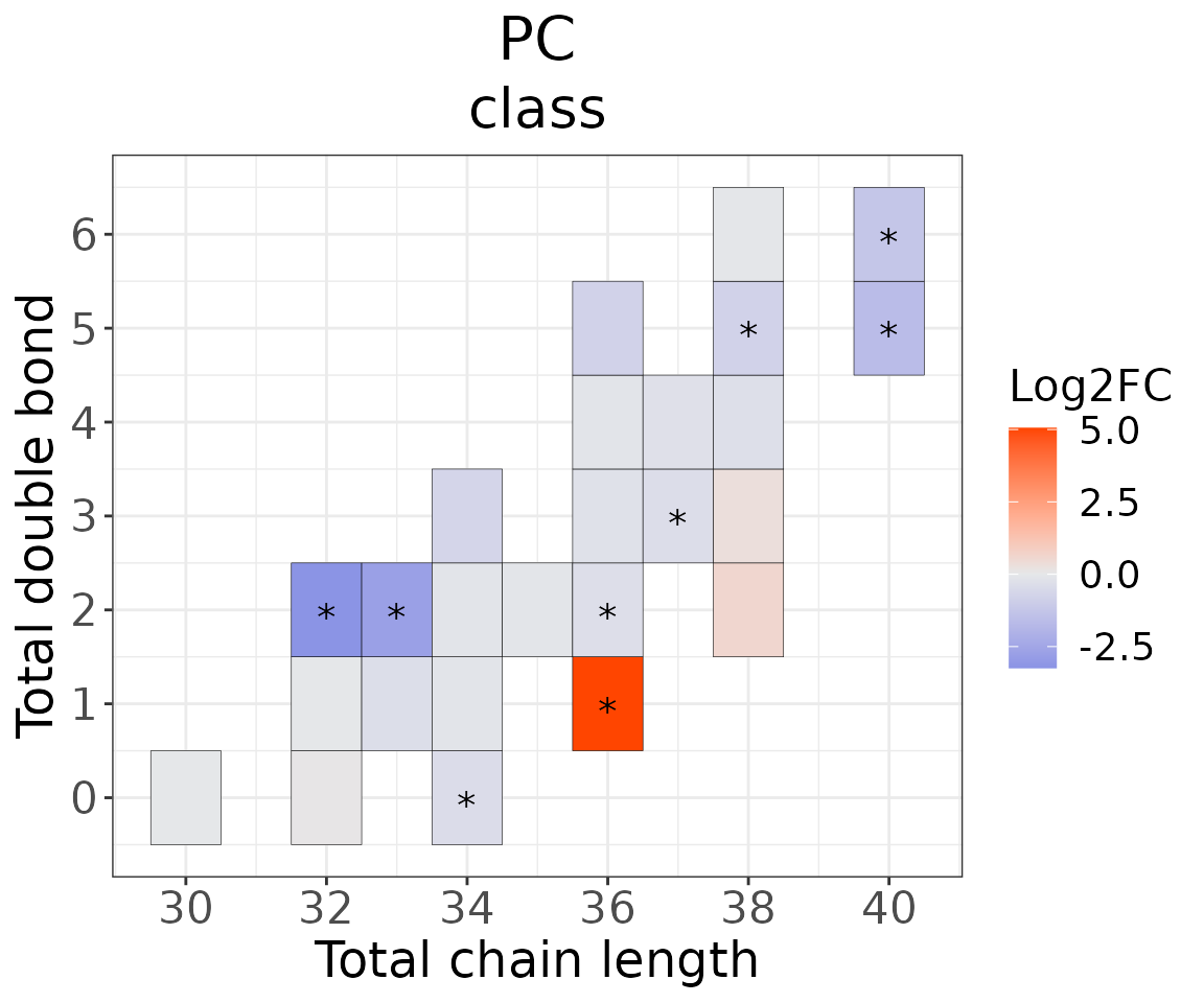
# summary of each chain result
summary(heatmap_one$each_chain)
#>                       Length Class                Mode
#> static_heatmap         9     gg                   list
#> table_heatmap         22     data.frame           list
#> processed_abundance   24     data.frame           list
#> transformed_abundance 24     data.frame           list
#> chain_db_se           18     SummarizedExperiment S4
# view result: heatmap of each chain
heatmap_one$each_chain$static_heatmap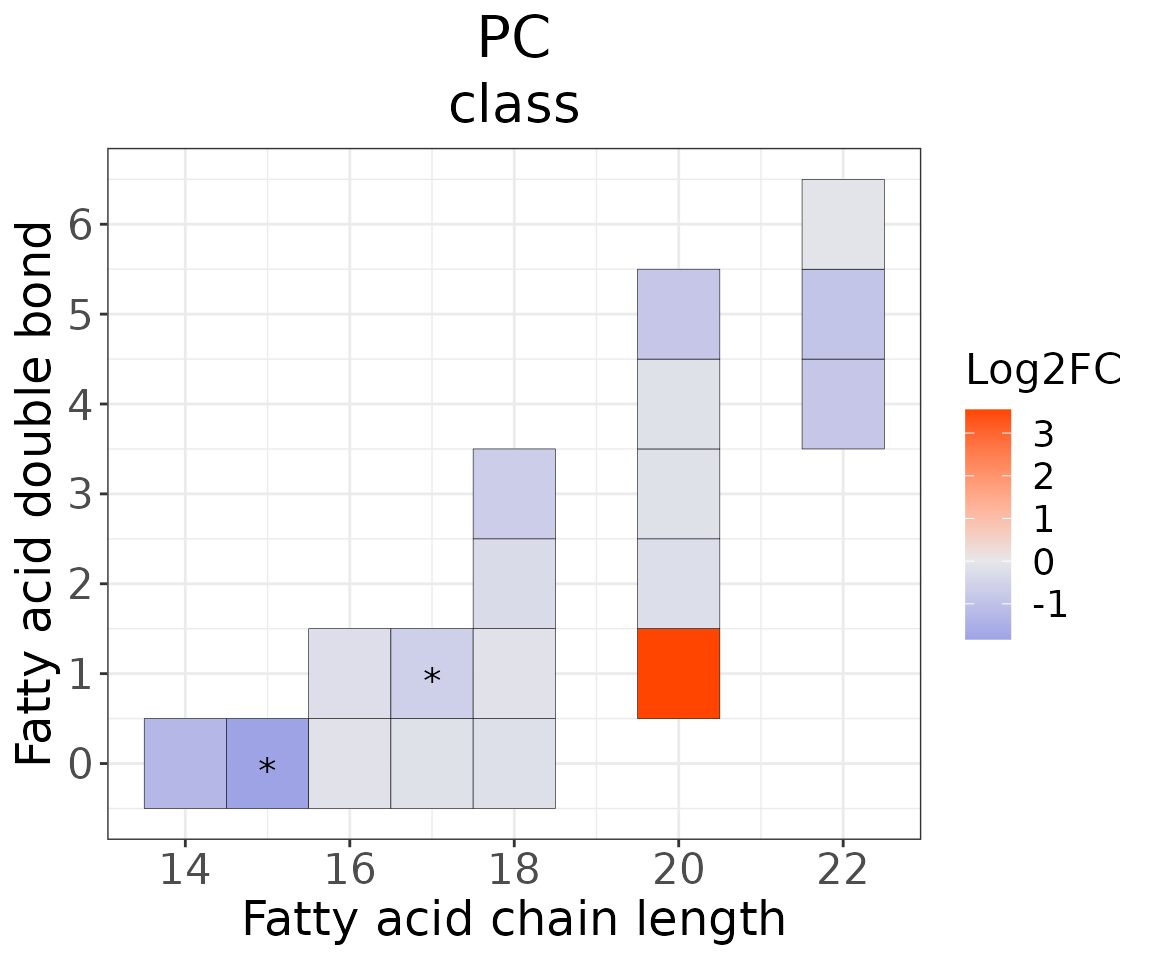
- NOTE: You can view the data in
chain_db_sebyLipidSigR::extract_summarized_experiment.
For example:
# view data in `chain_db_se`
heatmap_one_total_chain_list <-
    extract_summarized_experiment(heatmap_one$each_chain$chain_db_se)
# result summary
summary(heatmap_one_total_chain_list)
#>                  Length Class      Mode
#> abundance        24     data.frame list
#> lipid_char_table  4     data.frame list
#> group_info        4     data.frame list
You can further plot an abundance box plot for any lipid species of
interest by LipidSigR::boxPlot_feature_twoGroup.
For example, let’s use 15:0, a significant lipid species
from the heatmap above.
# plot abundance box plot of "15:0"
boxPlot_result <- boxPlot_feature_twoGroup(
    heatmap_one$each_chain$chain_db_se, feature='15:0',
    ref_group='ctrl', test='t-test', transform='log10')

# result summary
summary(boxPlot_result)
#>                Length Class        Mode
#> static_boxPlot 9      gg           list
#> table_boxplot  7      data.frame   list
#> table_stat     5      rstatix_test list

# view result: static box plot
boxPlot_result$static_boxPlot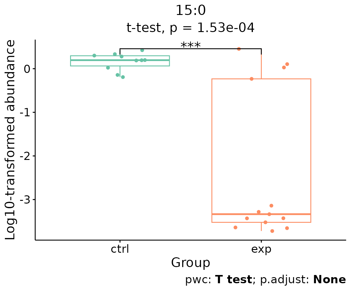
Box plot of lipid abundance An asterisk sign indicates significant differences between groups. The absence of an asterisk or line denotes a non-significant difference between groups.
Enrichment
Enrichment analysis provides two main approaches: ‘Over Representation Analysis (ORA)’ and ‘Lipid Set Enrichment Analysis (LSEA)’. ORA analysis illustrates significant lipid species enriched in the categories of lipid class. LSEA analysis is a computational method determining whether an a priori-defined set of lipids shows statistically significant, concordant differences between two biological states (e.g., phenotypes).
Over Representation Analysis (ORA)
The Over-Representation analysis provides whether significant lipid species are enriched in the categories of lipid class. Results are presented in tables and bar plots categorizing lipid species into ‘up-regulated’ or ‘down-regulated’ groups based on log2 fold change.
- NOTE: The input data of this section
deSp_seis generated bydeSp_twoGroupin lipid species analysis.
# conduct ORA
ora_all <- enrichment_ora(
    deSp_se, char=NULL, significant='pval', p_cutoff=0.05)
# result summary
summary(ora_all)
#>                     Length Class      Mode
#> enrich_result       14     tbl_df     list
#> static_barPlot       9     gg         list
#> interactive_barPlot  8     plotly     list
#> table_barPlot       10     grouped_df list
# view result: ORA bar plot
ora_all$static_barPlot 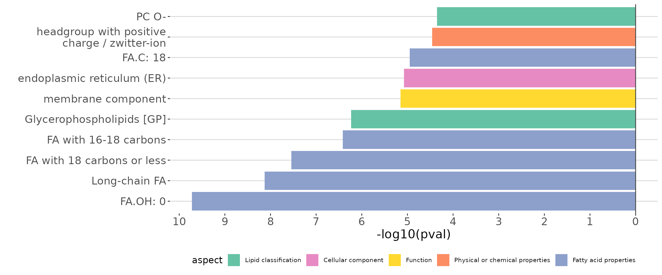
ORA bar plot of all characteristics The bar plot shows the top 10 significant up-regulated and down-regulated terms.
# get lipid characteristics
list_lipid_char(processed_se)$common_list
#> There are 4 ratio characteristics that can be converted in your dataset.
#>            Lipid classification            Lipid classification
#>                      "Category"                    "Main.Class"
#>            Lipid classification            Lipid classification
#>                     "Sub.Class"                         "class"
#>           Fatty acid properties           Fatty acid properties
#>                            "FA"                          "FA.C"
#>           Fatty acid properties           Fatty acid properties
#>     "FA.Chain.Length.Category1"     "FA.Chain.Length.Category2"
#>           Fatty acid properties           Fatty acid properties
#>     "FA.Chain.Length.Category3"                         "FA.DB"
#>           Fatty acid properties           Fatty acid properties
#>                         "FA.OH"     "FA.Unsaturation.Category1"
#>           Fatty acid properties           Fatty acid properties
#>     "FA.Unsaturation.Category2"                       "Total.C"
#>           Fatty acid properties           Fatty acid properties
#>                      "Total.DB"                      "Total.FA"
#>           Fatty acid properties Physical or chemical properties
#>                      "Total.OH"             "Bilayer.Thickness"
#> Physical or chemical properties Physical or chemical properties
#>                     "Bond.type"              "Headgroup.Charge"
#> Physical or chemical properties Physical or chemical properties
#>           "Intrinsic.Curvature"             "Lateral.Diffusion"
#> Physical or chemical properties              Cellular component
#>        "Transition.Temperature"            "Cellular.Component"
#>                        Function
#>                      "Function"
# conduct ORA of a specific `char`
ora_one <- enrichment_ora(
    deSp_se, char='class', significant='pval', p_cutoff=0.05)
# result summary
summary(ora_one)
#>                     Length Class      Mode
#> enrich_result       14     tbl_df     list
#> static_barPlot       9     gg         list
#> interactive_barPlot  8     plotly     list
#> table_barPlot       11     grouped_df list
# view result: ORA bar plot
ora_one$static_barPlot 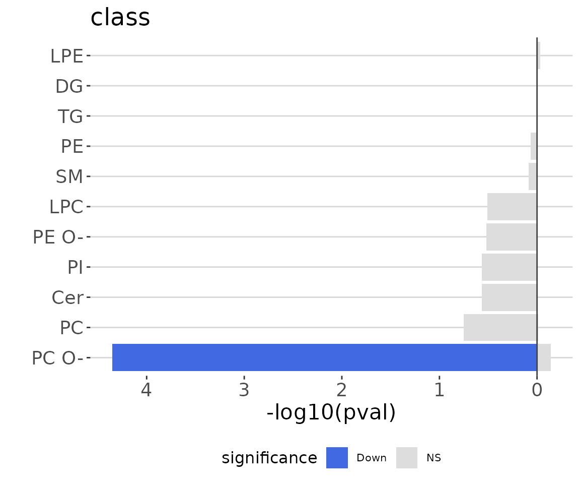
ORA bar plot of specific characteristics The bar plot classifies significant lipid species into ‘up-regulated’ or ‘down-regulated’ categories based on their log2 fold change, according to a selected characteristic. Red bars indicate up-regulated, blue bars represent down-regulated, and grey bars signify non-significant.
Lipid Set Enrichment Analysis (LSEA)
Lipid Set Enrichment Analysis (LSEA) is a computational method determining whether an a priori-defined set of lipids shows statistically significant, concordant differences between two biological states (e.g., phenotypes). Results are presented in tables and bar plots categorizing lipid species into ‘up-regulated’ or ‘down-regulated’ groups based on NES (Normalized Enrichment Score), and a table.
- NOTE: The input data of this section
deSp_seis generated bydeSp_twoGroupin lipid species analysis.
# conduct LSEA
lsea_all <- enrichment_lsea(
    deSp_se, char=NULL, rank_by='statistic', significant='pval',
    p_cutoff=0.05)
# result summary
summary(lsea_all)
#>                     Length Class  Mode
#> enrich_result        11    tbl_df list
#> static_barPlot        9    gg     list
#> interactive_barPlot   8    plotly list
#> table_barPlot         8    tbl_df list
#> lipid_set           167    -none- list
#> ranked_list         182    -none- numeric
# view result: LSEA bar plot
lsea_all$static_barPlot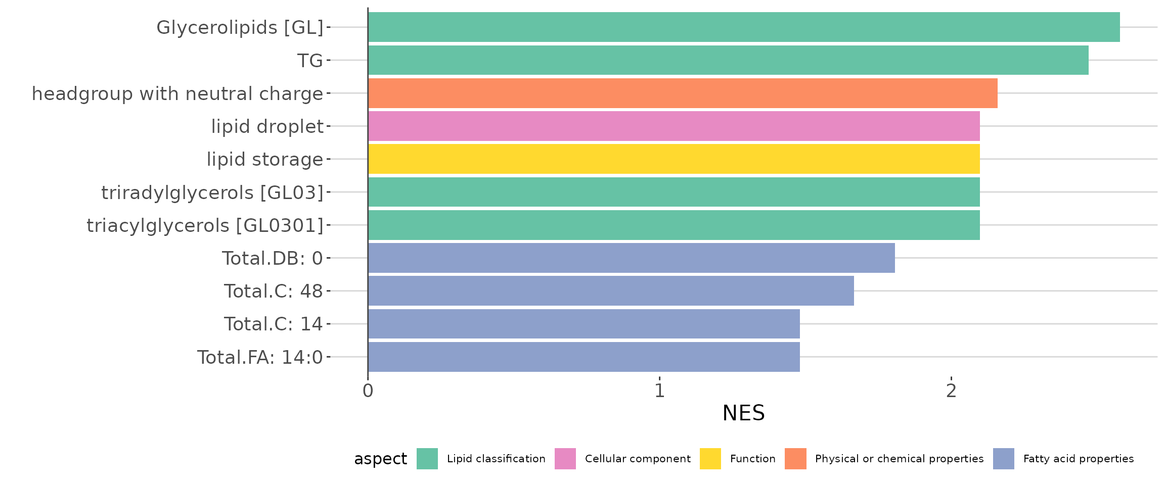
LSEA bar plot of all characteristics The bar plot shows the top 10 significant up-regulated and down-regulated terms.
# get lipid characteristics
list_lipid_char(processed_se)$common_list
#> There are 4 ratio characteristics that can be converted in your dataset.
#>            Lipid classification            Lipid classification
#>                      "Category"                    "Main.Class"
#>            Lipid classification            Lipid classification
#>                     "Sub.Class"                         "class"
#>           Fatty acid properties           Fatty acid properties
#>                            "FA"                          "FA.C"
#>           Fatty acid properties           Fatty acid properties
#>     "FA.Chain.Length.Category1"     "FA.Chain.Length.Category2"
#>           Fatty acid properties           Fatty acid properties
#>     "FA.Chain.Length.Category3"                         "FA.DB"
#>           Fatty acid properties           Fatty acid properties
#>                         "FA.OH"     "FA.Unsaturation.Category1"
#>           Fatty acid properties           Fatty acid properties
#>     "FA.Unsaturation.Category2"                       "Total.C"
#>           Fatty acid properties           Fatty acid properties
#>                      "Total.DB"                      "Total.FA"
#>           Fatty acid properties Physical or chemical properties
#>                      "Total.OH"             "Bilayer.Thickness"
#> Physical or chemical properties Physical or chemical properties
#>                     "Bond.type"              "Headgroup.Charge"
#> Physical or chemical properties Physical or chemical properties
#>           "Intrinsic.Curvature"             "Lateral.Diffusion"
#> Physical or chemical properties              Cellular component
#>        "Transition.Temperature"            "Cellular.Component"
#>                        Function
#>                      "Function"
# conduct LSEA of a specific `char`
lsea_one <- enrichment_lsea(
    deSp_se, char='class', rank_by='statistic',
    significant='pval', p_cutoff=0.05)
# result summary
summary(lsea_one)
#>                     Length Class  Mode
#> enrich_result        11    tbl_df list
#> static_barPlot        9    gg     list
#> interactive_barPlot   8    plotly list
#> table_barPlot         9    tbl_df list
#> lipid_set            11    -none- list
#> ranked_list         182    -none- numeric
# view result: LSEA bar plot
lsea_one$static_barPlot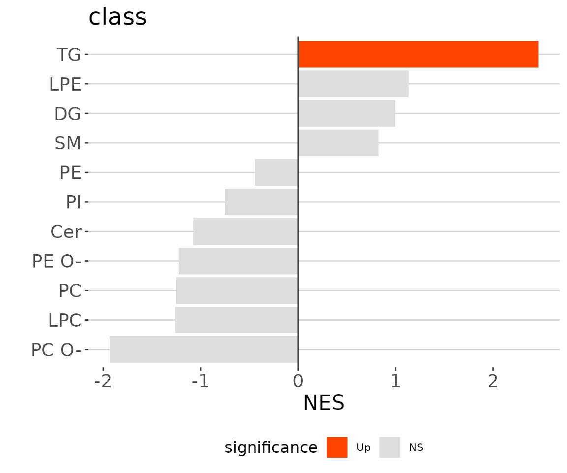
LSEA bar plot of a specific char The
bar plot classifies significant lipid species into ‘up-regulated’ or
‘down-regulated’ categories based on their log2 fold change, according
to a selected characteristic. Red bars indicate up-regulated, blue bars
represent down-regulated, and grey bars signify non-significant.
After running enrichment_lsea, you can continue
executing plot_enrichment_lsea to plot the enrichment plot
further. Please use the whole output of enrichment_lsea as
the input for plotting.
# plot LSEA results
lsea_plot <- plot_enrichment_lsea(
    lsea_res=lsea_one, char='class', char_feature='TG')

# view result: enrichment plot
lsea_plot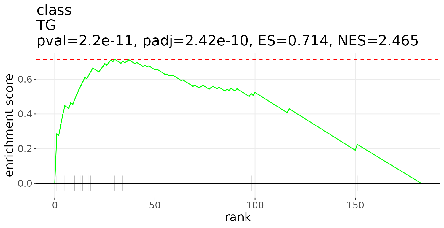
Network
This section provides three functions to quickly generate input data for constructing networks. After running the corresponding function, you will obtain the input data for a specific network. The available networks include the Pathway Activity Network, Lipid Reaction Network, and GATOM Network. Detailed instructions for each are described in the following sections.
- NOTE: The input data of this section
deSp_seis generated bydeSp_twoGroupin lipid species analysis.
Pathway activity network
The network provides activity pathways among lipid classes.
Follow the instructions below to get the input data for constructing the network.
# generate table for constructing Pathway activity network
network_table <- nw_pathway_activity(deSp_se, organism='mouse')

# result summary
summary(network_table)
#>                     Length Class      Mode
#> table_edge          11     data.frame list
#> table_node           9     tbl_df     list
#> table_pathway_score  4     grouped_df list
#> table_zScore         8     data.frame list
After obtaining all the returned tables, you can use them to
construct a network. Here, we use the visNetwork package to
display an example.
# network visualization
library(visNetwork)
network <- visNetwork(
    nodes=network_table$table_node, edges=network_table$table_edge) %>%
    visLayout(randomSeed=500) %>%
    visPhysics(
        solver='barnesHut', stabilization=TRUE,
        barnesHut=list(gravitationalConstant=-3000)) %>%
    visInteraction(navigationButtons=TRUE) %>%
    visEvents(
        dragEnd="function () {this.setOptions( { physics: false } );}") %>%
    visEdges(color=list(color="#DDDDDD",highlight="#C62F4B")) %>%
    visOptions(
        highlightNearest=list(enabled=TRUE, degree=1, hover=FALSE),
        selectedBy="group", nodesIdSelection=TRUE)
# view network
network
Lipid reaction network
This network illustrates the important reactions of differentially expressed lipid classes and species.
Follow the instructions below to get the input data for constructing the network.
# generate table for constructing Lipid reaction network
network_table <- nw_lipid_reaction(
    deSp_se, organism='mouse', show_sp='sigClass', show_all_reactions=FALSE,
    sp_significant='pval', sp_p_cutoff=0.05, sp_FC_cutoff=1,
    class_significant='pval', class_p_cutoff=0.05, class_FC_cutoff=1)

# result summary
summary(network_table)
#>                Length Class      Mode
#> table_edge     11     data.table list
#> table_node      9     data.table list
#> table_reaction  4     data.frame list
#> table_stat      4     data.frame list
After obtaining all the returned tables, you can use them to
construct a network. Here, we use the visNetwork package to
display an example.
library(visNetwork)
# network visualization
network <- visNetwork(
    nodes=network_table$table_node, edges=network_table$table_edge) %>%
    visLayout(randomSeed=500) %>%
    visPhysics(
        solver='barnesHut', stabilization=TRUE,
        barnesHut=list(gravitationalConstant=-2500)) %>%
    visInteraction(navigationButtons=TRUE) %>%
    visEvents(
        dragEnd="function () {this.setOptions( { physics: false } );}") %>%
    visOptions(
        highlightNearest=list(enabled=TRUE, degree=1, hover=FALSE),
        selectedBy="group", nodesIdSelection=TRUE)
# view network
network
GATOM network
The network shows the important reactions of differentially expressed lipid species.
Follow the instructions below to get the input data for constructing the network.
# generate table for constructing GATOM network
network_table <- nw_gatom(
    deSp_se, organism='mouse', n_lipid=50, sp_significant='pval',
    sp_p_cutoff=0.05, sp_FC_cutoff=1)
#> Registered S3 method overwritten by 'GGally':
#>   method from
#>   +.gg   ggplot2
#> Found DE table for metabolites with Species IDs
#> Metabolite p-value threshold: 1.000000
#> Metabolite BU alpha: 0.043884
#> FDR for metabolites: 0.043894

# result summary
summary(network_table)
#>                Length Class      Mode
#> table_edge     17     data.table list
#> table_node     12     data.table list
#> table_reaction  4     data.table list
#> table_stat      3     data.table list
After obtaining all the returned tables, you can use them to
construct a network. Here, we use the visNetwork package to
display an example.
library(visNetwork)
# network visualization
network <- visNetwork(
    nodes=network_table$table_node, edges=network_table$table_edge) %>%
    visLayout(randomSeed=500) %>%
    visPhysics(
        solver='barnesHut', stabilization=TRUE,
        barnesHut=list(gravitationalConstant=-3000)) %>%
    visInteraction(navigationButtons=TRUE) %>%
    visEvents(
        dragEnd="function () {this.setOptions( { physics: false } );}") %>%
    visEdges(color=list(color="#DDDDDD",highlight="#C62F4B")) %>%
    visOptions(
        highlightNearest=list(enabled=TRUE, degree=1, hover=FALSE),
        selectedBy="group", nodesIdSelection=TRUE)
# view network
network
Session info
#> R version 4.2.3 (2023-03-15)
#> Platform: x86_64-pc-linux-gnu (64-bit)
#> Running under: CentOS Stream 8
#>
#> Matrix products: default
#> BLAS/LAPACK: /usr/lib64/libopenblasp-r0.3.15.so
#>
#> locale:
#>  [1] LC_CTYPE=en_US.UTF-8       LC_NUMERIC=C
#>  [3] LC_TIME=en_US.UTF-8        LC_COLLATE=en_US.UTF-8
#>  [5] LC_MONETARY=en_US.UTF-8    LC_MESSAGES=en_US.UTF-8
#>  [7] LC_PAPER=en_US.UTF-8       LC_NAME=C
#>  [9] LC_ADDRESS=C               LC_TELEPHONE=C
#> [11] LC_MEASUREMENT=en_US.UTF-8 LC_IDENTIFICATION=C
#>
#> attached base packages:
#> [1] stats     graphics  grDevices utils     datasets  methods   base
#>
#> other attached packages:
#> [1] visNetwork_2.1.2 LipidSigR_0.7.0  dplyr_1.1.3
#>
#> loaded via a namespace (and not attached):
#>   [1] backports_1.4.1             Hmisc_5.1-1
#>   [3] fastmatch_1.1-4             systemfonts_1.0.4
#>   [5] plyr_1.8.8                  igraph_1.5.1
#>   [7] lazyeval_0.2.2              BiocParallel_1.32.6
#>   [9] crosstalk_1.2.0             GenomeInfoDb_1.34.9
#>  [11] ggplot2_3.4.3               pryr_0.1.6
#>  [13] digest_0.6.33               htmltools_0.5.6
#>  [15] fansi_1.0.4                 magrittr_2.0.3
#>  [17] checkmate_2.2.0             memoise_2.0.1
#>  [19] cluster_2.1.4               Biostrings_2.66.0
#>  [21] fastcluster_1.2.3           wordcloud_2.6
#>  [23] matrixStats_1.0.0           rARPACK_0.11-0
#>  [25] pkgdown_2.0.7               gatom_0.99.3
#>  [27] colorspace_2.1-0            blob_1.2.4
#>  [29] ggrepel_0.9.3               textshaping_0.3.6
#>  [31] xfun_0.42                   crayon_1.5.2
#>  [33] RCurl_1.98-1.12             jsonlite_1.8.7
#>  [35] glue_1.6.2                  polyclip_1.10-4
#>  [37] gtable_0.3.4                zlibbioc_1.44.0
#>  [39] XVector_0.38.0              shinyCyJS_1.0.0
#>  [41] DelayedArray_0.24.0         car_3.1-2
#>  [43] BiocGenerics_0.44.0         abind_1.4-5
#>  [45] scales_1.3.0                GGally_2.1.2
#>  [47] DBI_1.2.2                   rstatix_0.7.2
#>  [49] ggthemes_4.2.4              Rcpp_1.0.11
#>  [51] viridisLite_0.4.2           htmlTable_2.4.1
#>  [53] foreign_0.8-85              bit_4.0.5
#>  [55] rgoslin_1.2.0               Formula_1.2-5
#>  [57] stats4_4.2.3                htmlwidgets_1.6.2
#>  [59] httr_1.4.7                  fgsea_1.24.0
#>  [61] FNN_1.1.3.2                 RColorBrewer_1.1-3
#>  [63] ellipsis_0.3.2              factoextra_1.0.7
#>  [65] XML_3.99-0.14               reshape_0.8.9
#>  [67] pkgconfig_2.0.3             farver_2.1.1
#>  [69] nnet_7.3-19                 sass_0.4.7
#>  [71] uwot_0.1.16                 utf8_1.2.3
#>  [73] tidyselect_1.2.0            labeling_0.4.3
#>  [75] rlang_1.1.1                 reshape2_1.4.4
#>  [77] AnnotationDbi_1.60.2        munsell_0.5.0
#>  [79] tools_4.2.3                 cachem_1.0.8
#>  [81] cli_3.6.1                   generics_0.1.3
#>  [83] RSQLite_2.3.5               broom_1.0.5
#>  [85] evaluate_0.21               stringr_1.5.0
#>  [87] fastmap_1.1.1               yaml_2.3.7
#>  [89] ragg_1.3.0                  knitr_1.44
#>  [91] bit64_4.0.5                 fs_1.6.3
#>  [93] mwcsr_0.1.7                 purrr_1.0.2
#>  [95] KEGGREST_1.38.0             iheatmapr_0.7.0
#>  [97] BioNet_1.58.0               compiler_4.2.3
#>  [99] rstudioapi_0.15.0           png_0.1-8
#> [101] plotly_4.10.2               ggsignif_0.6.4
#> [103] tibble_3.2.1                tweenr_2.0.3
#> [105] bslib_0.5.1                 stringi_1.7.12
#> [107] desc_1.4.2                  RSpectra_0.16-1
#> [109] lattice_0.22-5              Matrix_1.6-3
#> [111] vctrs_0.6.3                 pillar_1.9.0
#> [113] lifecycle_1.0.3             jquerylib_0.1.4
#> [115] data.table_1.15.2           cowplot_1.1.1
#> [117] bitops_1.0-7                irlba_2.3.5.1
#> [119] hwordcloud_0.1.0            corpcor_1.6.10
#> [121] GenomicRanges_1.50.2        R6_2.5.1
#> [123] gridExtra_2.3               IRanges_2.32.0
#> [125] codetools_0.2-19            MASS_7.3-60
#> [127] SummarizedExperiment_1.28.0 rprojroot_2.0.3
#> [129] withr_3.0.0                 S4Vectors_0.36.2
#> [131] GenomeInfoDbData_1.2.9      parallel_4.2.3
#> [133] mixOmics_6.22.0             grid_4.2.3
#> [135] rpart_4.1.19                tidyr_1.3.0
#> [137] rmarkdown_2.25              MatrixGenerics_1.10.0
#> [139] carData_3.0-5               Rtsne_0.16
#> [141] ggpubr_0.6.0                ggforce_0.4.1
#> [143] Biobase_2.58.0              base64enc_0.1-3
#> [145] ellipse_0.5.0